By Kirby Ng, Lead IGCSE Economics Tutor at KS Academia Prep, who also teaches IB Economics at SL and HL · Updated 6 October 2026
By our count, the IB Economics guide (first assessment 2022) requires 108 diagrams: 81 for SL and HL, and 27 for HL only. Every one is drawn below, grouped by syllabus unit, plus three extension diagrams.
I tell students in my IB Economics classes that an IB diagram only earns its marks once you explain it. That is the biggest change from IGCSE. A correct diagram followed by a paragraph that never refers to it stays in the lower markbands.
The IB guide expects “correctly labelled and clearly drawn diagrams” wherever they are appropriate. The Paper 1 part (a) markbands then reward diagrams in three steps:
5 to 6 marks: relevant diagrams are included
7 to 8 marks: relevant diagrams are included and explained
9 to 10 marks: relevant diagrams are included and fully explained
The same wording runs through the markbands for Paper 1 part (b) and Paper 2 part (g). The question-specific markschemes also name the diagrams examiners expect. In the May 2023 HL Paper 1 markscheme (time zone 2), the question on income elasticity of demand lists a demand and supply diagram showing the relevant shifts, or an Engel curve.
In practice essays, the slips I see most often are: a diagram that the text never refers to; AD/AS axes labelled price and quantity instead of average price level and real GDP; a shift drawn without naming its cause; and a welfare loss shaded in the wrong place.
In the Internal Assessment, diagrams sit outside the 800-word count, and criterion A rewards relevant, accurate, correctly labelled diagrams with a full explanation. See our IB Economics IA guide.
Sources: IB Economics guide (first assessment 2022), “Use of diagrams” and external assessment markbands; IB Economics HL Paper 1 markscheme, May 2023, time zone 2.
Original curveNew or shifted curveSocial cost or benefit (MSC, MSB)Government price controlWelfare lossProfit or revenue
Jump to a topic
Unit 1: Introduction to economics
Unit 1 needs two models: the production possibilities curve and the circular flow of income.
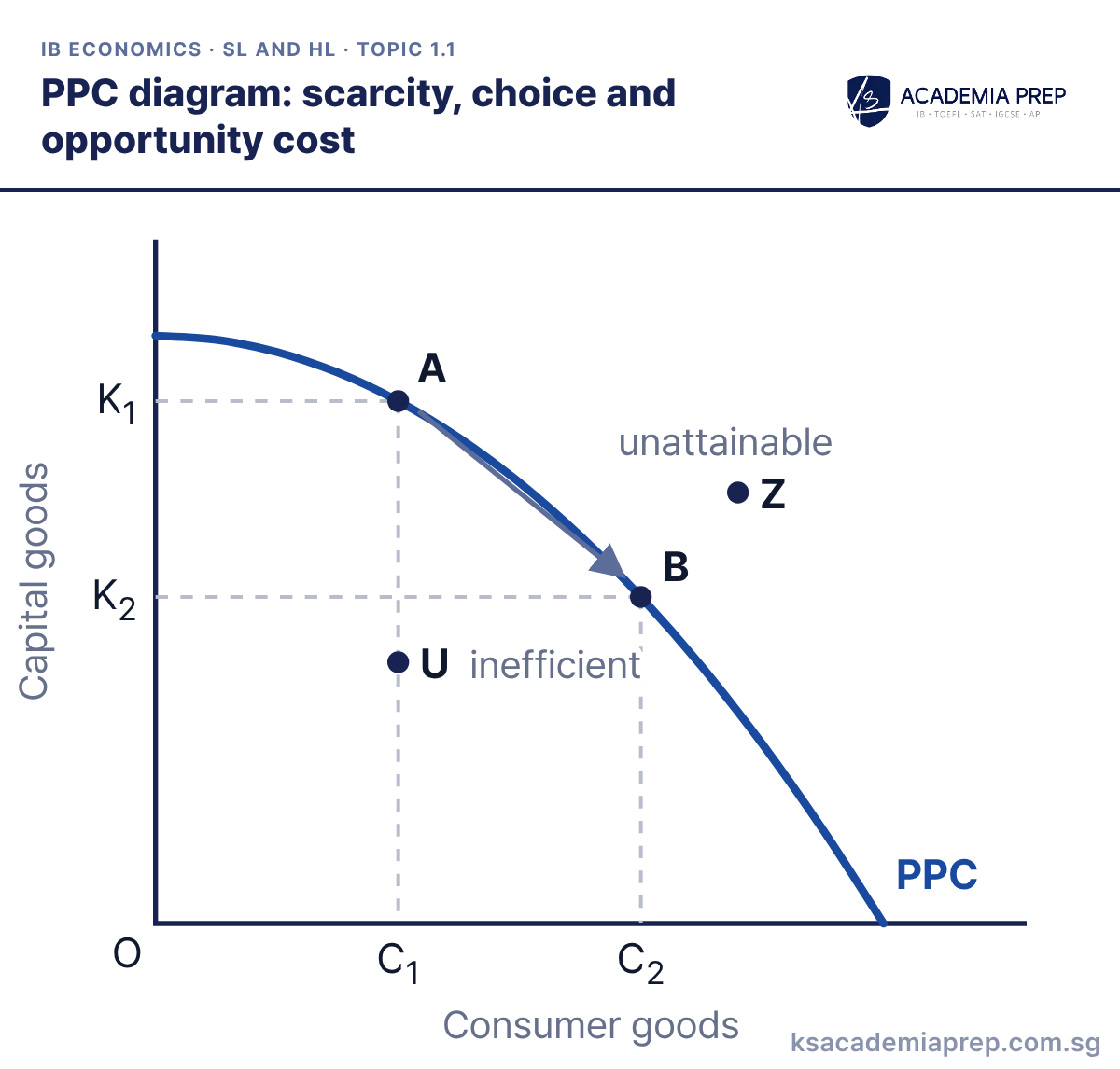
PPC diagram: scarcity, choice and opportunity cost
What it shows: Points A and B on the PPC use all resources efficiently, U inside the curve means resources are unemployed or used inefficiently, and Z beyond it is unattainable with current resources, which shows scarcity. Choosing to move from A to B raises consumer goods from C1 to C2, and the opportunity cost is the capital goods given up, K1 − K2.
How to draw it
Label the vertical axis Capital goods and the horizontal axis Consumer goods, with O at the origin.
Draw a concave curve bowed outward from the origin and label it PPC.
Mark A and B on the curve, U inside it (inefficient) and Z beyond it (unattainable). Draw dashed lines from A and B to K₁, K₂, C₁ and C₂.
State opportunity cost as the quantity of the other good given up, not as money. Paper 1: use it to open any essay on scarcity and choice, or on the trade-off between consumption now and growth later.
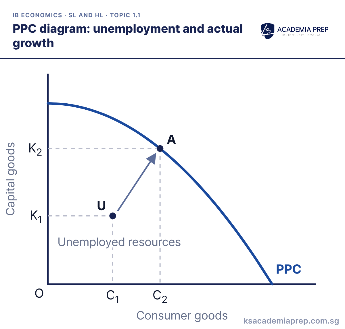
What it shows: At U the economy has unemployed or underused resources, so it produces less than it could. Putting those resources to work moves output to A on the curve, raising both goods from C1 to C2 and K1 to K2. This is actual growth: output rises but the PPC does not shift.
How to draw it
Label the vertical axis Capital goods and the horizontal axis Consumer goods.
Draw one concave curve labelled PPC. Mark U inside it, labelled Unemployed resources, and A on the curve up and to the right of U.
Draw dashed lines from U to K₁ and C₁ and from A to K₂ and C₂, with an arrow from U to A. Do not shift the PPC.
Do not shift the curve for actual growth; only the point moves. Paper 1: contrast this with an outward shift when asked to distinguish actual from potential growth.
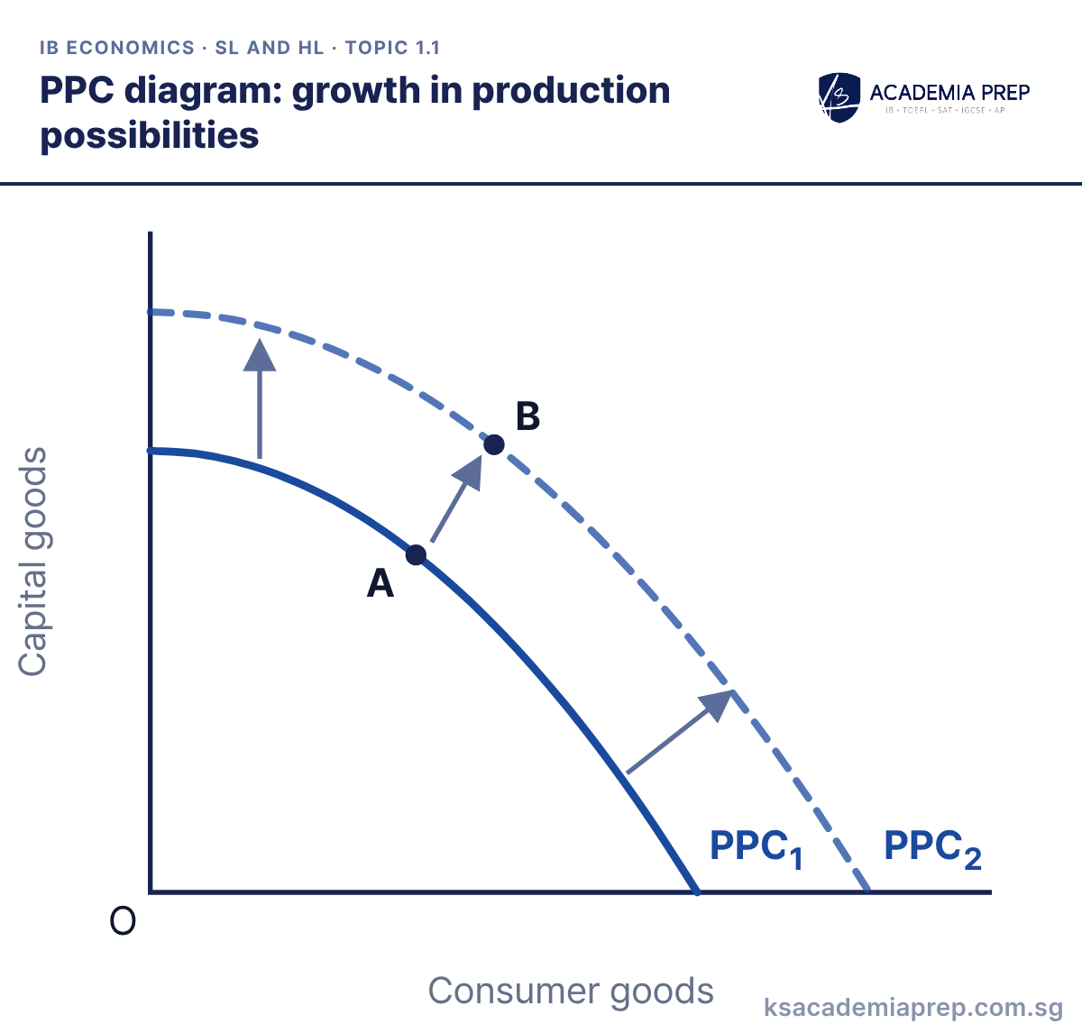
What it shows: An increase in the quantity or quality of factors of production, such as more capital, a larger labour force or better technology, shifts the curve outward from PPC1 to PPC2. This is growth in production possibilities (potential growth). The economy can now reach B, with more of both goods than at A.
How to draw it
Label the vertical axis Capital goods and the horizontal axis Consumer goods.
Draw a concave curve labelled PPC₁, then a second concave curve further out labelled PPC₂, with an arrow showing the outward shift.
Mark A on PPC₁ and B on PPC₂ up and to the right of A. State the cause of the shift in your answer.
Name the cause of the shift (for example investment in capital goods or education), not just "growth". Paper 1: pair it with the actual growth diagram to separate the two ideas.
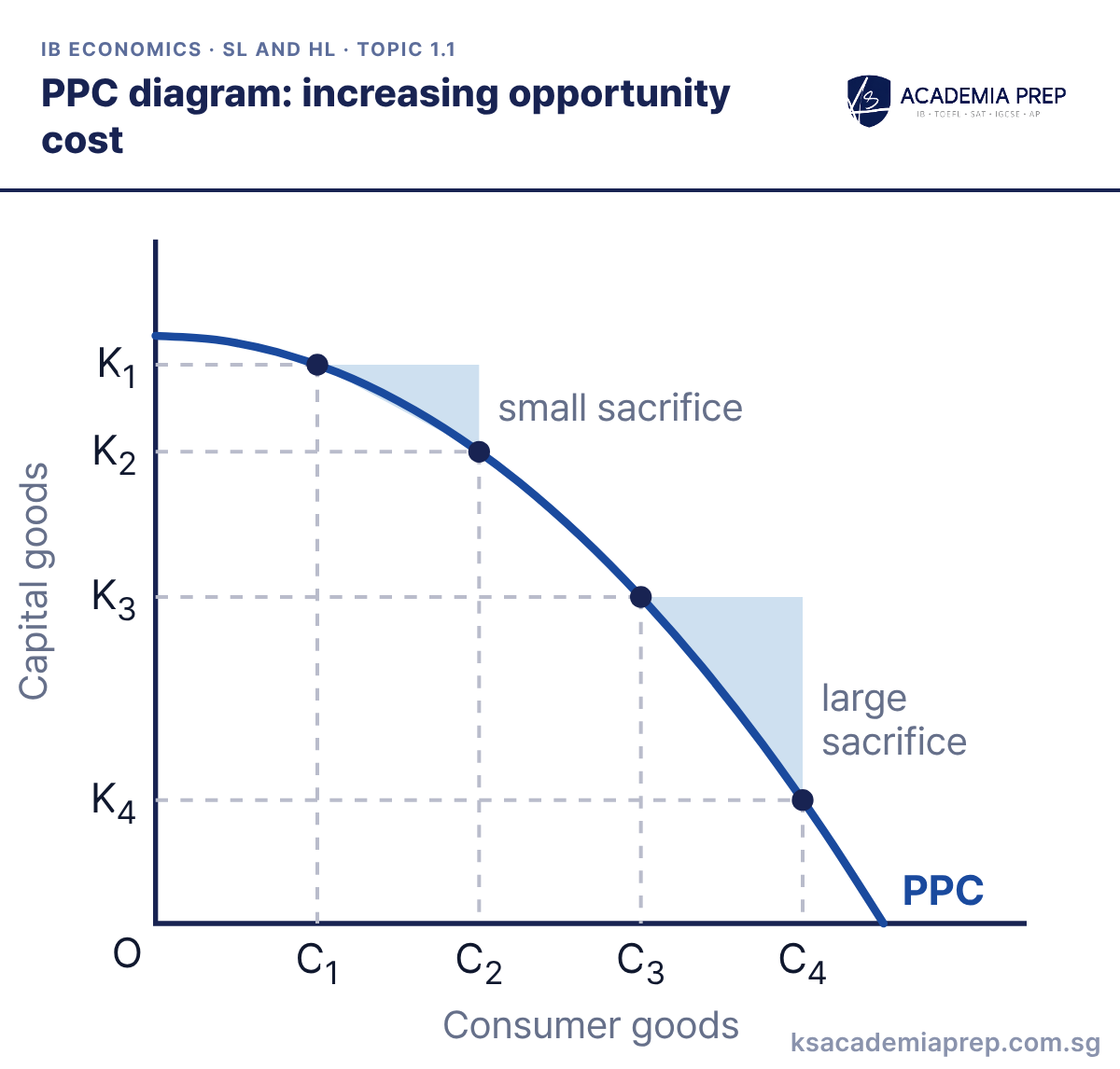
What it shows: The PPC is concave (bowed outward) because resources are not equally suited to producing both goods. Raising consumer goods from C1 to C2 costs only K1 − K2 of capital goods, but the same increase from C3 to C4 costs a much larger K3 − K4, as less suitable resources are switched.
How to draw it
Label the vertical axis Capital goods and the horizontal axis Consumer goods.
Draw a concave curve bowed outward from the origin and label it PPC.
Mark equal steps C₁ to C₂ and C₃ to C₄, with dashed lines to the curve and across to K₁, K₂, K₃ and K₄. Label small sacrifice and large sacrifice.
Make the two steps on the horizontal axis equal in width so the growing sacrifice is obvious. Paper 1: explain the concave shape with the idea that factors of production are specialised.
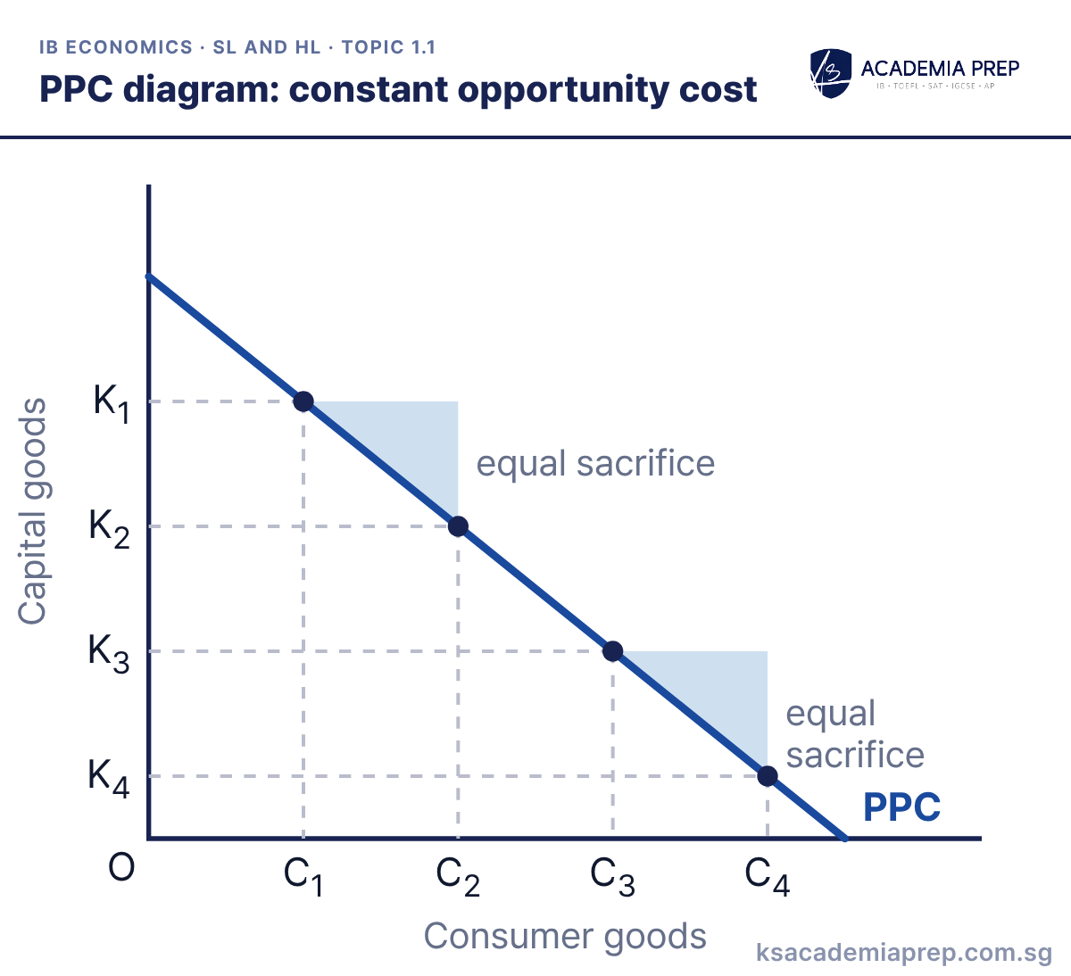
What it shows: A straight-line PPC assumes resources are equally good at producing both goods, so the opportunity cost stays the same. Raising consumer goods from C1 to C2 costs K1 − K2 of capital goods, and the equal increase from C3 to C4 costs exactly the same, K3 − K4.
How to draw it
Label the vertical axis Capital goods and the horizontal axis Consumer goods.
Draw a straight line from the vertical axis to the horizontal axis and label it PPC.
Mark equal steps C₁ to C₂ and C₃ to C₄, with dashed lines to the line and across to K₁, K₂, K₃ and K₄. Label both drops equal sacrifice.
The constant slope is the opportunity cost; say so explicitly. Paper 1: use it as the contrast case when explaining why most PPCs are drawn concave.
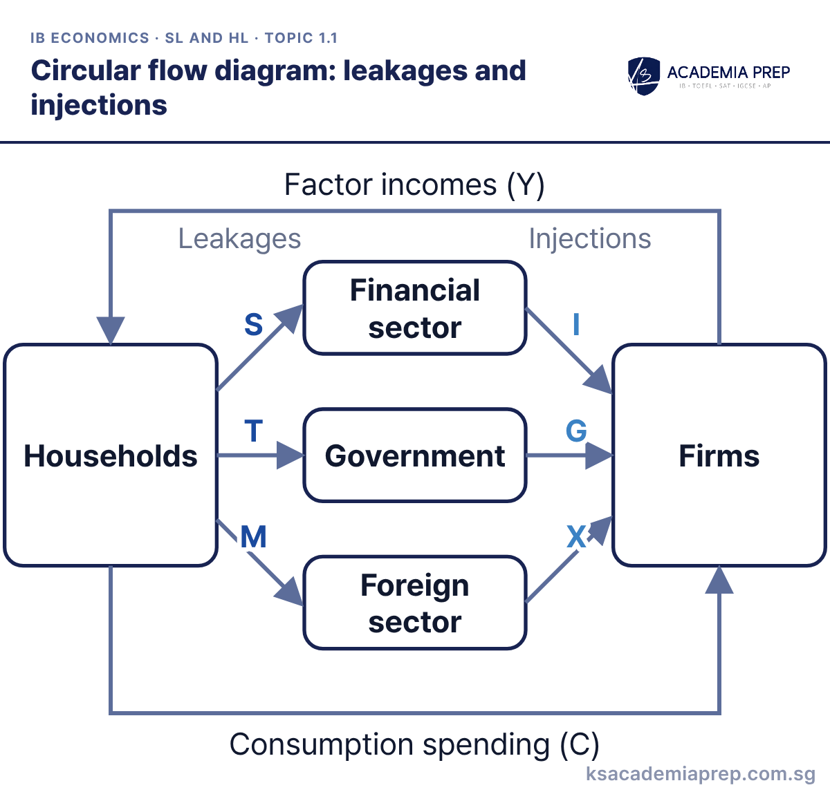
What it shows: Firms pay factor incomes (Y) to households, and households spend on firms’ output (C). Saving (S), taxes (T) and import spending (M) leak out of the flow to the financial, government and foreign sectors, while investment (I), government spending (G) and exports (X) are injected back in. If injections exceed leakages national income rises; if leakages exceed injections it falls.
How to draw it
Draw two boxes, Households and Firms. Add an arrow of Factor incomes (Y) to households and an arrow of Consumption spending (C) to firms.
Draw three sector boxes, Financial sector, Government and Foreign sector, with a Leakages side and an Injections side.
Draw leakage arrows S, T and M from the flow into each sector, and injection arrows I, G and X from each sector back into the flow towards firms.
Pair each leakage with its matching injection and sector (S with I, T with G, M with X). Paper 1: use it to explain why a fall in exports or investment reduces national income.
Best for: Paper 1Paper 2
Unit 2: Microeconomics
Microeconomics has the most diagrams in the course, and HL adds a full set of market structure diagrams in 2.11.
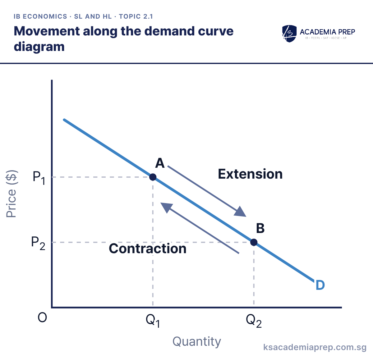
What it shows: A change in the good’s own price causes a movement along the demand curve, not a shift. A fall in price from P1 to P2 is an extension of quantity demanded from Q1 to Q2 (A to B). A rise in price from P2 to P1 is a contraction from B back to A.
How to draw it
Label the vertical axis Price ($) and the horizontal axis Quantity.
Draw one downward-sloping demand curve and label it D.
Mark A at P₁, Q₁ and B at P₂, Q₂ with dashed lines to the axes. Label Extension from A to B and Contraction back. Do not shift D.
Say “quantity demanded” for a movement and keep “demand” for a shift of the whole curve. Paper 1: this is the vocabulary examiners check before they read your analysis.
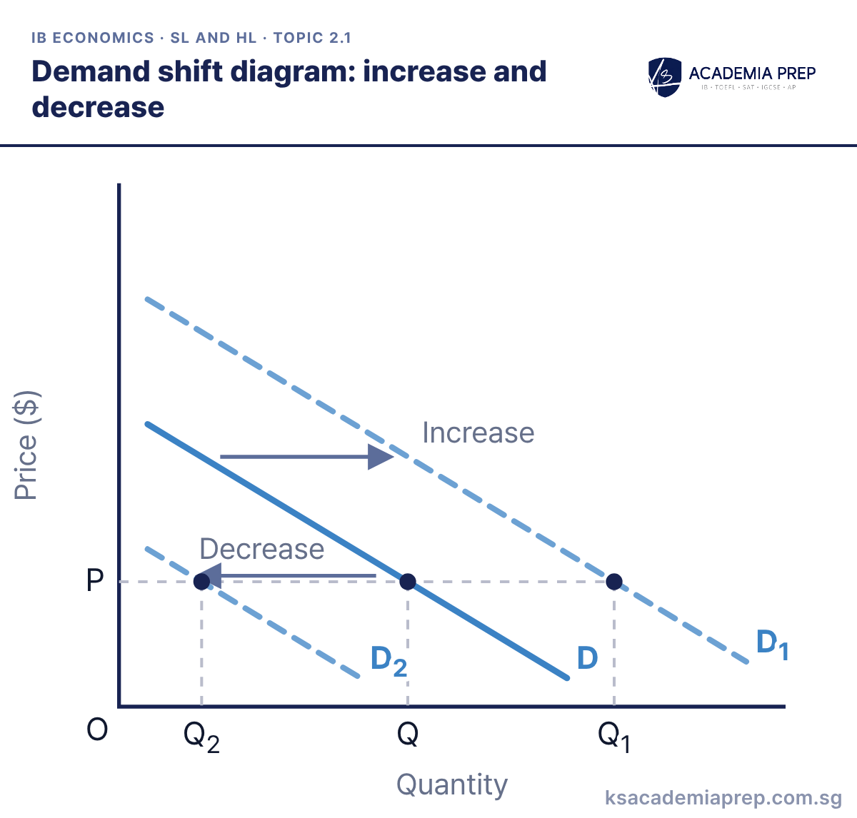
What it shows: A change in a non-price determinant shifts the whole demand curve. Higher income for a normal good, a rise in the price of a substitute or more favourable tastes shift D right to D1, so more is demanded at P (Q1). A fall in the price of a substitute, less favourable tastes or fewer consumers shift D left to D2 (Q2).
How to draw it
Label the vertical axis Price ($) and the horizontal axis Quantity.
Draw the original demand curve D, then D₁ to its right and D₂ to its left, with arrows labelled Increase and Decrease.
Draw a dashed line across at price P and drop dashed lines to Q₂, Q and Q₁ where it meets D₂, D and D₁.
Name the determinant and its direction before you draw the shift. Paper 2: a news extract almost always gives you the determinant, so quote it next to the arrow.
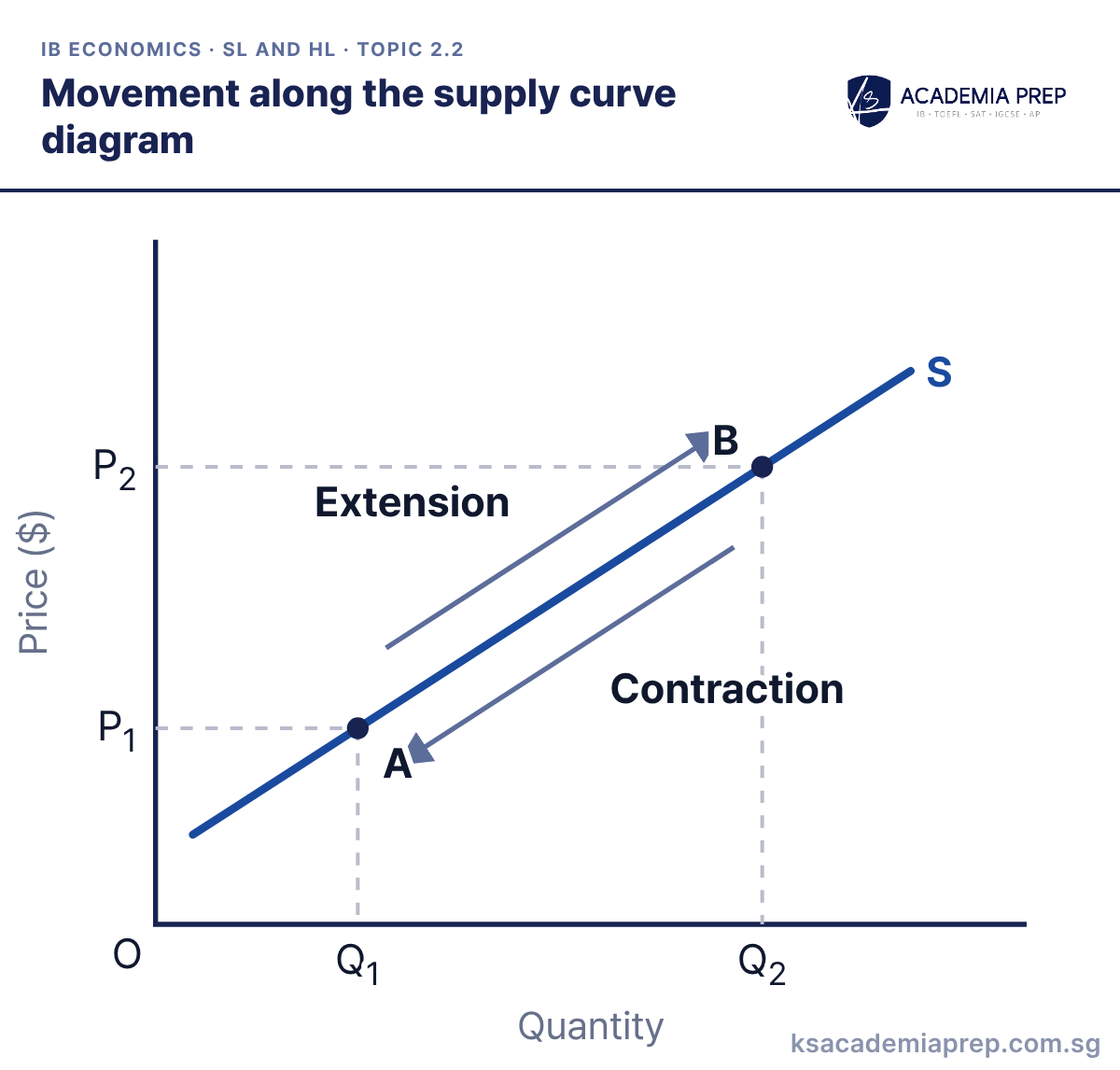
What it shows: A change in the good’s own price causes a movement along the supply curve. A rise in price from P1 to P2 is an extension of quantity supplied from Q1 to Q2 (A to B), because higher prices make production more profitable. A fall in price from P2 to P1 is a contraction from B back to A.
How to draw it
Label the vertical axis Price ($) and the horizontal axis Quantity.
Draw one upward-sloping supply curve and label it S.
Mark A at P₁, Q₁ and B at P₂, Q₂ with dashed lines to the axes. Label Extension from A to B and Contraction back. Do not shift S.
Do not shift the supply curve when the good’s own price changes. Paper 1: link the upward slope to rising marginal cost to show understanding, not just a rule.
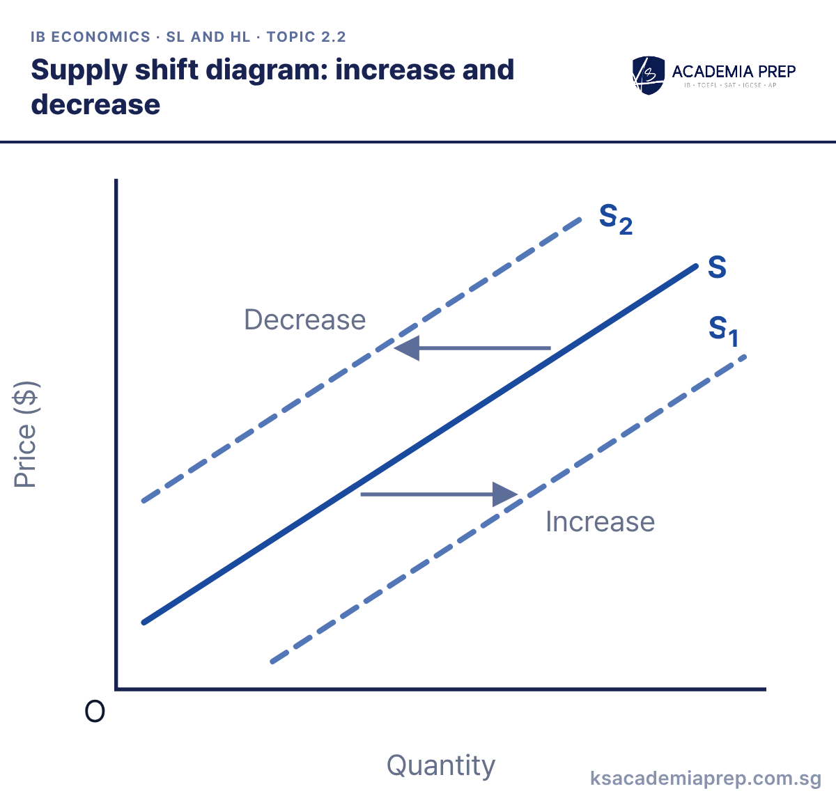
What it shows: A change in a non-price determinant shifts the whole supply curve. Lower costs of production, better technology, a subsidy or more firms shift S right to S1. Higher costs, an indirect tax, fewer firms or bad weather in agriculture shift S left to S2.
How to draw it
Label the vertical axis Price ($) and the horizontal axis Quantity.
Draw the original upward-sloping supply curve S, then S₁ to its right and S₂ to its left.
Draw horizontal arrows labelled Increase towards S₁ and Decrease towards S₂. An increase in supply sits lower on the diagram, not higher.
An increase in supply is a shift to the right, which on the diagram looks lower, not higher. Paper 2: say which cost changed and draw the arrow horizontally between the curves.
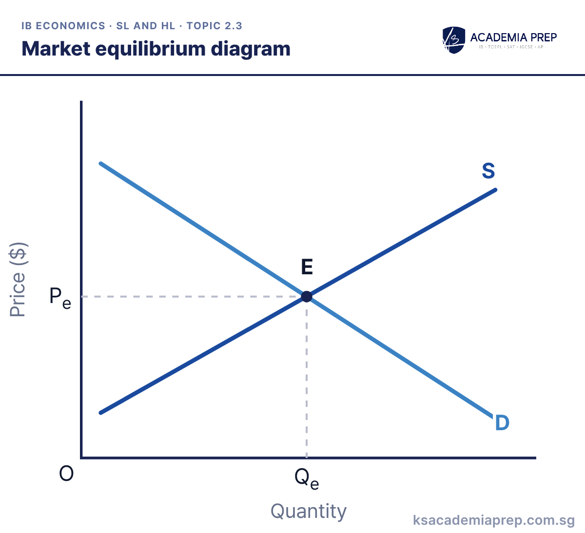
What it shows: Equilibrium E is where demand equals supply. At Pe the quantity consumers want to buy equals the quantity firms want to sell, Qe, so there is no pressure for the price to change.
How to draw it
Label the vertical axis Price ($) and the horizontal axis Quantity, with O at the origin.
Draw a downward-sloping D and an upward-sloping S, and label both.
Mark the point where they cross as E and draw dashed lines from it to both axes, labelled Pe and Qe.
Label the axes “Price ($)” and “Quantity”, not “P” and “Q”. Paper 1: every microeconomics answer starts from this equilibrium before anything shifts.
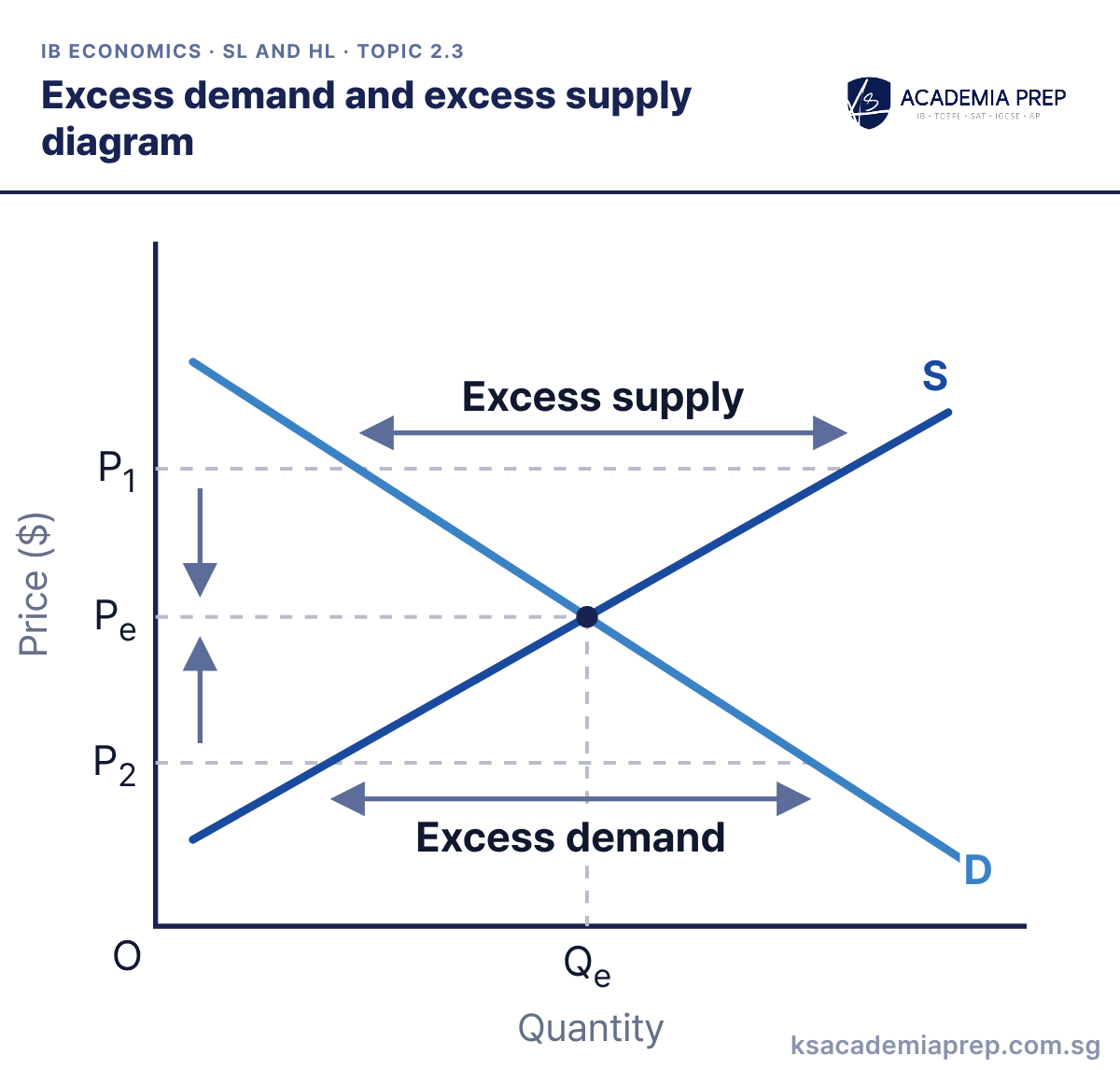
What it shows: At P1, above Pe, quantity supplied exceeds quantity demanded, so there is excess supply and the price falls. At P2, below Pe, there is excess demand and the price rises. The price mechanism signals the shortage or surplus, gives firms and consumers an incentive to respond, and rations the good until the market clears at Pe and Qe.
How to draw it
Label the vertical axis Price ($) and the horizontal axis Quantity. Draw and label D and S, and mark Pe and Qe.
Draw a horizontal line at P₁ above Pe and label the gap between D and S Excess supply.
Draw a horizontal line at P₂ below Pe and label the gap between D and S Excess demand. Add arrows showing the price moving back to Pe.
Measure the gap horizontally along the price line, from the demand curve to the supply curve. Paper 1: name all three functions of price (signalling, incentive, rationing) as the price moves back.
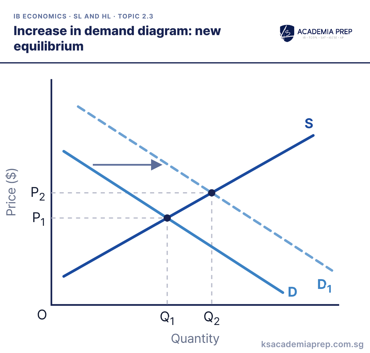
What it shows: An increase in demand shifts D right to D1. At the old price P1 there is now excess demand, so the price rises, signalling firms to extend supply along S. The new equilibrium is at a higher price P2 and a larger quantity Q2.
How to draw it
Label the vertical axis Price ($) and the horizontal axis Quantity. Draw D and S and mark the first equilibrium at P₁ and Q₁.
Draw D₁ to the right of D and add an arrow showing the shift.
Mark the new equilibrium where D₁ crosses S, with dashed lines to P₂ and Q₂. Do not shift S: quantity supplied extends along it.
Show the movement along S as well as the shift of D, and never shift both curves unless both determinants changed. Paper 2: this is the standard answer to “use a diagram to explain the rise in price”.
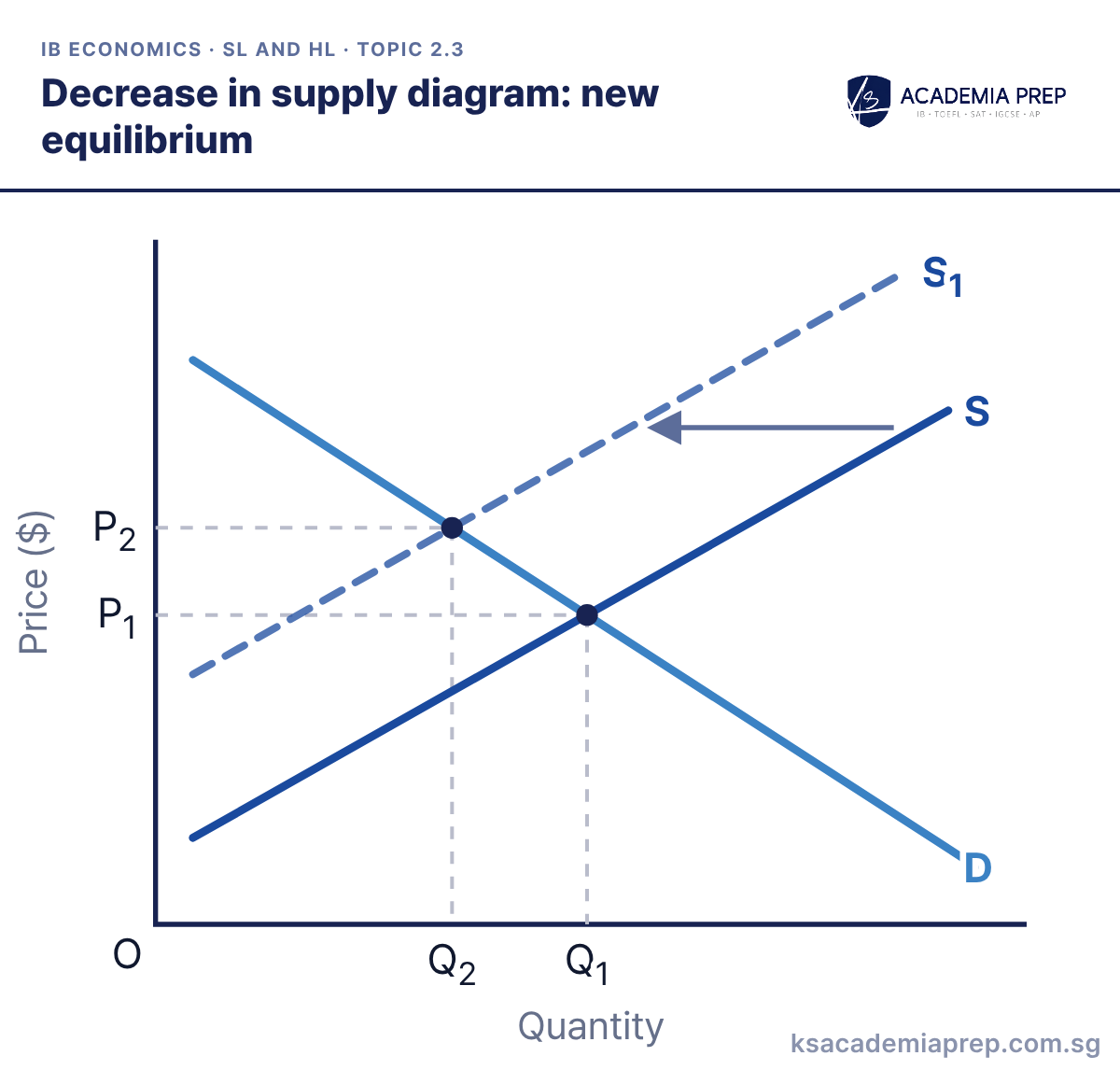
What it shows: A decrease in supply, for example from higher input costs, shifts S left to S1. At P1 there is excess demand, so the price rises and quantity demanded contracts along D. The new equilibrium has a higher price P2 and a smaller quantity Q2.
How to draw it
Label the vertical axis Price ($) and the horizontal axis Quantity. Draw D and S and mark the first equilibrium at P₁ and Q₁.
Draw S₁ to the left of S, parallel to it, and add an arrow showing the shift.
Mark the new equilibrium where S₁ crosses D, with dashed lines to P₂ and Q₂. Do not shift D: quantity demanded contracts along it.
Draw the new supply curve parallel to the old one and label both equilibria on the axes. Paper 2: use it for any supply shock in the extract, such as droughts, strikes or oil prices.
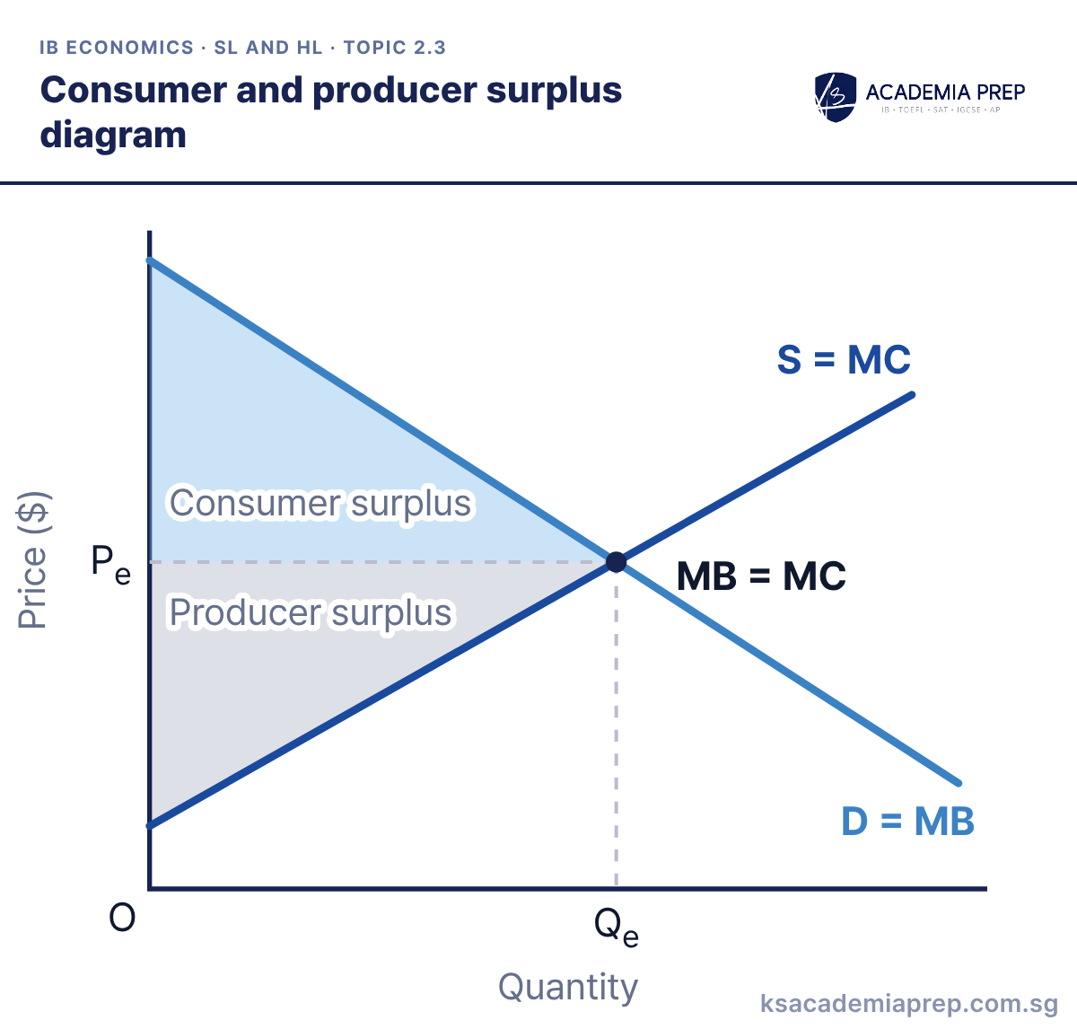
What it shows: Consumer surplus is the area below the demand (MB) curve and above Pe; producer surplus is the area above the supply (MC) curve and below Pe. Together they form social (community) surplus, which is maximised at the competitive equilibrium Qe where MB = MC. This is allocative efficiency: no other output gives society a larger total surplus.
How to draw it
Label the vertical axis Price ($) and the horizontal axis Quantity.
Draw a downward-sloping curve labelled D = MB and an upward-sloping curve labelled S = MC, and label where they cross MB = MC.
Draw dashed lines to Pe and Qe. Shade Consumer surplus between D = MB and Pe, and Producer surplus between Pe and S = MC, both ending at Qe.
Both surplus areas stop at Qe and meet along the Pe line. Paper 3: HL students calculate each triangle as ½ × Qe × the vertical distance from Pe to the curve’s intercept.
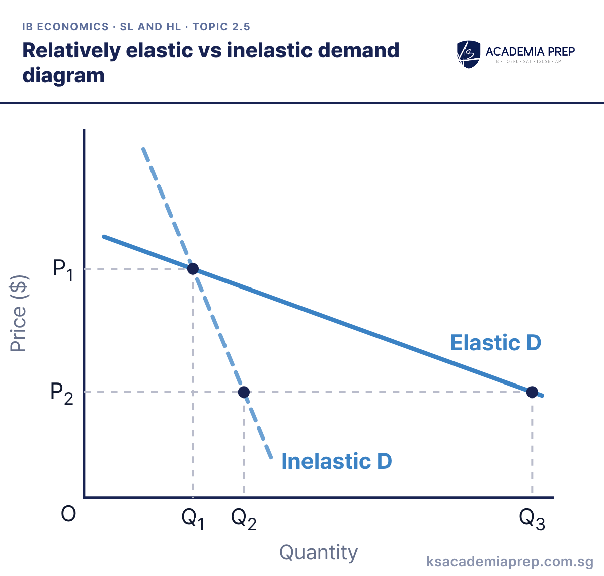
What it shows: Both curves pass through P1, Q1. When price falls to P2, quantity demanded rises only to Q2 on the relatively inelastic curve (PED < 1) but all the way to Q3 on the relatively elastic curve (PED > 1). Goods with few substitutes, necessities and small shares of income tend to have inelastic demand.
How to draw it
Label the vertical axis Price ($) and the horizontal axis Quantity.
Draw a steep curve labelled Inelastic D and a flatter curve labelled Elastic D, both passing through one shared point at P₁ and Q₁.
Draw a dashed line at the lower price P₂ and drop dashed lines to Q₂ on Inelastic D and Q₃ on Elastic D.
Draw both curves through one shared point so the comparison is fair, since slope alone is not elasticity. Paper 2: use it to explain why a tax on cigarettes or petrol raises revenue but barely cuts consumption.
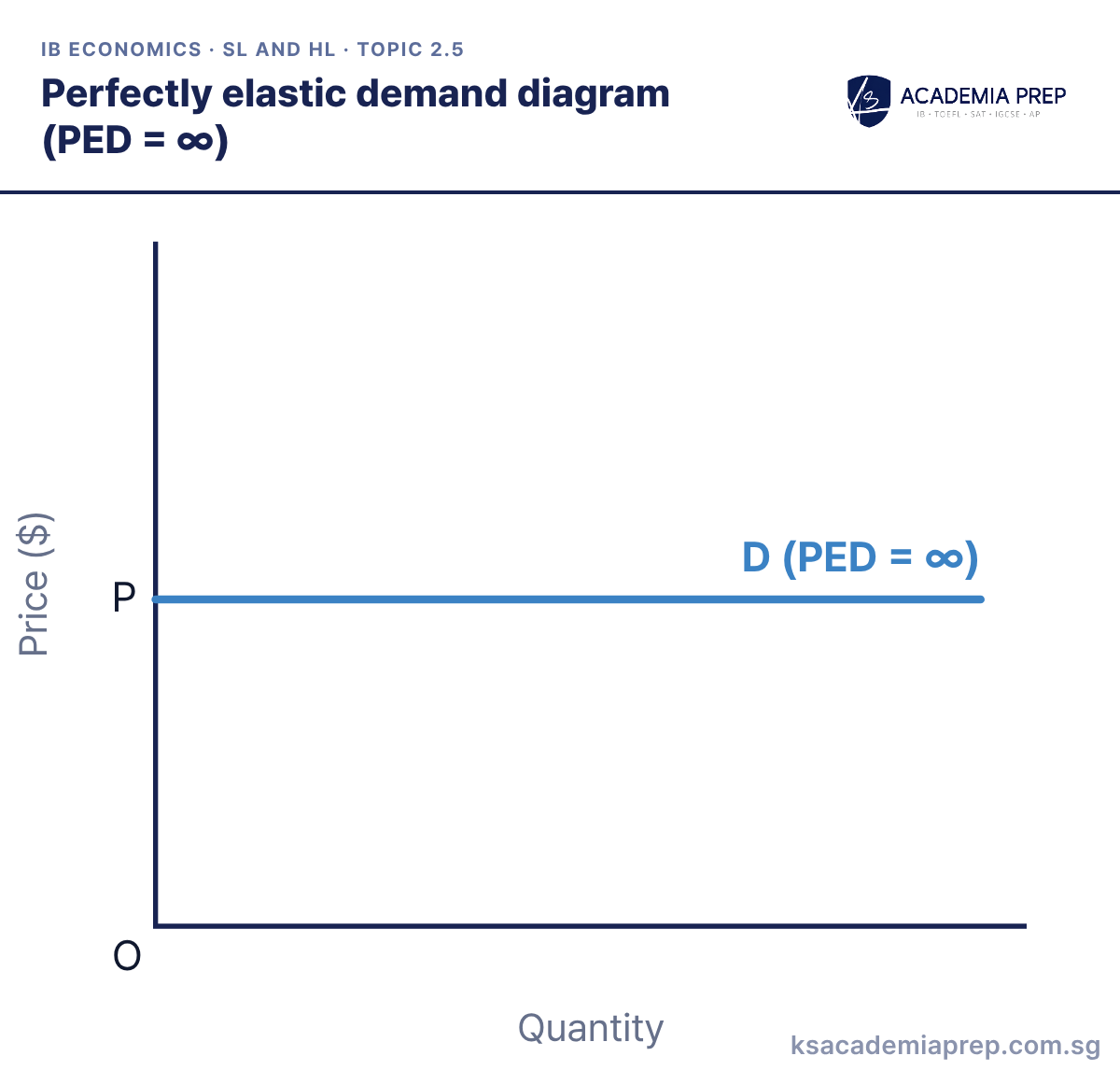
What it shows: Demand is horizontal at P. Consumers will buy any quantity at P, but if the price rises even slightly above P quantity demanded falls to zero. PED is infinite, which is the demand curve facing a single firm in perfect competition.
How to draw it
Label the vertical axis Price ($) and the horizontal axis Quantity, with O at the origin.
Mark P on the price axis and draw a perfectly horizontal line from it.
Label the line D (PED = ∞) so it is not mistaken for a price control. Do not tilt the line.
Keep the line perfectly flat and label it with PED = ∞ so it is not confused with a price control. Paper 1: use it as the theoretical limit when evaluating how close real goods come to it.
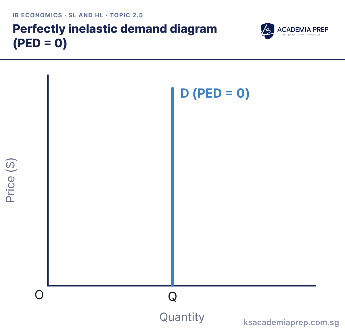
What it shows: Demand is vertical at Q. Whatever happens to the price, quantity demanded stays at Q, so PED is zero. No real good is this extreme, but essential medicines with no substitute come close.
How to draw it
Label the vertical axis Price ($) and the horizontal axis Quantity, with O at the origin.
Mark Q on the quantity axis and draw a perfectly vertical line up from it.
Label the line D (PED = 0). Draw it vertical, not just steep.
Draw the curve vertical, not just steep, and label PED = 0. Paper 1: contrast it with relatively inelastic demand to show that zero is only a theoretical limit.
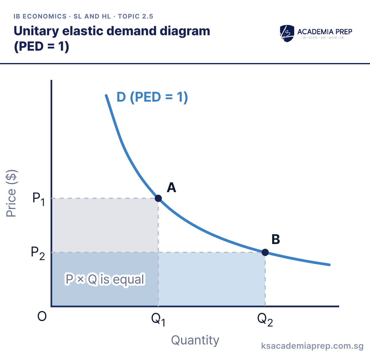
What it shows: The demand curve is a rectangular hyperbola, so every point has the same total revenue. When the price halves from P1 to P2, quantity demanded doubles from Q1 to Q2, and the revenue rectangles at A and B are equal. Because total revenue never changes, PED = 1 at every point on the curve; for a change this large, measure PED at a point rather than with simple percentage changes.
How to draw it
Label the vertical axis Price ($) and the horizontal axis Quantity.
Draw a smooth curve bowed towards the origin that never touches either axis, and label it D (PED = 1).
Mark A at P₁, Q₁ and B at P₂, Q₂ on the curve. Draw both revenue rectangles and label them P × Q is equal.
Draw a smooth curve that never touches either axis, not a straight line. Paper 1: use it to explain why a price change leaves total revenue unchanged when PED = 1.
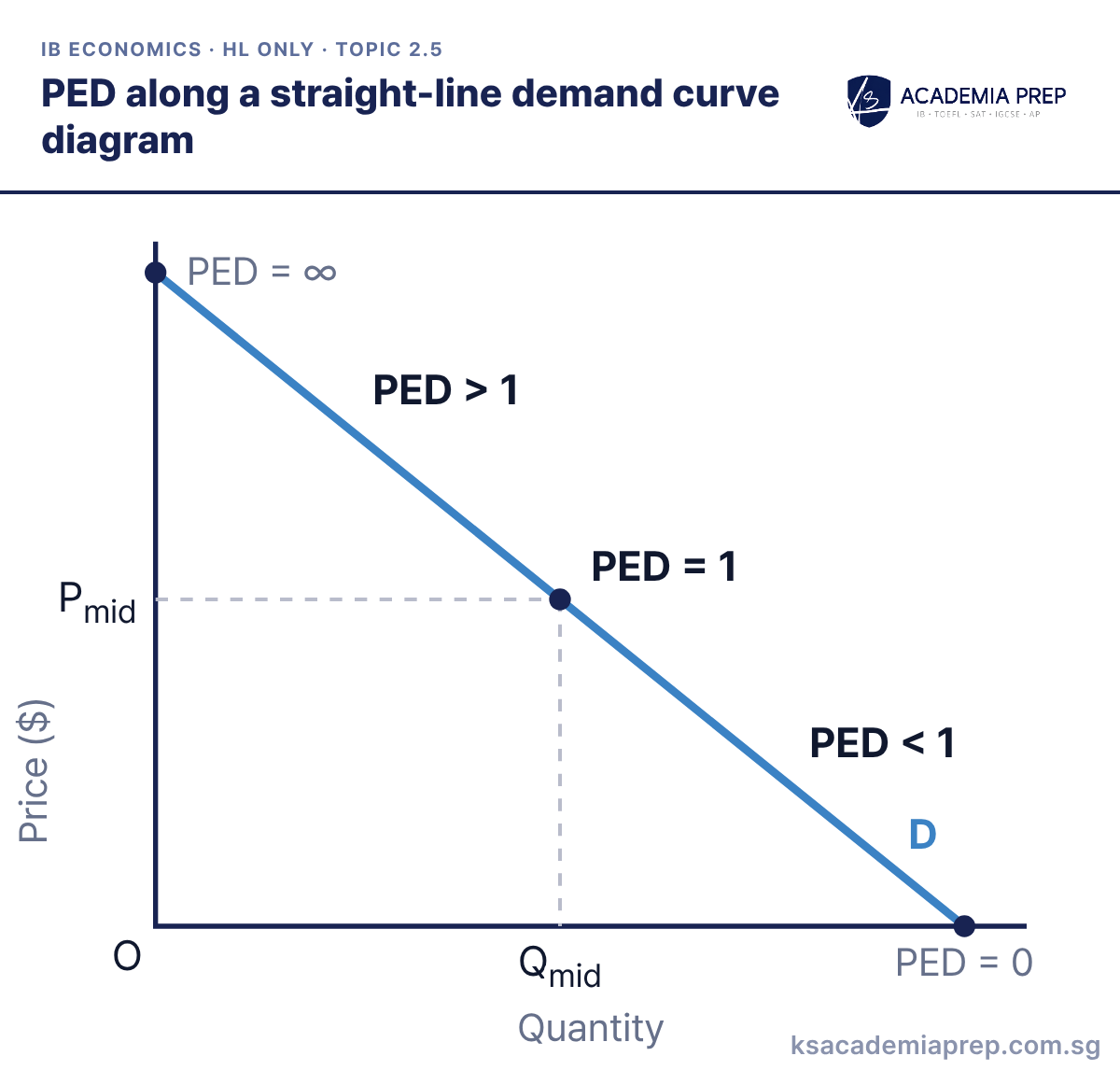
What it shows: A straight-line demand curve has a constant slope but its PED changes at every point. Above the midpoint demand is elastic (PED > 1), at the midpoint Pmid, Qmid it is unit elastic (PED = 1), and below it is inelastic (PED < 1). PED approaches infinity at the price axis and zero at the quantity axis, because P/Q changes while ΔQ/ΔP stays fixed.
How to draw it
Label the vertical axis Price ($) and the horizontal axis Quantity.
Draw a straight downward-sloping line from the price axis to the quantity axis and label it D.
Label the midpoint PED = 1, dashed to Pmid and Qmid. Add PED > 1 above, PED < 1 below, PED = ∞ and PED = 0 at the ends.
Never say a straight-line demand curve has one elasticity just because its slope is constant. Paper 3: calculate PED between two points on the line to show that the value depends on where you measure it.
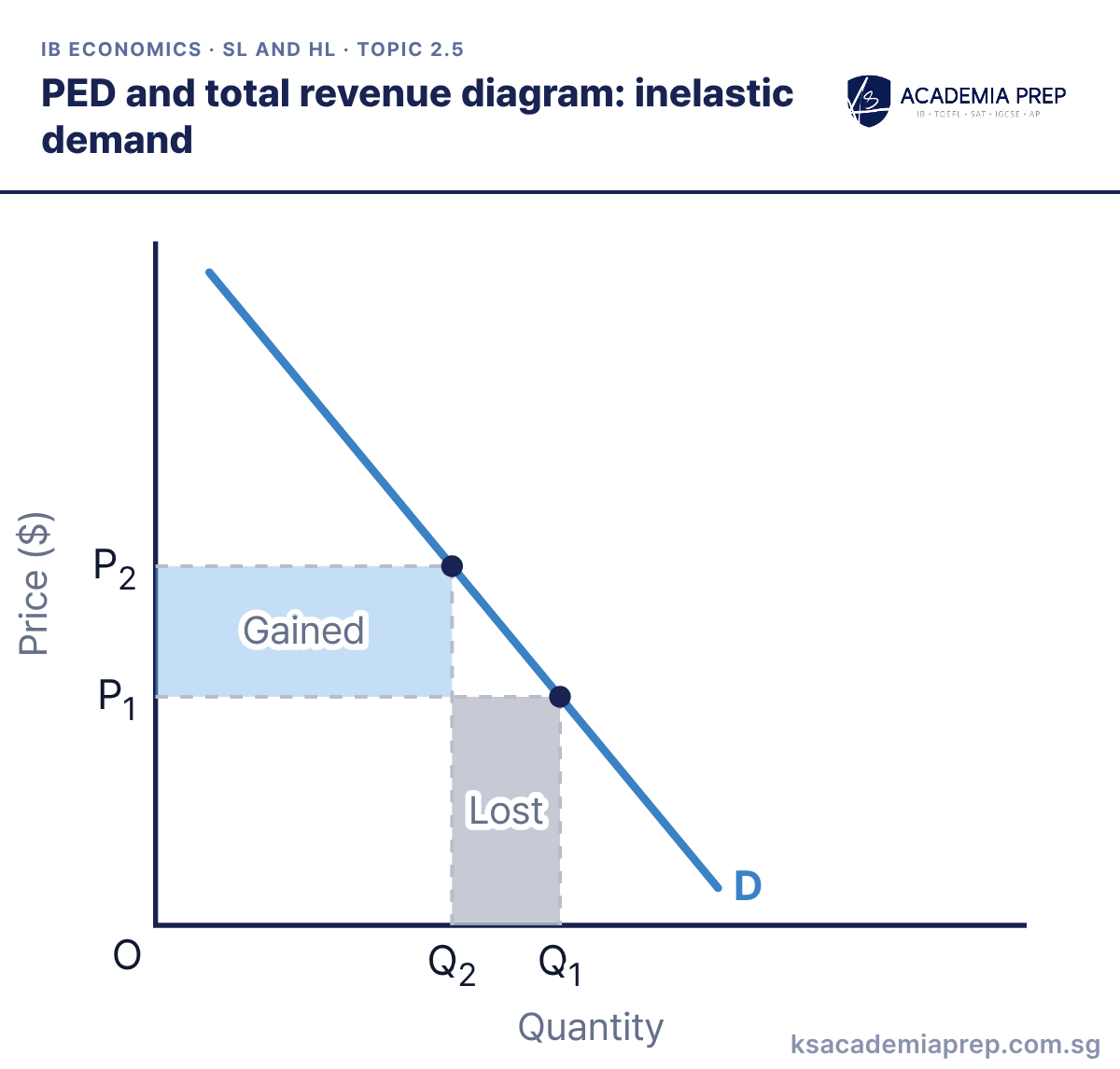
What it shows: Demand is inelastic, so a price rise from P1 to P2 causes a proportionately smaller fall in quantity demanded, from Q1 to Q2. The firm gains the blue rectangle (the higher price on the Q2 units still sold) and loses the grey rectangle (P1 on the units no longer sold). The gain is larger, so total revenue rises.
How to draw it
Label the vertical axis Price ($) and the horizontal axis Quantity. Draw a steep downward-sloping curve labelled D.
Mark P₁, Q₁ and the higher price P₂ with its smaller quantity Q₂ on D, with dashed lines to both axes.
Shade the rectangle between P₁ and P₂ up to Q₂ as Gained, and the rectangle under P₁ between Q₂ and Q₁ as Lost. Gained is larger.
Compare the two rectangles, not the lengths of the price and quantity changes. Paper 3: calculate total revenue before and after (P × Q) and state the change.
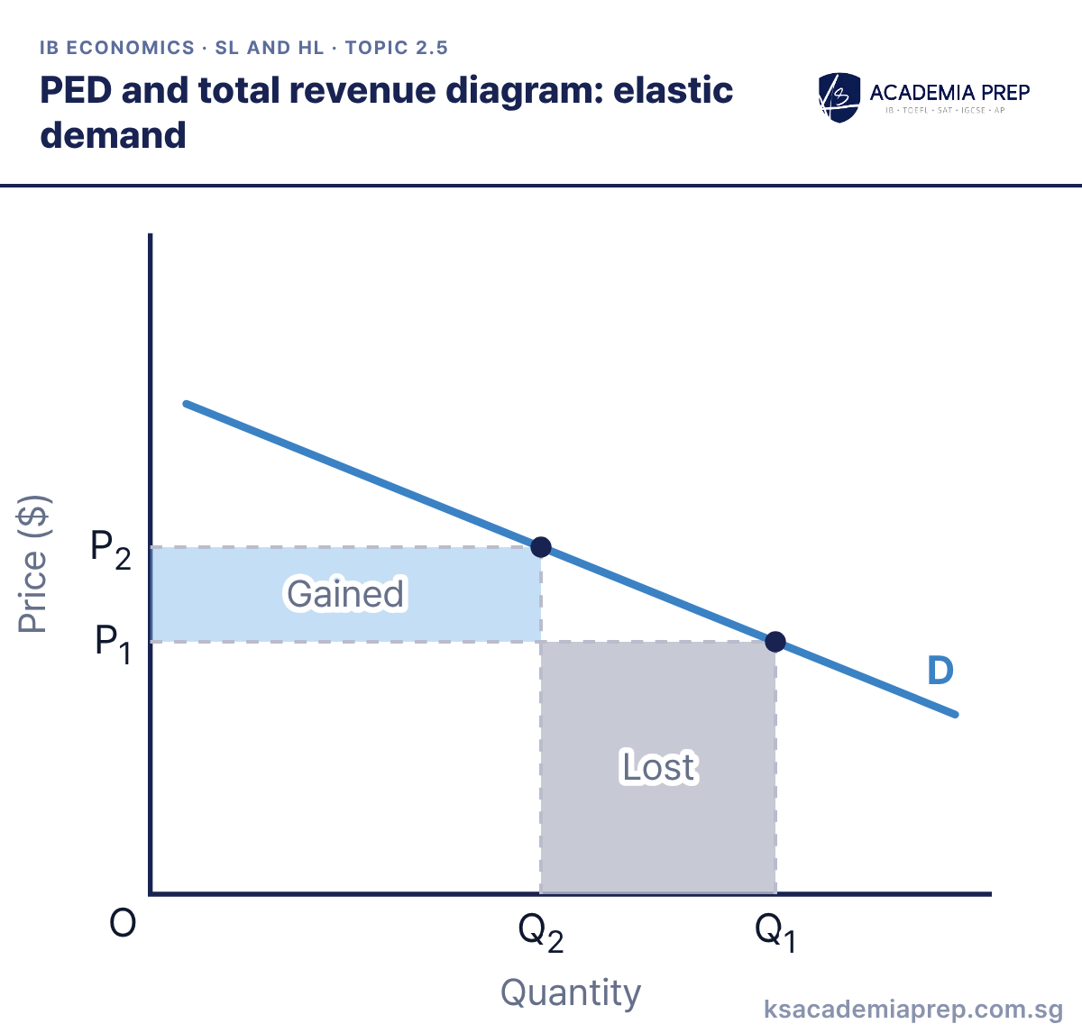
What it shows: Demand is elastic, so a price rise from P1 to P2 causes a proportionately larger fall in quantity demanded, from Q1 to Q2. The revenue lost on units no longer sold (grey) is larger than the revenue gained on units still sold (blue), so total revenue falls. A firm facing elastic demand raises revenue by cutting its price instead.
How to draw it
Label the vertical axis Price ($) and the horizontal axis Quantity. Draw a flat downward-sloping curve labelled D.
Mark P₁, Q₁ and the higher price P₂ with its much smaller quantity Q₂ on D, with dashed lines to both axes.
Shade the rectangle between P₁ and P₂ up to Q₂ as Gained, and the rectangle under P₁ between Q₂ and Q₁ as Lost. Lost is larger.
Shade the two rectangles in different tones and say which is bigger. Paper 3: calculate P1 × Q1 and P2 × Q2 to prove the fall in total revenue.
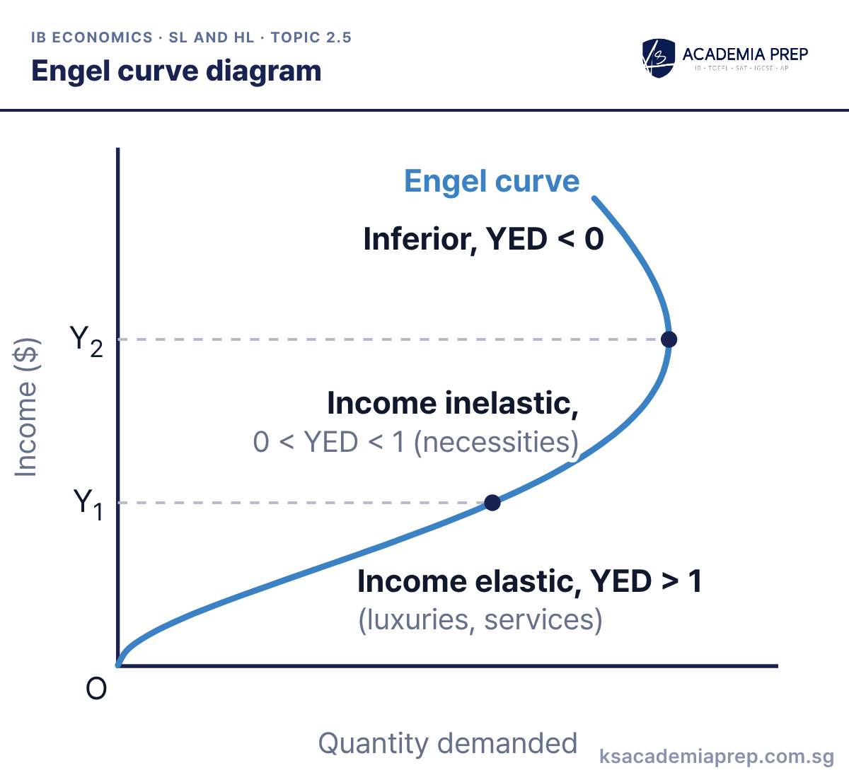
What it shows: The Engel curve shows how quantity demanded changes as income rises. Up to Y1 demand is income elastic (YED > 1), as for luxuries and many services; between Y1 and Y2 it is income inelastic (0 < YED < 1), as for necessities. Above Y2 the curve bends back: the good has become inferior (YED < 0) and people buy less of it as income grows.
How to draw it
Label the vertical axis Income ($) and the horizontal axis Quantity demanded.
Draw the curve rising gently up to Y₁, then steeply up to Y₂, then bending back to the left above Y₂. Label it Engel curve.
Mark Y₁ and Y₂ with dashed lines. Label the sections income elastic (YED > 1), income inelastic (0 < YED < 1) and inferior (YED < 0).
Put income on the vertical axis and quantity demanded on the horizontal axis. Paper 1: use it to show how the same good can change category as incomes rise, and why firms and countries care about YED.
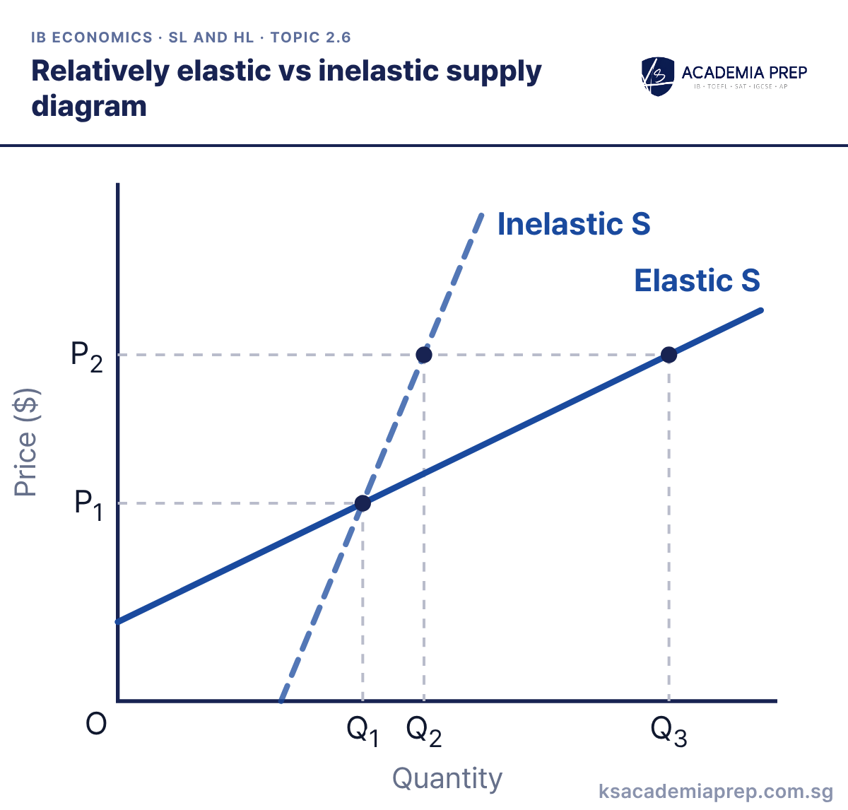
What it shows: Both curves pass through P1, Q1. A price rise to P2 extends quantity supplied only to Q2 on the relatively inelastic curve (PES < 1) but to Q3 on the relatively elastic curve (PES > 1). Spare capacity, large stocks, mobile factors and a longer time period make supply more elastic.
How to draw it
Label the vertical axis Price ($) and the horizontal axis Quantity.
Draw a steep curve labelled Inelastic S and a flatter curve labelled Elastic S, both passing through one shared point at P₁ and Q₁.
Draw a dashed line at the higher price P₂ and drop dashed lines to Q₂ on Inelastic S and Q₃ on Elastic S.
A straight supply curve starting on the price axis always has PES > 1, and one starting on the quantity axis has PES < 1. Paper 2: use it to explain why farm prices swing so much when demand changes.
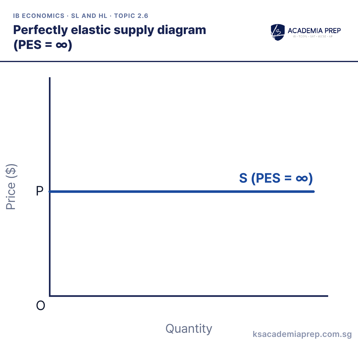
What it shows: Supply is horizontal at P. Firms will supply any quantity at P but nothing at all below it, so PES is infinite. It is a theoretical limit, close to a firm with large spare capacity and constant costs.
How to draw it
Label the vertical axis Price ($) and the horizontal axis Quantity, with O at the origin.
Mark P on the price axis and draw a perfectly horizontal line from it.
Label the line S (PES = ∞) so it is not read as a price floor. Do not tilt the line.
Label it S with PES = ∞ so it is not read as a price floor. Paper 1: use it as the benchmark when evaluating how quickly firms can respond to a price rise.
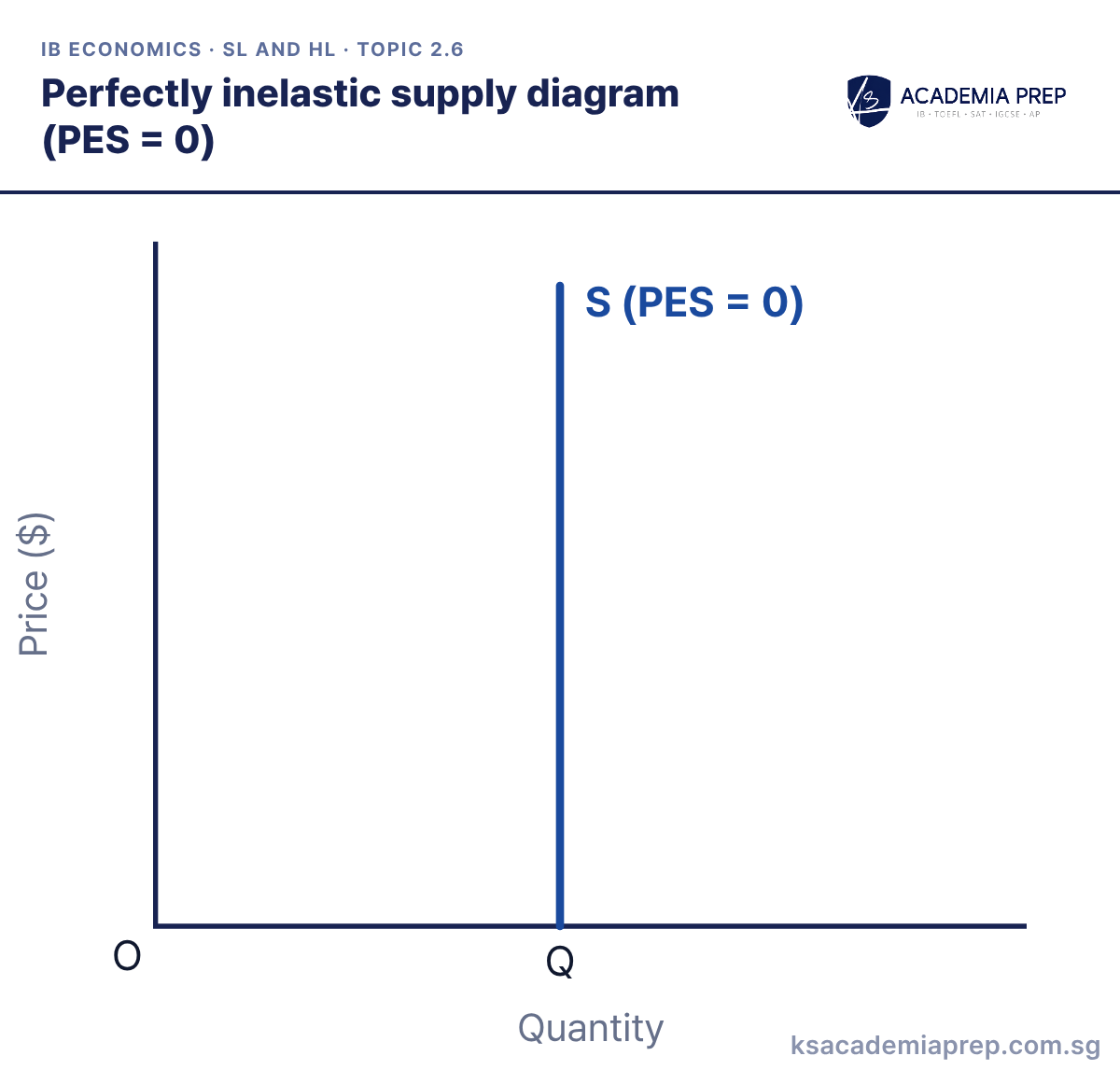
What it shows: Supply is vertical at Q. Whatever the price, quantity supplied cannot change, so PES is zero. Tickets for a stadium on match day or land in a fixed location come close.
How to draw it
Label the vertical axis Price ($) and the horizontal axis Quantity, with O at the origin.
Mark Q on the quantity axis and draw a perfectly vertical line up from it.
Label the line S (PES = 0). Draw it vertical, not just steep.
Draw the curve vertical, not just steep, and label PES = 0. Paper 1: use it to show that in the momentary period price is set entirely by demand.
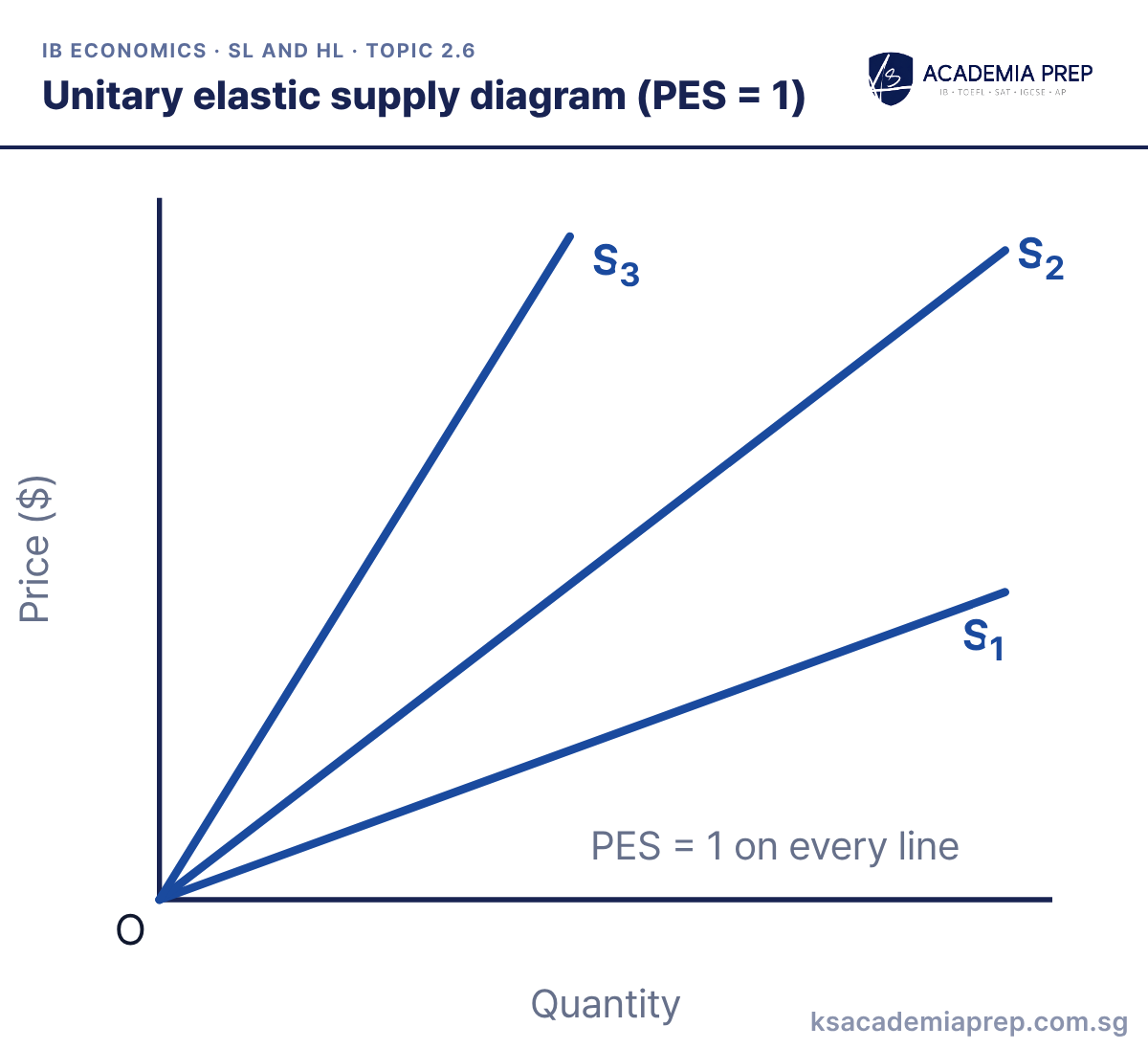
What it shows: Any straight-line supply curve that starts at the origin has PES = 1 at every point, whatever its slope. S1, S2 and S3 have different gradients, but on each one a given percentage rise in price causes the same percentage rise in quantity supplied.
How to draw it
Label the vertical axis Price ($) and the horizontal axis Quantity, with O at the origin.
Draw three straight upward-sloping lines of different slopes, all starting at O, and label them S₁, S₂ and S₃.
Add the label PES = 1 on every line. Start each line exactly at the origin, not on either axis.
Slope is not elasticity: a steep line through the origin is just as unit elastic as a flat one. Paper 1: use it when explaining why PES depends on where the curve meets the axes.
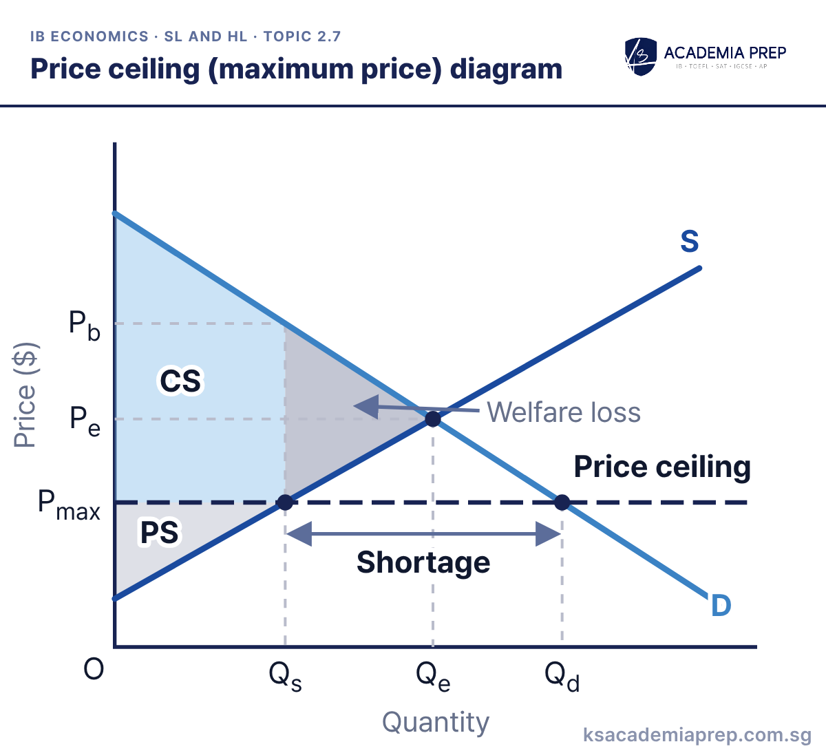
What it shows: The government sets a maximum price Pmax below Pe. Quantity supplied contracts to Qs while quantity demanded extends to Qd, so there is a shortage of QsQd. Consumers who still buy gain the area between Pe and Pmax from producers, but output falls from Qe to Qs. Producer surplus (PS) shrinks, consumer surplus (CS) may rise or fall, and the grey triangle is the welfare loss. Pb is the price some buyers would pay on a parallel market.
How to draw it
Label the vertical axis Price ($) and the horizontal axis Quantity. Draw D and S and mark Pe and Qe.
Draw a horizontal line at Pmax below Pe and label it Price ceiling. Read off Qs on S and Qd on D and label the gap Shortage.
Draw a dashed line up from Qs to D and across to Pb. Shade CS, PS and the Welfare loss triangle between Qs and Qe. Do not shift either curve.
Draw the ceiling below equilibrium; a ceiling above Pe has no effect. Paper 3: calculate the shortage (Qd − Qs) and the welfare loss as ½ × (Qe − Qs) × (Pb − Pmax).
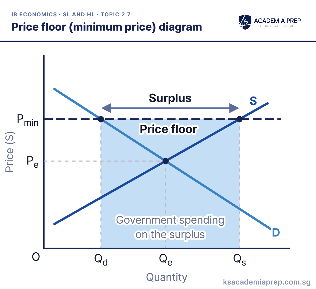
What it shows: The government sets a minimum price Pmin above Pe, often to support farmers’ incomes. Quantity supplied extends to Qs while quantity demanded contracts to Qd, leaving a surplus of QdQs. To keep the price at Pmin the government buys the surplus, and the shaded rectangle is what that costs it.
How to draw it
Label the axes Price ($) and Quantity, then draw D and S and mark Pe and Qe.
Draw a horizontal line above Pe, label it Price floor and Pmin, and read off Qd on D and Qs on S.
Label the gap from Qd to Qs as the Surplus, and shade the rectangle between Qd and Qs from Pmin down to the quantity axis as government spending. Do not shift either curve.
The government spending rectangle runs from Qd to Qs and all the way down to the quantity axis. Paper 3: calculate the cost as Pmin × (Qs − Qd).
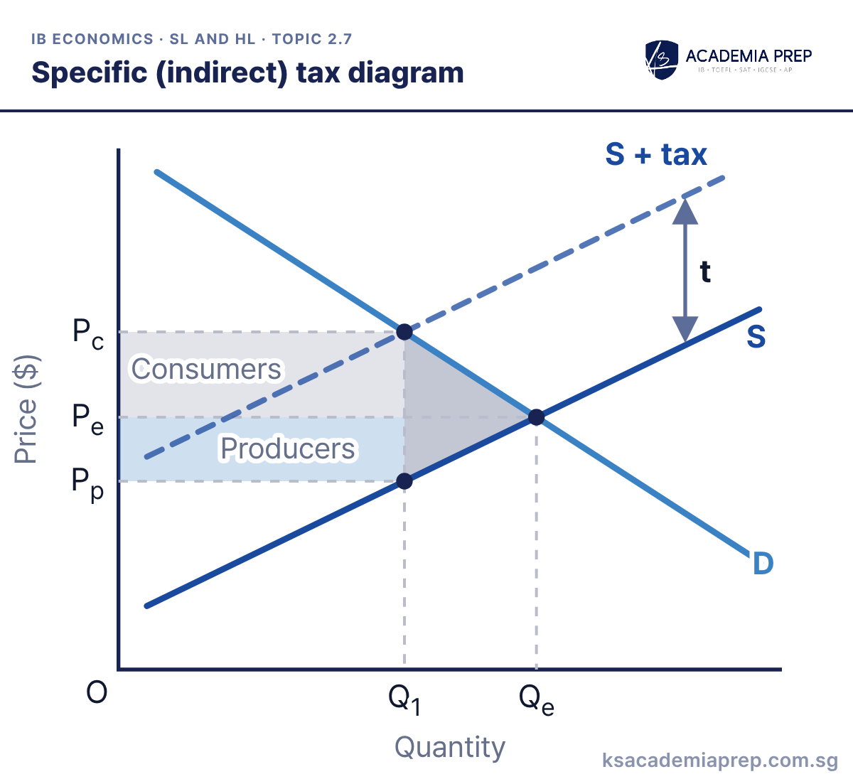
What it shows: A specific tax of t per unit shifts supply up parallel to S + tax. Output falls from Qe to Q1, consumers now pay Pc and producers keep Pp = Pc − t. Tax revenue is the whole rectangle t × Q1: the upper part (Pc − Pe) × Q1 is the consumer incidence and the lower part (Pe − Pp) × Q1 is the producer incidence. The grey triangle is the welfare loss.
How to draw it
Label the axes Price ($) and Quantity, draw D and S, and mark the first equilibrium at Pe and Qe.
Draw S + tax parallel to and above S, and label the vertical gap between them t, the tax per unit.
Mark Q₁ where S + tax meets D, read Pc off D and Pp off S, then shade the consumer and producer shares and the welfare loss.
The price consumers pay rises by less than the tax unless demand is perfectly inelastic or supply is perfectly elastic. Paper 3: calculate revenue as t × Q1, then split it into the consumer and producer shares.
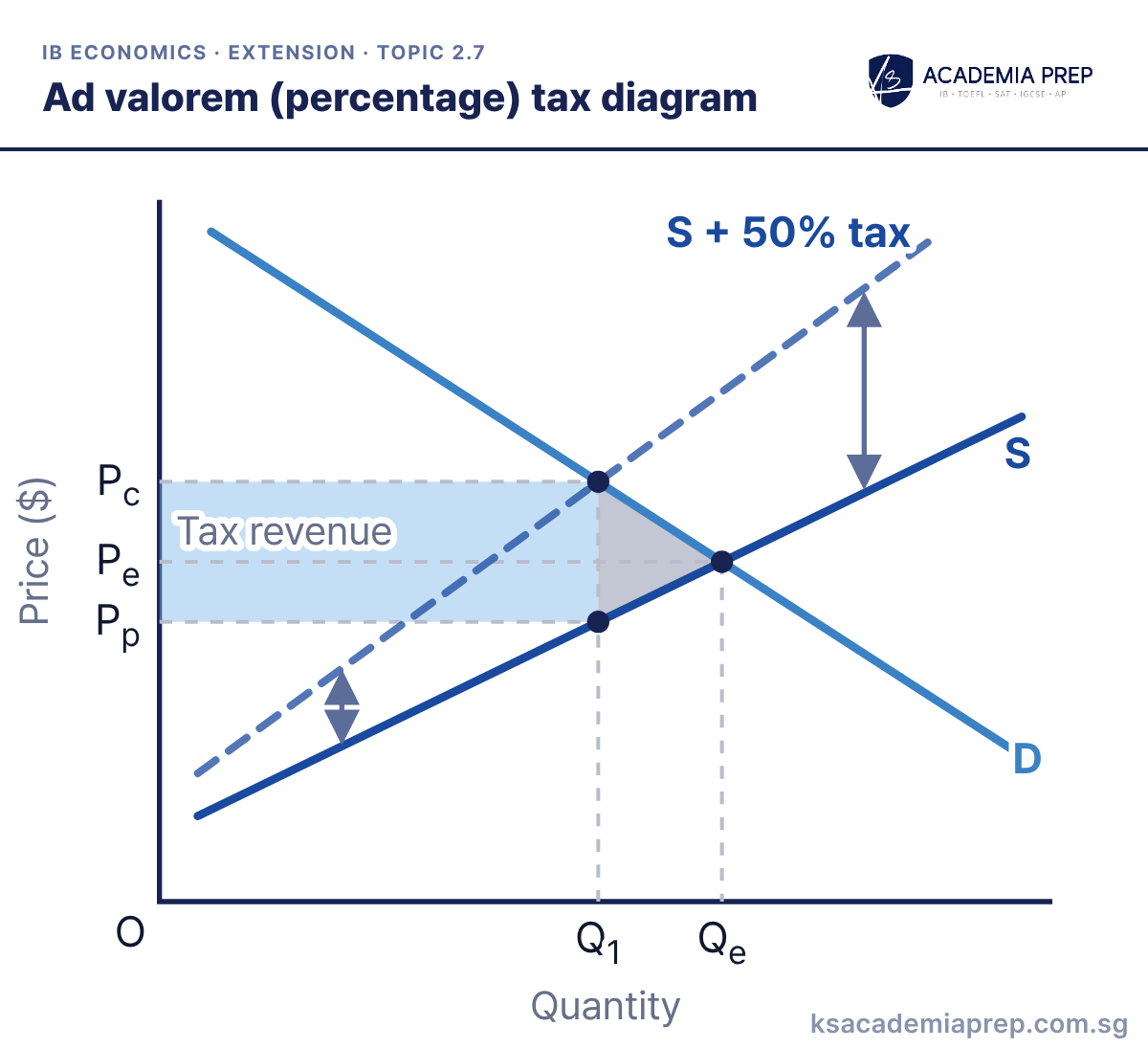
What it shows: An ad valorem tax is a percentage of the price, so the tax per unit is larger at higher prices. Supply pivots upwards rather than shifting parallel, and the gap between S and S + 50% tax widens as output rises. Output falls from Qe to Q1, consumers pay Pc, producers keep Pp, and the government collects the shaded tax revenue, with a grey welfare loss.
How to draw it
Label the axes Price ($) and Quantity, draw D and S, and mark Pe and Qe.
Draw S + 50% tax pivoting upwards from S, steeper than S, so the vertical gap widens as price rises.
Mark Q₁ where S + 50% tax meets D, read off Pc and Pp, and shade the tax revenue and welfare loss. Do not draw a parallel shift.
Draw S + tax steeper than S so the vertical gap widens as price rises; a parallel shift would be a specific tax. Paper 1: use it to discuss GST, which Singapore levies as a percentage of the price.
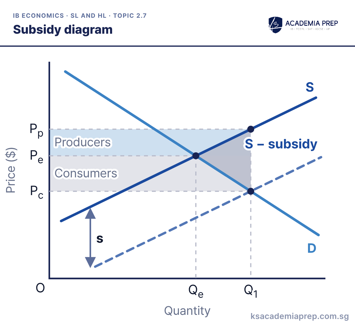
What it shows: A subsidy of s per unit shifts supply down to S − subsidy. Output rises from Qe to Q1, consumers pay Pc and producers receive Pp = Pc + s. Government spending is s × Q1, the rectangle from Pc to Pp. Consumers gain the lower part and producers the upper part. The grey triangle is the welfare loss from producing units whose cost is above their benefit.
How to draw it
Label the axes Price ($) and Quantity, draw D and S, and mark Pe and Qe.
Draw S − subsidy parallel to and below S, and label the vertical gap between them s, the subsidy per unit.
Mark Q₁ where S − subsidy meets D, read Pc off D and Pp off S, and shade the government spending rectangle from Pc to Pp.
The price consumers pay falls by less than the subsidy, so draw Pc less than s below Pe. Paper 3: calculate government spending as s × Q1 and the welfare loss as a triangle.
Best for: Paper 3 (HL)Paper 2IA
2.8 Market failure: externalities and common pool resources
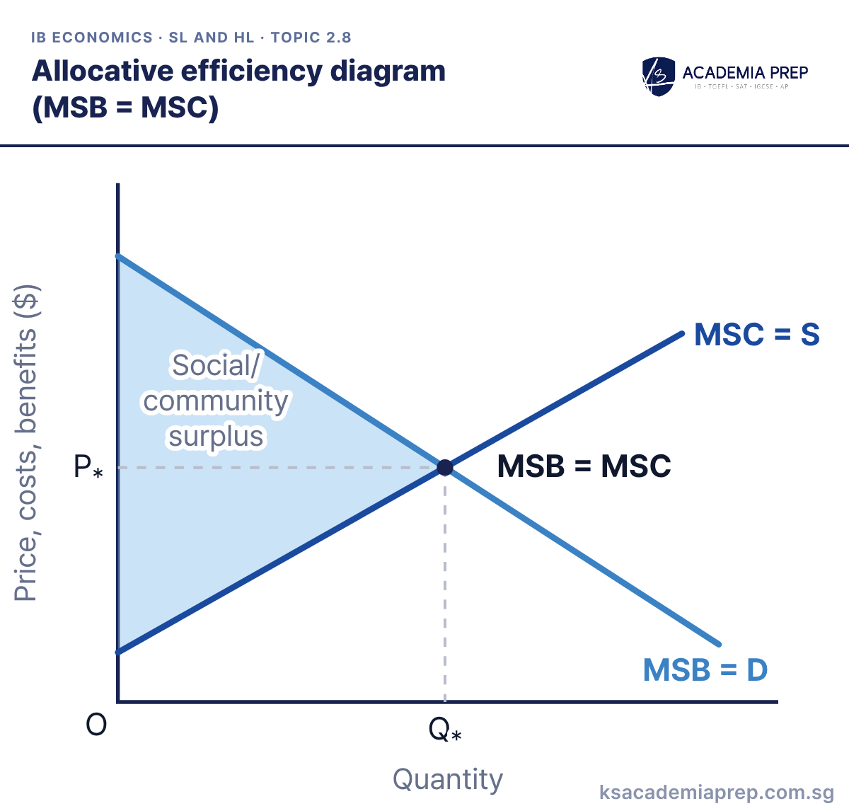
What it shows: With no externalities, marginal private and marginal social curves are the same, so the market settles at Q* where MSB = MSC. At Q* the shaded social/community surplus, the gap between MSB and MSC summed over every unit, is as large as it can be. Producing less than Q* or more than Q* would shrink it.
How to draw it
Label the axes Price, costs, benefits ($) and Quantity.
Draw a downward-sloping MSB = D and an upward-sloping MSC = S, and label both.
Mark the point MSB = MSC with dashed lines to P* and Q*, then shade the social/community surplus between the curves up to Q*.
Say “MSB = MSC” rather than just “demand = supply” so the examiner sees you link equilibrium to allocative efficiency. Paper 1: use it as the benchmark before you draw any market failure diagram.
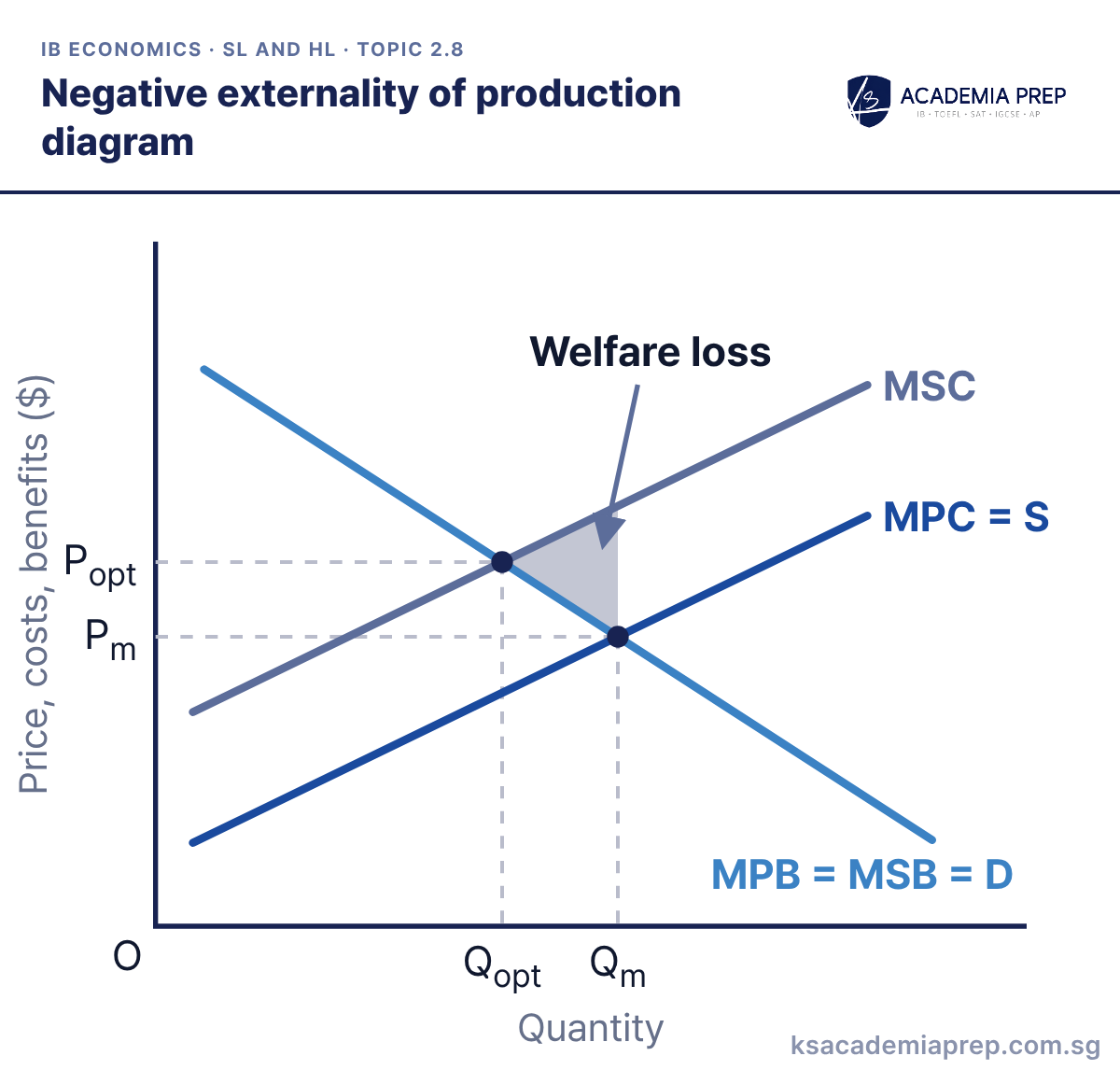
What it shows: Production creates an external cost, so marginal social cost (MSC) lies above marginal private cost (MPC). The market produces Qm where MPC = MPB, but the socially optimum output is Qopt where MSC = MSB. The shaded triangle is the welfare loss from overproduction.
How to draw it
Label the axes Price, costs, benefits ($) and Quantity.
Draw MPB = MSB = D sloping down, MPC = S sloping up, and MSC above MPC.
Mark Pm and Qm where MPC = S meets D, and Popt and Qopt where MSC meets D. Shade the welfare loss triangle between Qopt and Qm.
The welfare loss triangle sits between MSC and MSB, from Qopt to Qm, with its point at Qopt. Paper 2: this is the diagram behind most pollution and carbon questions.
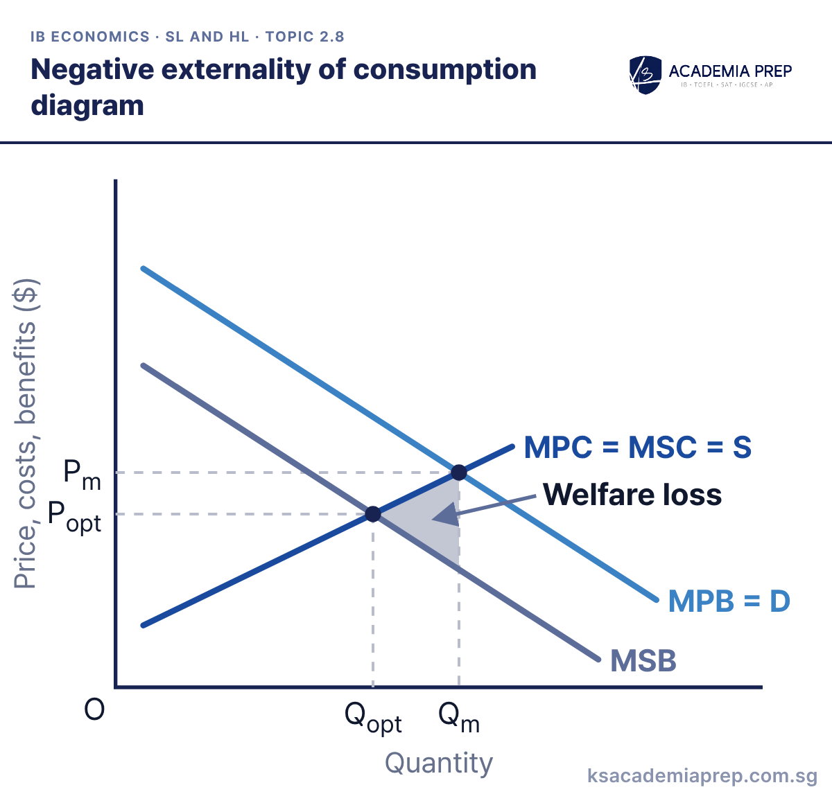
What it shows: Consuming the good harms third parties, so marginal social benefit (MSB) lies below marginal private benefit (MPB), while MPC = MSC. Consumers buy Qm at Pm, but the socially optimum output is Qopt where MSB = MSC. The shaded triangle is the welfare loss from overconsumption.
How to draw it
Label the axes Price, costs, benefits ($) and Quantity.
Draw MPB = D sloping down, MSB below it, and MPC = MSC = S sloping up.
Mark Pm and Qm where MPB = D meets S, and Popt and Qopt where MSB meets S. Shade the welfare loss triangle between Qopt and Qm.
Shift the benefit curve, not the cost curve: the external cost comes from consumers, so MSB sits below MPB. Paper 2: this is the standard diagram for demerit goods such as cigarettes, alcohol and sugary drinks.
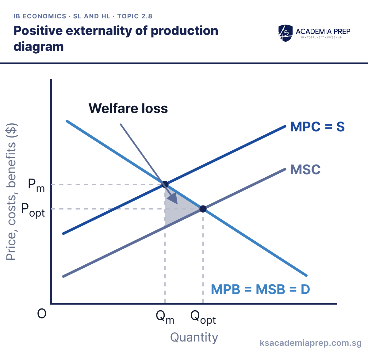
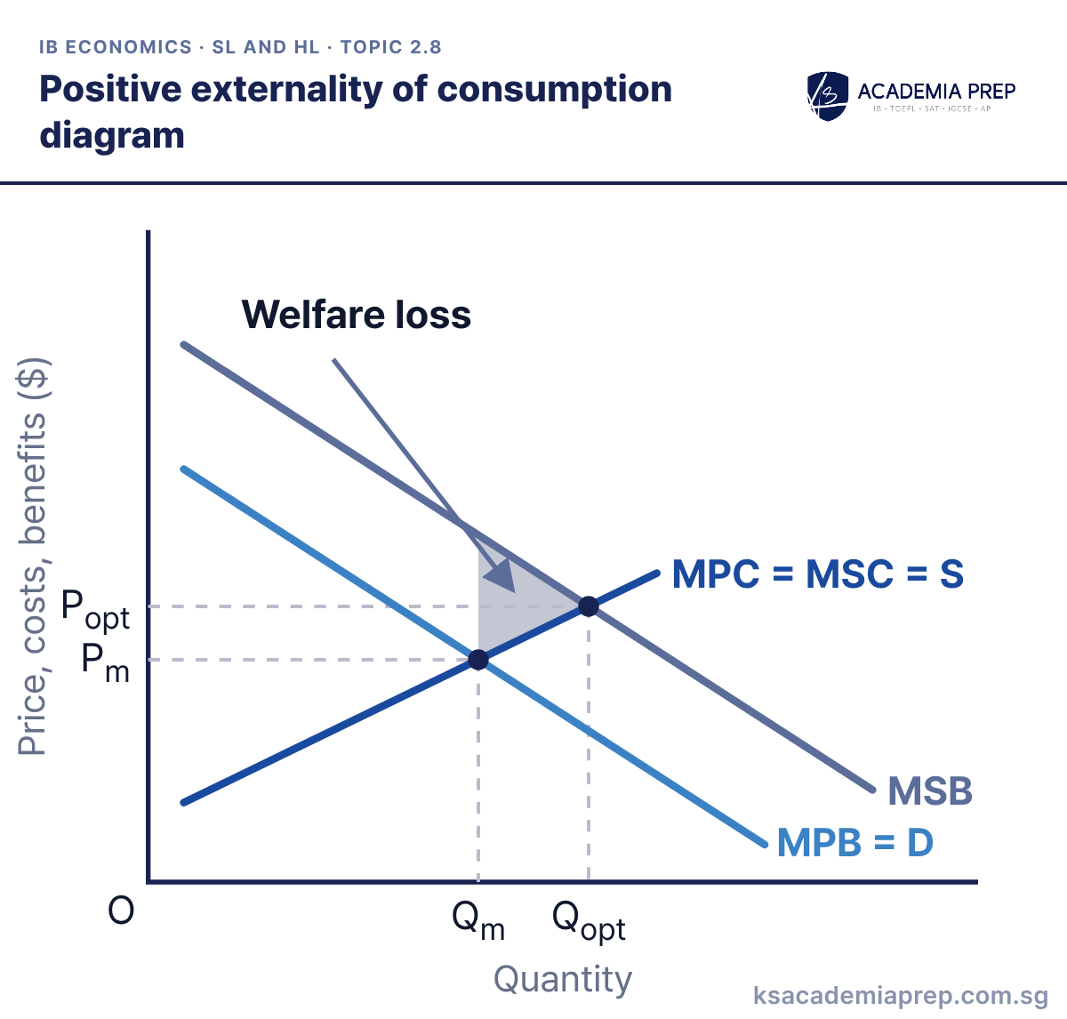
What it shows: Production creates an external benefit, such as firms training workers who later move on, so MSC lies below MPC while MPB = MSB. The market produces Qm where MPC = MPB, less than the socially optimum Qopt where MSC = MSB. The shaded triangle is the welfare loss from underproduction.
How to draw it
Label the axes Price, costs, benefits ($) and Quantity.
Draw MPB = MSB = D sloping down, MPC = S sloping up, and MSC below MPC.
Mark Pm and Qm where MPC = S meets D, and Popt and Qopt where MSC meets D. Shade the welfare loss triangle between Qm and Qopt.
The welfare loss triangle points right, towards Qopt, because the market produces too little. Paper 1: pair it with a subsidy to producers or government provision as the policy response.
What it shows: Consuming merit goods such as education or vaccinations benefits third parties, so MSB lies above MPB while MPC = MSC. Consumers only buy Qm at Pm, below the socially optimum Qopt where MSB = MSC. The shaded triangle is the welfare loss from underconsumption.
How to draw it
Label the axes Price, costs, benefits ($) and Quantity.
Draw MPB = D sloping down, MSB parallel above it, and MPC = MSC = S sloping up.
Mark Pm and Qm where MPB = D meets S, and Popt and Qopt where MSB meets S. Shade the welfare loss triangle between Qm and Qopt.
Keep MPB labelled as demand and draw MSB parallel above it, not pivoting from the axis. Paper 2: this is the diagram behind most education, healthcare and vaccination questions.
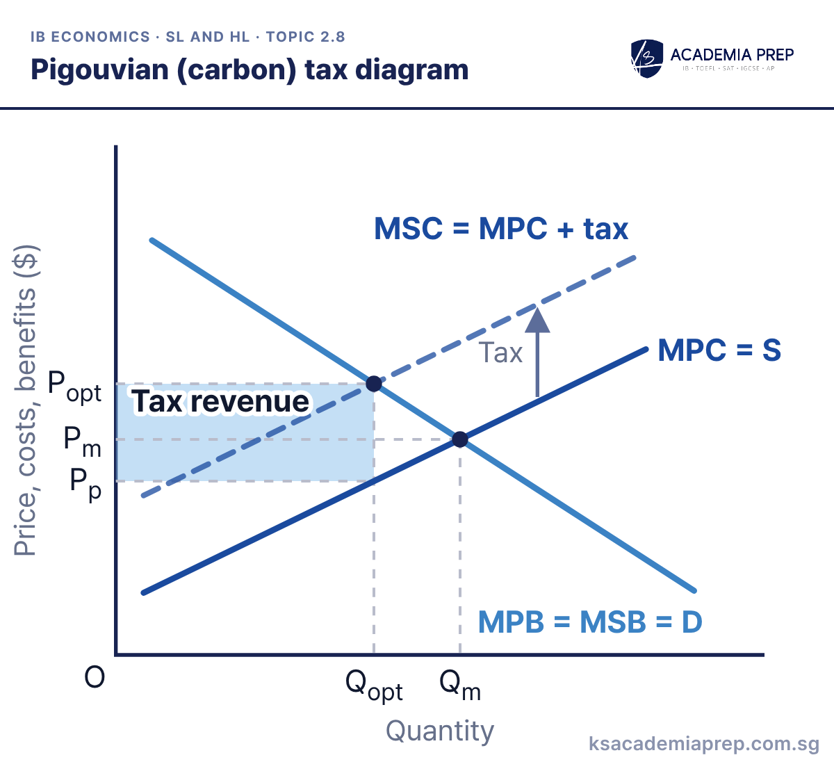
What it shows: A per-unit tax equal to the external cost shifts MPC up until it lies on MSC, so firms now pay for the pollution they cause. Output falls from Qm to Qopt, consumers pay Popt and producers keep Pp. A carbon tax works the same way, taxing each tonne of carbon emitted, and the shaded rectangle is government tax revenue.
How to draw it
Label the axes Price, costs, benefits ($) and Quantity.
Draw MPB = MSB = D and MPC = S, then MSC = MPC + tax above MPC, labelling the vertical gap Tax.
Mark Pm and Qm at the old equilibrium and Popt and Qopt at the new one. Read Pp off MPC = S at Qopt and shade the tax revenue.
Make the vertical gap between MPC and the new curve equal to the external cost, so the new curve lands exactly on MSC. Paper 3: tax revenue is (Popt − Pp) × Qopt.
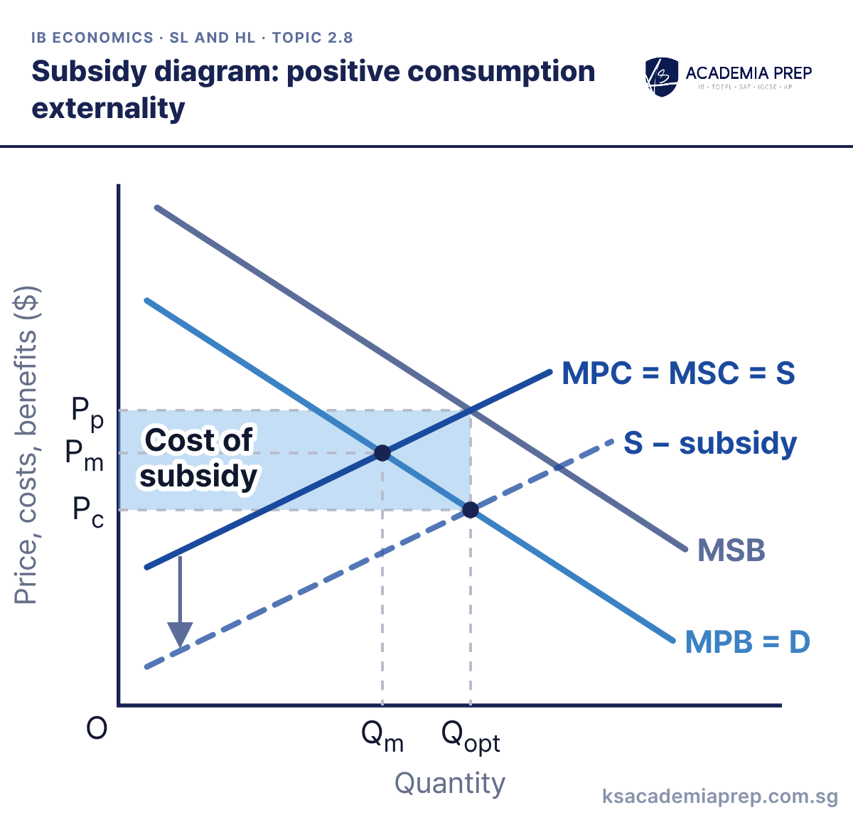
What it shows: A per-unit subsidy equal to the external benefit shifts supply down to S − subsidy, so the merit good becomes cheaper to buy. Consumers now pay Pc, producers receive Pp, and output rises from Qm to Qopt where MSB = MSC. The shaded rectangle is the cost of the subsidy to the government.
How to draw it
Label the axes Price, costs, benefits ($) and Quantity.
Draw MPB = D, MSB parallel above it, MPC = MSC = S, and S − subsidy below S by the gap between MSB and MPB.
Mark Pm and Qm, then Qopt where S − subsidy meets MPB = D. Read Pc off MPB = D and Pp off S, and shade the cost of subsidy.
Shift supply down by exactly the vertical gap between MSB and MPB, so the new equilibrium lands on Qopt. Paper 3: the cost to the government is (Pp − Pc) × Qopt, and there is an opportunity cost to that spending.
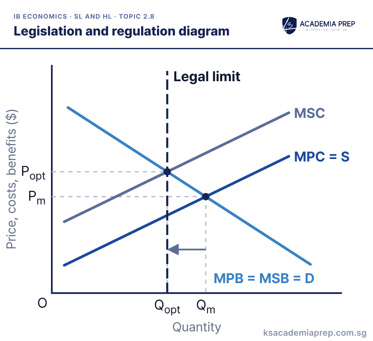
What it shows: The government sets a legal limit, such as an emissions cap or production quota, at Qopt where MSC = MSB. Firms can no longer produce the market output Qm, so output falls to Qopt and the welfare loss from overproduction is removed. An outright ban would move output to zero, which only makes sense if the external cost is very high.
How to draw it
Label the axes Price, costs, benefits ($) and Quantity.
Draw MPB = MSB = D, MPC = S and MSC above MPC, and mark Pm and Qm where MPC = S meets D.
Draw a vertical line at Qopt, where MSC meets D, and label it Legal limit. Mark Popt and show output falling from Qm to Qopt.
Evaluate: regulation is simple and certain, but the government must know where Qopt is and pay to monitor firms. Paper 1: compare it with a Pigouvian tax, which raises revenue and gives firms an incentive to cut pollution further.
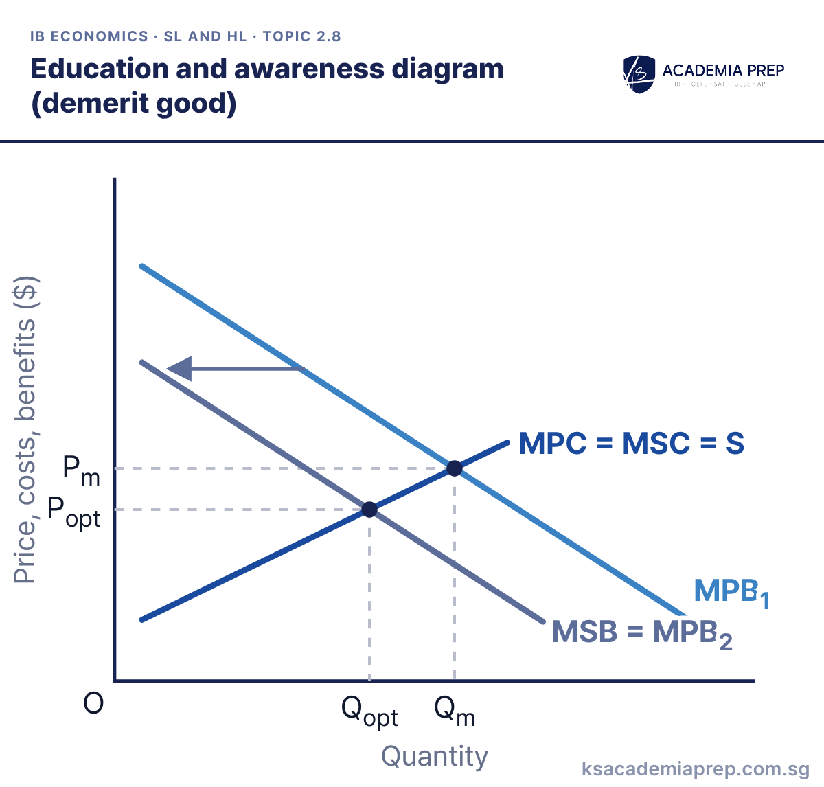
What it shows: This card shows a demerit good such as cigarettes. Consumers overvalue it, so they buy Qm where MPB1 = MPC. Education and awareness campaigns shift MPB1 left towards MSB, and if they fully correct the information failure, MPB2 = MSB and consumption falls to Qopt. For a merit good the same policy shifts MPB right towards MSB.
How to draw it
Label the axes Price, costs, benefits ($) and Quantity.
Draw MPC = MSC = S sloping up and MPB₁ sloping down, and mark Pm and Qm where they cross.
Draw MSB = MPB₂ to the left of MPB₁ with an arrow showing the shift, then mark Popt and Qopt. Do not shift the supply curve.
Label the shifted curve MPB2, not MSB alone, to show it is consumer behaviour that changes. Paper 1: evaluate that campaigns are slow, cost government money, and rarely shift MPB all the way to MSB.
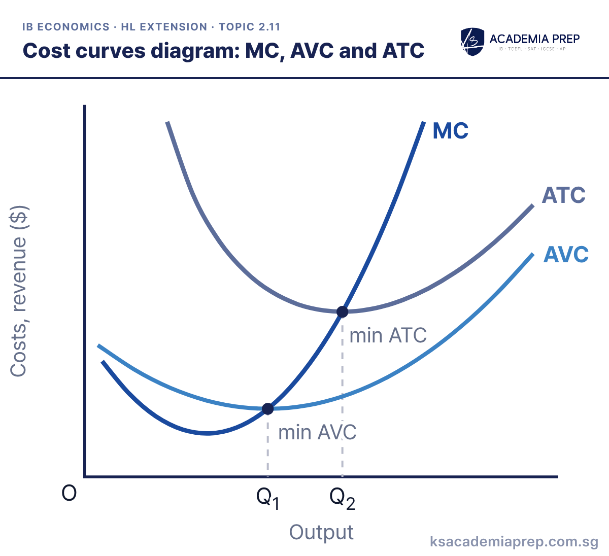
What it shows: Marginal cost falls then rises because of diminishing marginal returns, and it cuts AVC at its minimum (Q1) and ATC at its minimum (Q2). The gap between ATC and AVC is average fixed cost, which shrinks as output rises, so the minimum of ATC lies to the right of the minimum of AVC.
How to draw it
Label the axes Costs, revenue ($) and Output.
Draw U-shaped AVC and ATC, with ATC above AVC and the gap narrowing as output rises, then draw MC falling then rising.
Make MC cut AVC at min AVC (Q₁) and ATC at min ATC (Q₂), so Q₂ lies to the right of Q₁.
The most common error is letting MC cross ATC or AVC away from their lowest points. Paper 1: draw this carefully first, because every market structure diagram is built on it.
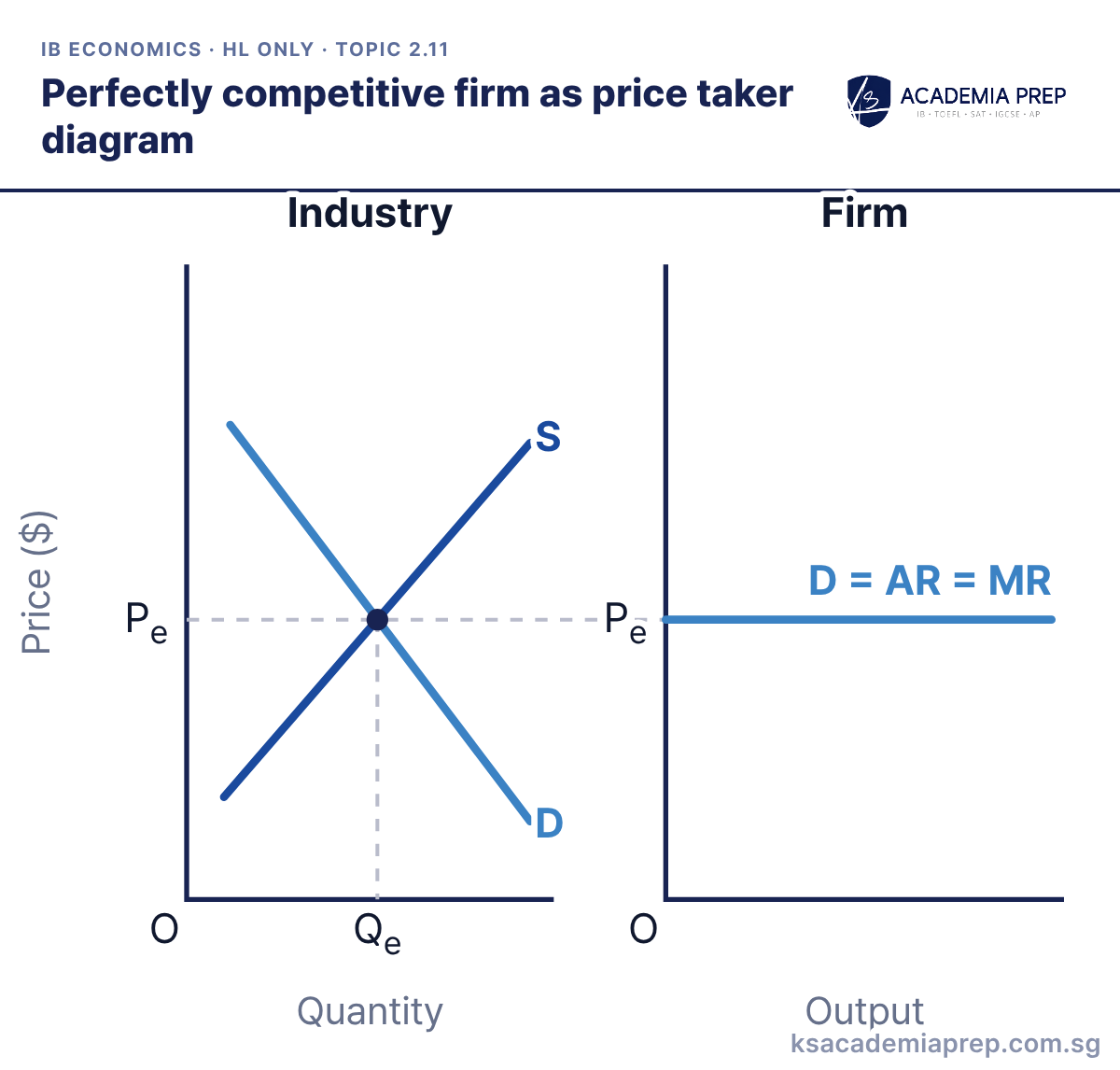
What it shows: Industry demand and supply set the market price Pe. Each firm is so small that it can sell any output at Pe, so it faces a perfectly elastic demand curve where P = D = AR = MR. If it charged more it would sell nothing, and it has no reason to charge less.
How to draw it
Draw two panels side by side: Industry with axes Price ($) and Quantity, and Firm with axes Price ($) and Output.
In the Industry panel draw D and S, and mark Pe and Qe where they cross.
Extend a horizontal dashed line from Pe into the Firm panel and label the firm's demand curve D = AR = MR.
Draw the two panels side by side with the price line running straight across, and label the firm’s axis with output, not quantity. Paper 1: start every perfect competition answer from this diagram.
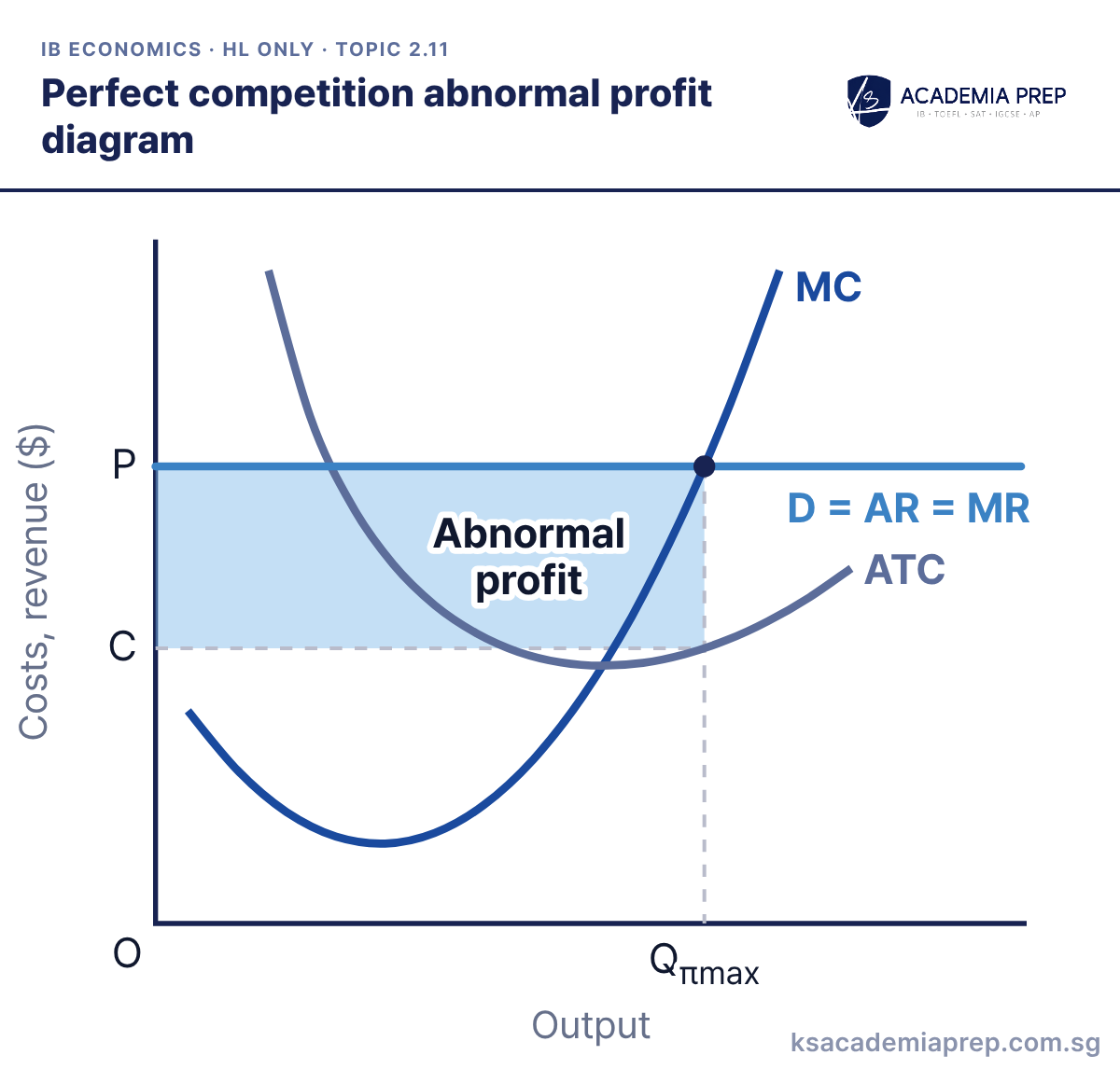
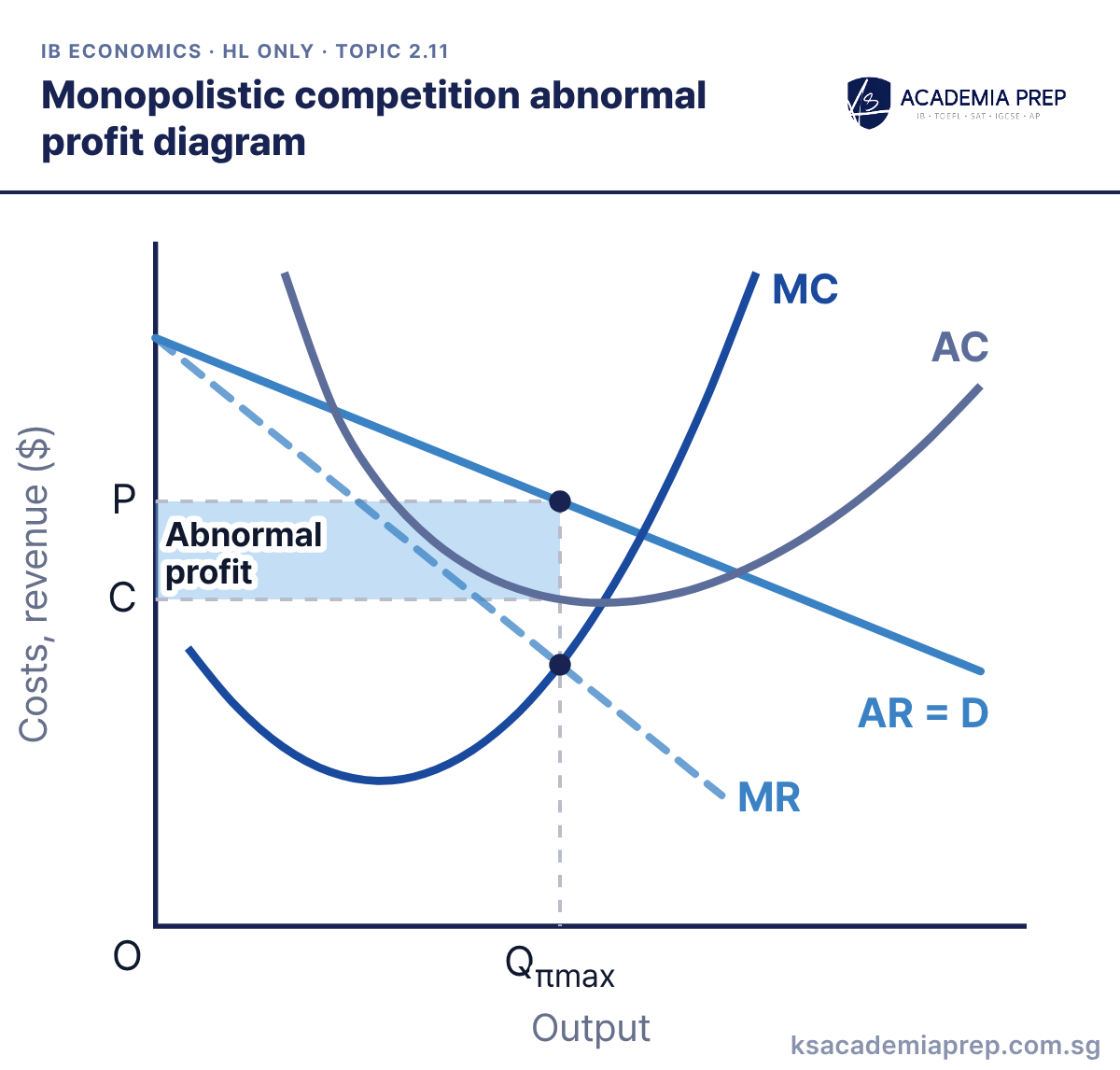
What it shows: The firm produces Qπmax where MC = MR (= P). Price P is above average total cost C, so it earns abnormal profit, the shaded rectangle. Because there are no barriers to entry, new firms join, industry supply rises and price falls until only normal profit is left.
How to draw it
Label the axes Costs, revenue ($) and Output.
Draw a U-shaped ATC, MC cutting ATC at its minimum, and a horizontal D = AR = MR at P above minimum ATC.
Mark Qπmax where MC cuts D = AR = MR on its rising section, read C off ATC, and shade the abnormal profit between P and C.
Put the firm’s output where MC cuts the price line on its rising section, not where it cuts ATC. Paper 3: abnormal profit is (P − C) × Qπmax.
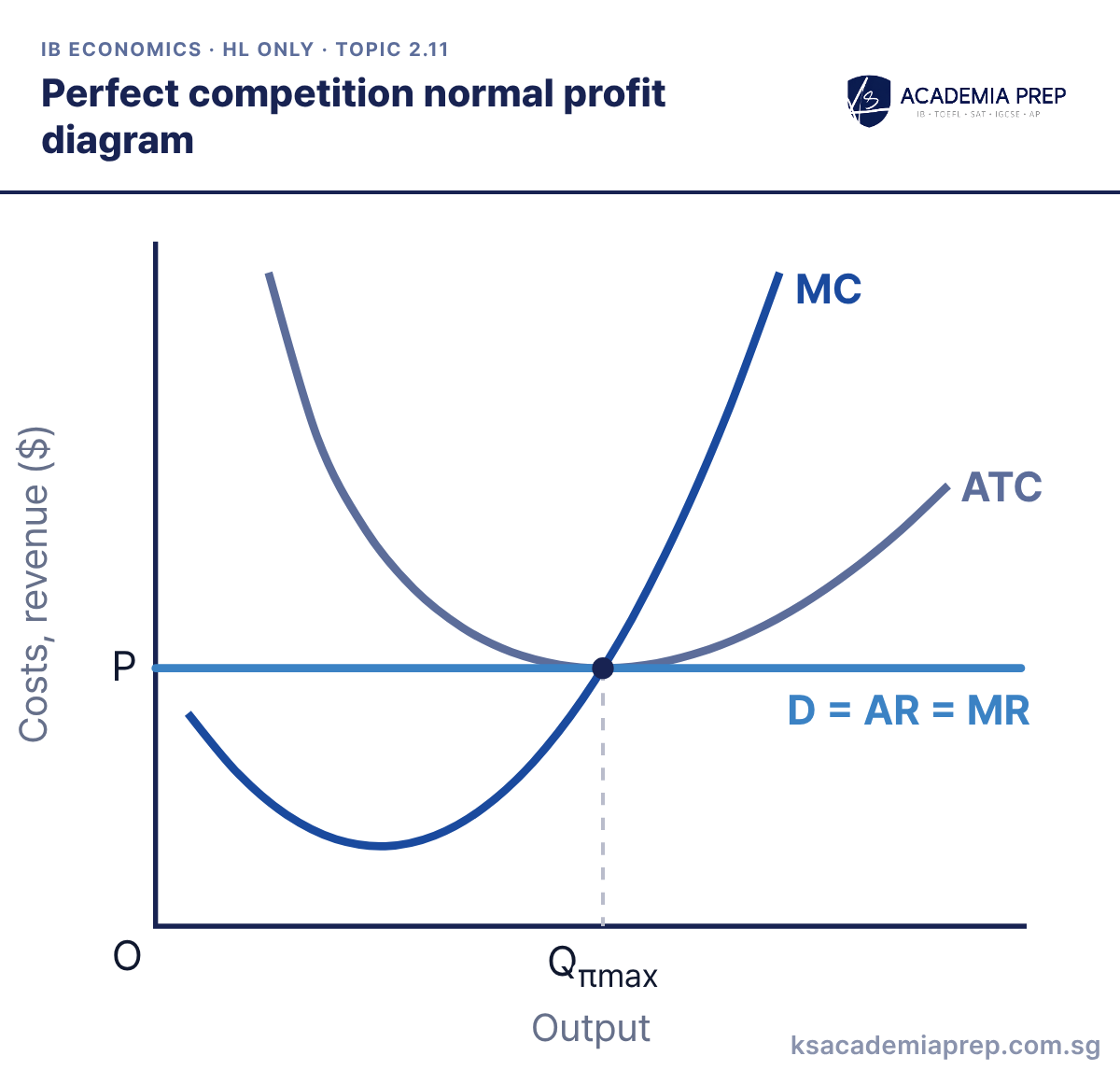
What it shows: In the long run entry and exit move price to P = minimum ATC. The firm produces Qπmax where MC = MR = AR = ATC, so it earns normal profit only. This point is both productively efficient (lowest ATC) and allocatively efficient (P = MC).
How to draw it
Label the axes Costs, revenue ($) and Output.
Draw a U-shaped ATC and an MC curve that cuts ATC at its minimum point.
Draw D = AR = MR as a horizontal line at P touching the minimum of ATC, and drop a dashed line from that point to Qπmax.
The price line must touch ATC at its lowest point, and MC must pass through that same point. Paper 1: use it to explain why perfect competition is efficient in the long run.
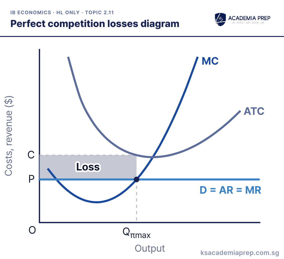
What it shows: Price has fallen below average total cost. The firm still produces where MC = MR at Qπmax, but ATC at that output is C, above P, so it makes the shaded loss. In the long run some firms leave, industry supply falls and price rises back to minimum ATC.
How to draw it
Label the axes Costs, revenue ($) and Output.
Draw a U-shaped ATC, MC cutting ATC at its minimum, and a horizontal D = AR = MR at P below minimum ATC.
Mark Qπmax where MC cuts D = AR = MR on its rising section, read C off ATC above P, and shade the loss between C and P.
Read the cost C off ATC at the MC = MR output, not at the lowest point of ATC. Paper 3: the loss is (C − P) × Qπmax.
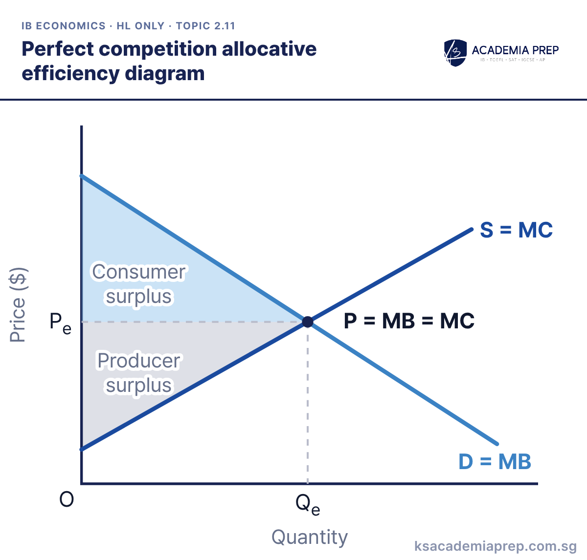
What it shows: Industry supply is the sum of the firms’ MC curves and demand reflects marginal benefit. At Qe price equals both, so MB = MC. Consumer surplus plus producer surplus, the social/community surplus, is as large as it can be, so resources are allocated efficiently.
How to draw it
Label the axes Price ($) and Quantity, with the price axis starting at O.
Draw a downward-sloping D = MB and an upward-sloping S = MC, and label both.
Mark P = MB = MC where they cross, with dashed lines to Pe and Qe, then shade consumer surplus above Pe and producer surplus below it.
Label supply as MC and demand as MB, otherwise the P = MC point is not visible to the examiner. Paper 1: use it as the benchmark to show the welfare loss of monopoly.
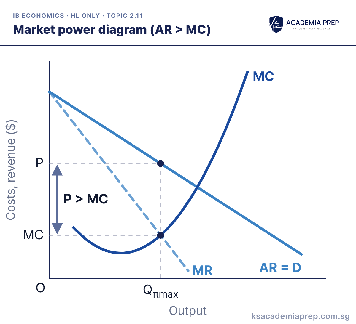
What it shows: A firm with market power faces a downward-sloping demand (AR) curve, so MR lies below AR. It produces Qπmax where MC = MR and charges P from the AR curve, which is above MC at that output. Because P > MC, consumers value one more unit more than it costs to make, so output is allocatively inefficient.
How to draw it
Label the axes Costs, revenue ($) and Output.
Draw a downward-sloping AR = D, MR below it and twice as steep, and an MC curve that cuts MR from below.
Mark Qπmax where MC = MR, go up to AR to find P, and label the vertical gap between P and MC as P > MC.
Mark the vertical gap between P and MC at Qπmax; that gap is the whole point of the diagram. Paper 2: use it for any news story about a dominant firm raising prices.
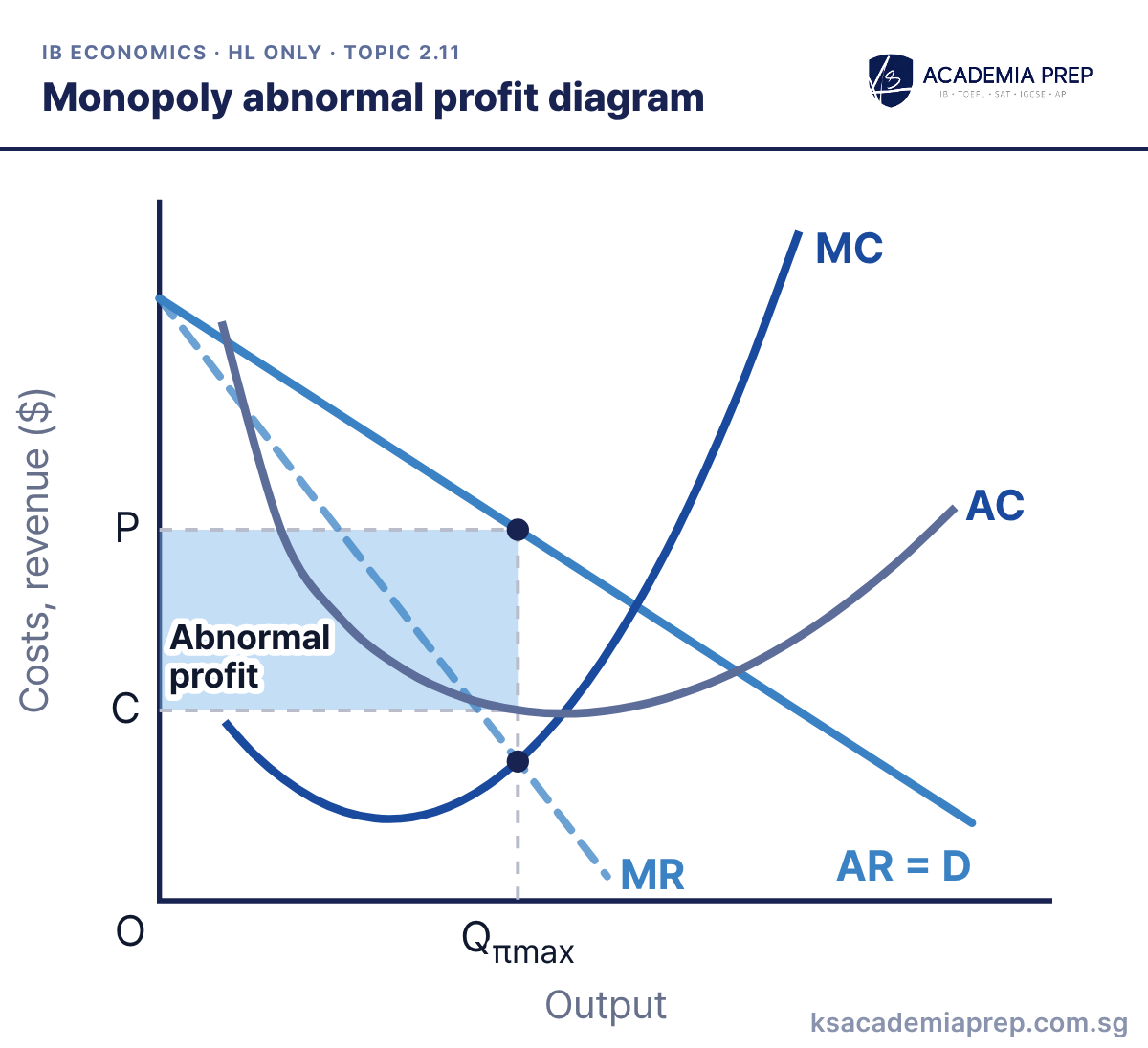
What it shows: The monopolist maximises profit where MC = MR, producing Qπmax and charging P from the demand (AR) curve. Because price is above average cost C, it earns abnormal profit (the shaded rectangle). High barriers to entry stop new firms competing it away in the long run.
How to draw it
Label the axes Costs, revenue ($) and Output.
Draw AR = D sloping down, MR twice as steep, and a U-shaped AC with MC cutting it at its lowest point.
Mark Qπmax where MC cuts MR from below, read P off AR and C off AC, and shade the abnormal profit between P and C.
Draw MR twice as steep as AR, and make MC cut AC at AC’s lowest point. Paper 3: you may be asked to calculate the profit rectangle, (P − C) × Q.
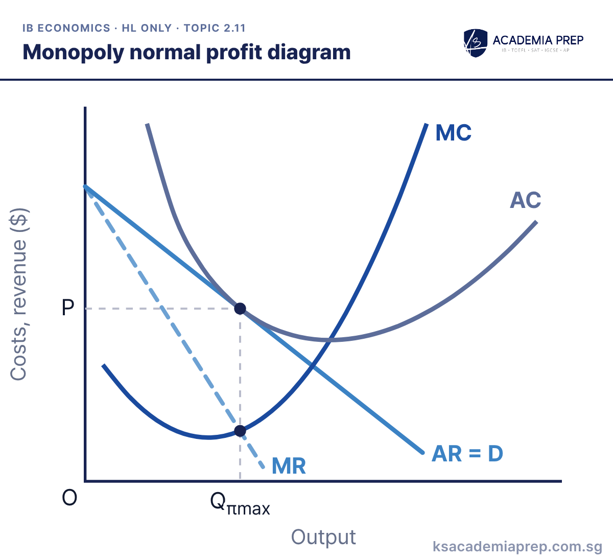
What it shows: The monopolist still produces where MC = MR, at Qπmax. Here demand is weak enough that AR just touches AC at that output, so price equals average cost (P = C) and the firm earns only normal profit. It stays in the industry because it covers all its costs, including opportunity cost.
How to draw it
Label the axes Costs, revenue ($) and Output.
Draw AR = D sloping down, MR twice as steep, and a U-shaped AC with MC cutting it at its lowest point.
Mark Qπmax where MC = MR, and draw AR just touching AC directly above it, on the falling part of AC, so P equals average cost.
AR must touch AC exactly above the MC = MR point, on the falling part of AC. Paper 1: use it to show that a monopoly does not always earn abnormal profit.
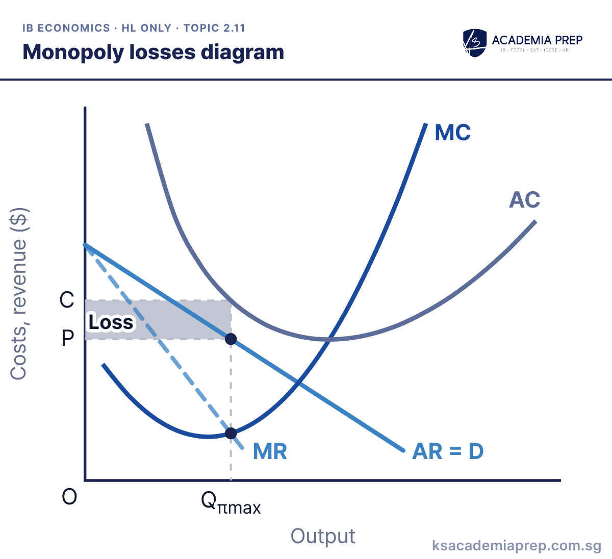
What it shows: Demand has fallen so far that AR lies below AC at every output. The monopolist minimises its loss by producing where MC = MR, at Qπmax, and charging P. Average cost C is above P, so it makes the shaded loss, and it will leave the industry in the long run unless demand recovers.
How to draw it
Label the axes Costs, revenue ($) and Output.
Draw a U-shaped AC with MC cutting it at its lowest point, then AR = D below AC at every output, and MR twice as steep.
Mark Qπmax where MC = MR, read P off AR and C off AC, and shade the loss between C and P. Never read price off MR.
Take P from AR and C from AC, both directly above Qπmax; never read price off MR. Paper 1: useful when evaluating that monopoly power does not guarantee profit.
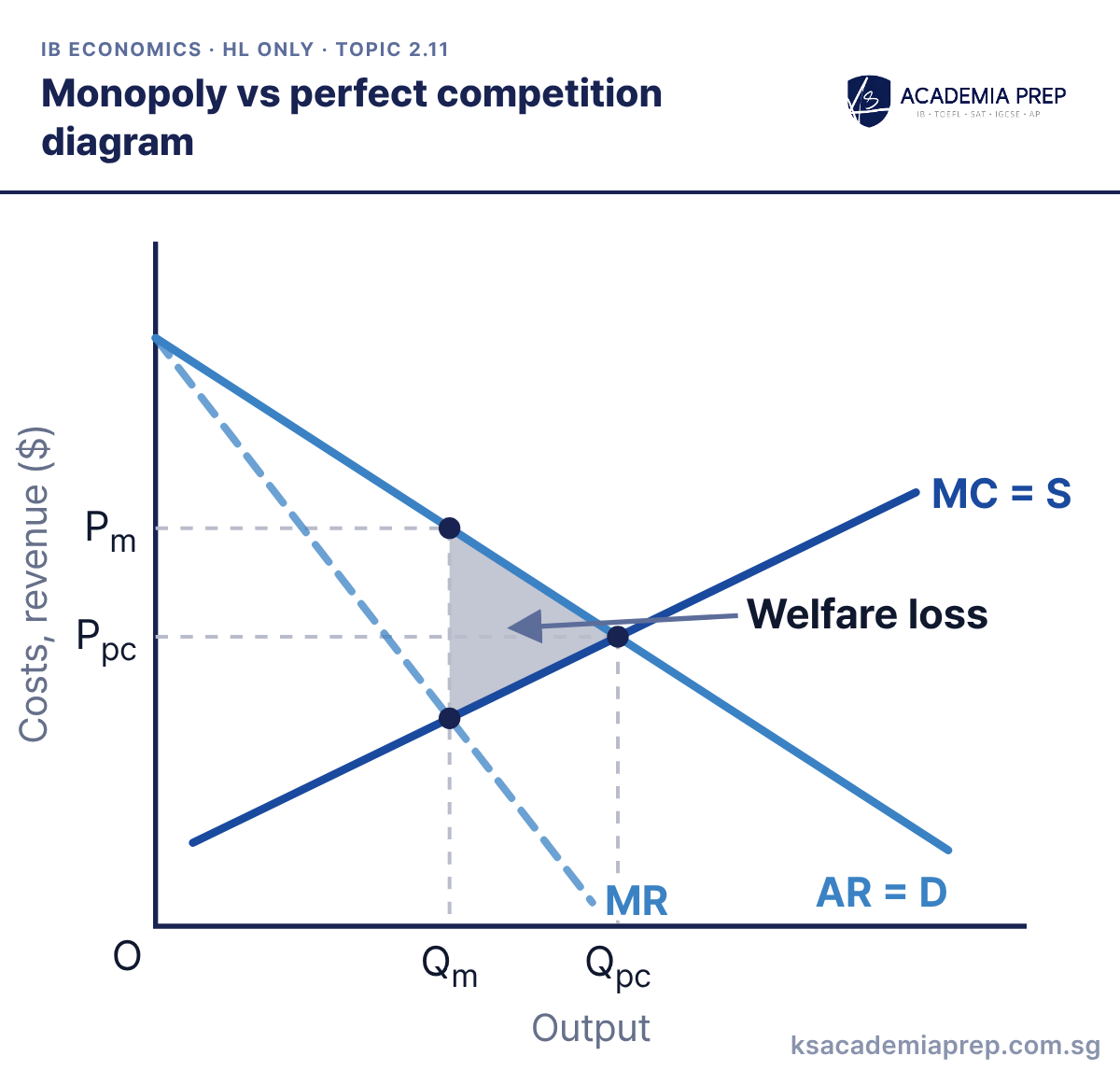
What it shows: If the industry were perfectly competitive, supply (MC) would meet demand at Ppc and Qpc. A monopolist with the same costs produces only Qm, where MC = MR, and charges the higher price Pm. The shaded triangle between AR and MC, from Qm to Qpc, is the welfare loss.
How to draw it
Label the axes Costs, revenue ($) and Output.
Draw AR = D sloping down, MR twice as steep, and an upward-sloping MC = S.
Mark Ppc and Qpc where MC = S meets AR = D, then Qm where MC = MR and Pm on AR. Shade the welfare loss from Qm to Qpc.
State the assumption that costs are the same in both structures; economies of scale could make a monopoly cheaper. Paper 3: the welfare loss is ½ × (Qpc − Qm) × (Pm − MC at Qm).
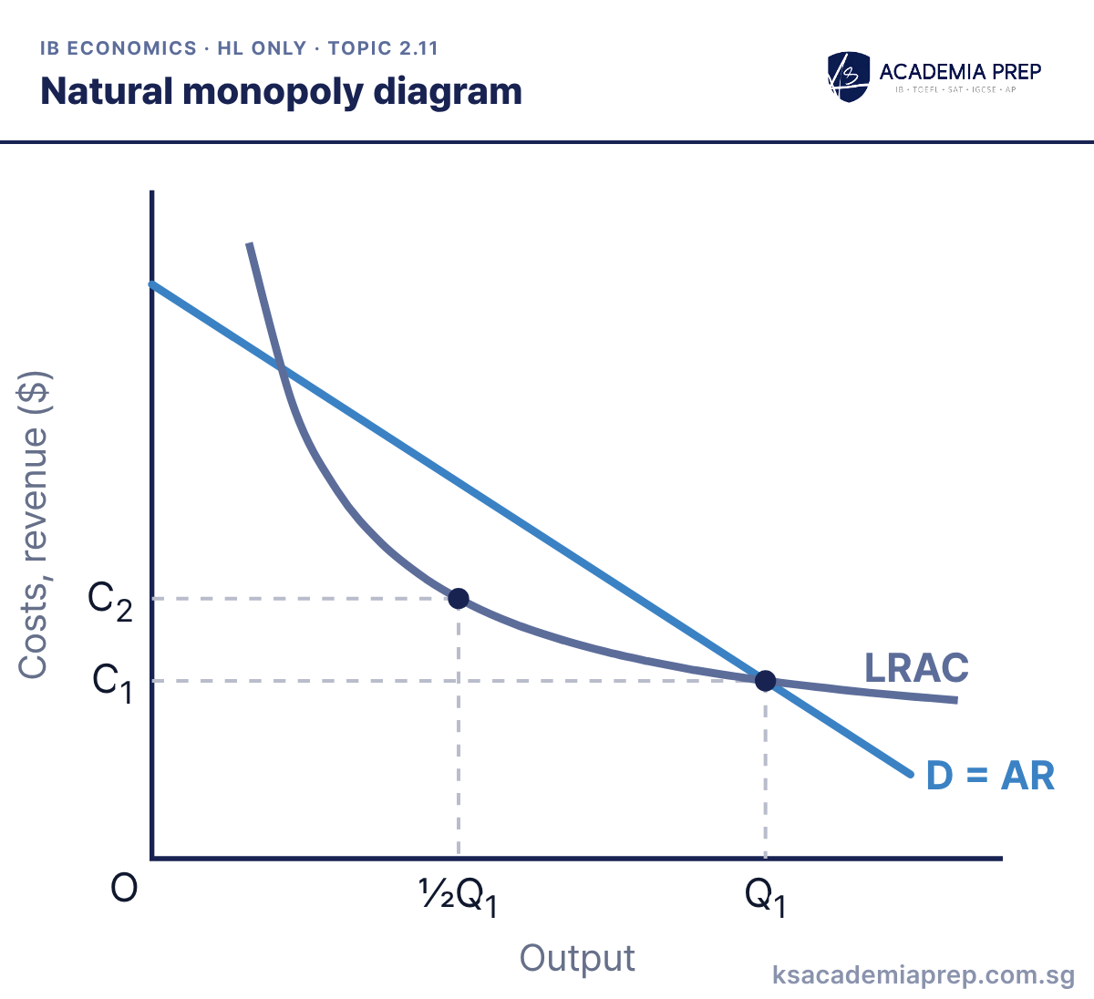
What it shows: Economies of scale are so large that LRAC is still falling where it meets market demand. One firm can supply the whole market, Q1, at average cost C1. If two firms split the market, each produces ½Q1 at the higher cost C2, so competition would raise costs. This is why water, rail and power grids are often run as regulated monopolies.
How to draw it
Label the axes Costs, revenue ($) and Output.
Draw a downward-sloping D = AR and an LRAC curve that is still falling where it crosses D.
Mark Q₁ and C₁ where LRAC meets D, then mark ½Q₁ and read off the higher cost C₂ on LRAC above it.
Make LRAC slope down all the way past the demand curve; if it turns up before meeting demand it is not a natural monopoly. Paper 2: use it for utility and infrastructure news stories.
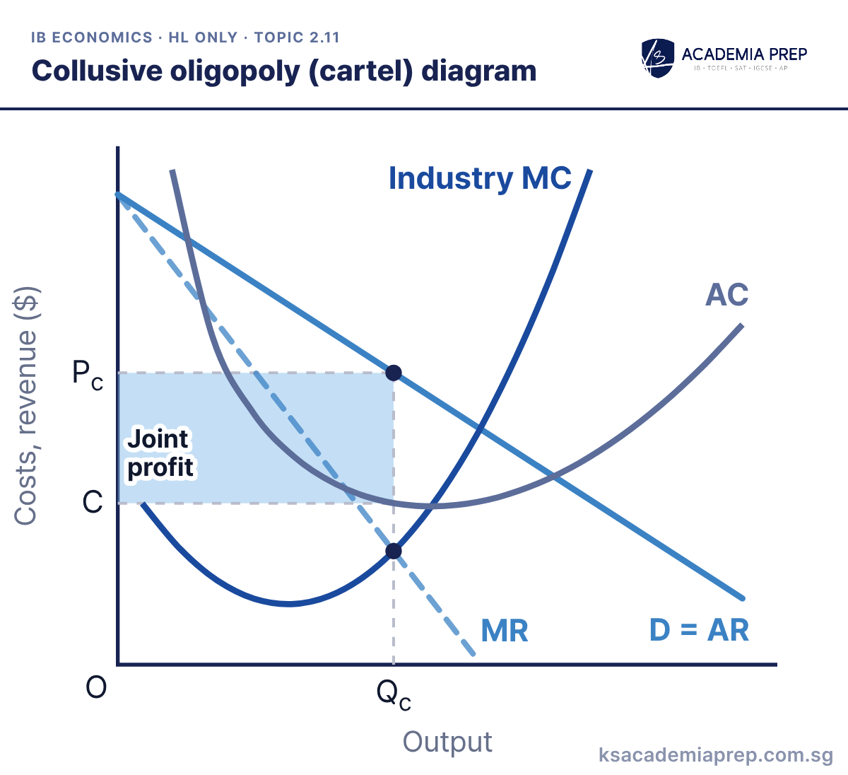
What it shows: The colluding firms act as one monopolist facing the industry demand curve. They set total output Qc where industry MC = MR and charge Pc, earning the largest possible joint abnormal profit. Each member is then given a quota, and each has an incentive to cheat by producing more at that high price.
How to draw it
Label the axes Costs, revenue ($) and Output.
Draw the industry D = AR, MR twice as steep, a U-shaped AC, and Industry MC cutting AC at its lowest point.
Mark Qc where Industry MC = MR, read Pc off D = AR and C off AC, and shade the joint profit between Pc and C.
Draw the industry demand curve, not one firm’s, because the cartel acts as a single monopolist; the members’ quotas add up to Qc. Paper 2: use it for OPEC or price-fixing cases, and note that collusion is illegal in most countries.
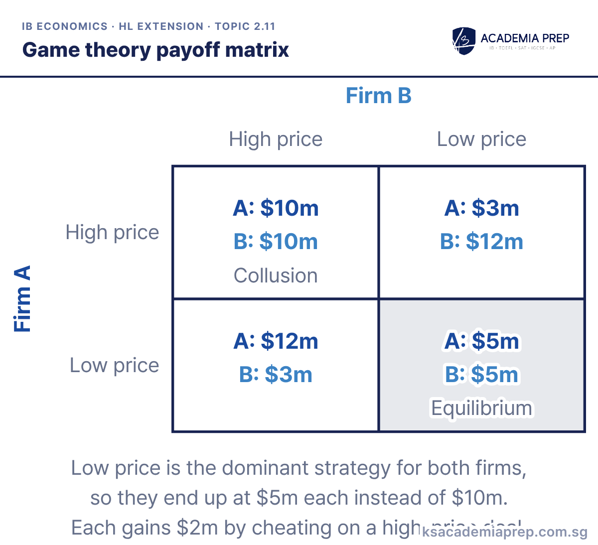
What it shows: Each cell shows the profits of Firm A and Firm B for one pair of pricing choices. Whatever B does, A earns more by choosing a low price ($12m not $10m, $5m not $3m), and the same is true for B, so low price is each firm’s dominant strategy and both end up earning $5m. If they agreed to keep prices high they would each earn $10m, but each could then earn $12m by cheating.
How to draw it
Draw a two-by-two grid, with Firm B's High price and Low price across the top and Firm A's down the side.
Fill each cell with both profits: $10m each if both price high, $5m each if both price low, otherwise $12m to the low pricer and $3m to the other.
Label the high-high cell Collusion and the low-low cell Equilibrium, then compare each firm's payoffs with the rival's choice held fixed.
Always compare one firm’s payoffs down a column or along a row, holding the rival’s choice fixed. Paper 1: use it to explain why oligopolists are interdependent and why collusive agreements tend to break down.
What it shows: Product differentiation gives the firm a downward-sloping but fairly elastic demand (AR) curve. It produces Qπmax where MC = MR and charges P, which is above average cost C, so it earns the shaded abnormal profit. Low barriers to entry mean this only lasts in the short run.
How to draw it
Label the axes Costs, revenue ($) and Output.
Draw a fairly elastic AR = D, flatter than for a monopoly, MR twice as steep, and a U-shaped AC with MC cutting it at its lowest point.
Mark Qπmax where MC = MR, read P off AR and C off AC, and shade the abnormal profit between P and C.
Draw AR flatter than in a monopoly diagram to show the many close substitutes. Paper 1: follow it with the long-run diagram to show new entrants competing the profit away.
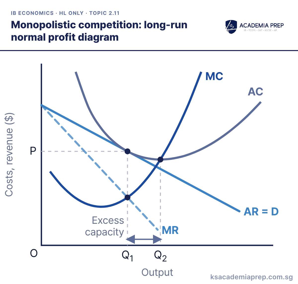
Monopolistic competition: long-run normal profit diagram
What it shows: New firms enter until each firm’s demand (AR) has fallen enough to just touch AC at Q1, the output where MC = MR. Price equals average cost (P = C), so only normal profit is earned. The firm produces Q1, below Q2 where AC is lowest; the gap is excess capacity, so the firm is not productively efficient.
How to draw it
Label the vertical axis Costs, revenue ($) and the horizontal axis Output, with O at the origin.
Draw a U-shaped AC, an MC cutting AC at its lowest point, a downward-sloping AR = D, and a steeper MR below it.
Make AR touch the falling part of AC directly above MC = MR at Q₁, mark P, then mark Q₂ at minimum AC and label the gap Excess capacity.
The tangency must be on the falling part of AC, directly above the MC = MR point, never at the minimum of AC. Paper 1: use excess capacity and P > MC to evaluate this market structure.
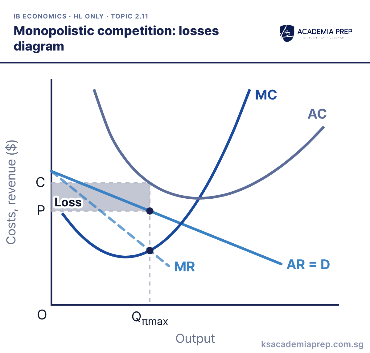
What it shows: Demand for the firm’s product is too weak, for example after rivals launch better substitutes. At Qπmax, where MC = MR, average cost C is above price P, so the firm makes the shaded loss. Some firms leave in the long run, and demand for those that remain rises until only normal profit is earned.
How to draw it
Label the vertical axis Costs, revenue ($) and the horizontal axis Output, with O at the origin.
Draw U-shaped AC and MC, then a fairly flat AR = D with MR below it, keeping AR below AC at every output.
Drop a dashed line from MC = MR to Qπmax, read across to C on AC and P on AR, and shade the Loss rectangle between C and P.
Keep AR flatter than in monopoly and make sure it lies below AC at every output. Paper 1: use it with the long-run diagram to explain exit and adjustment.
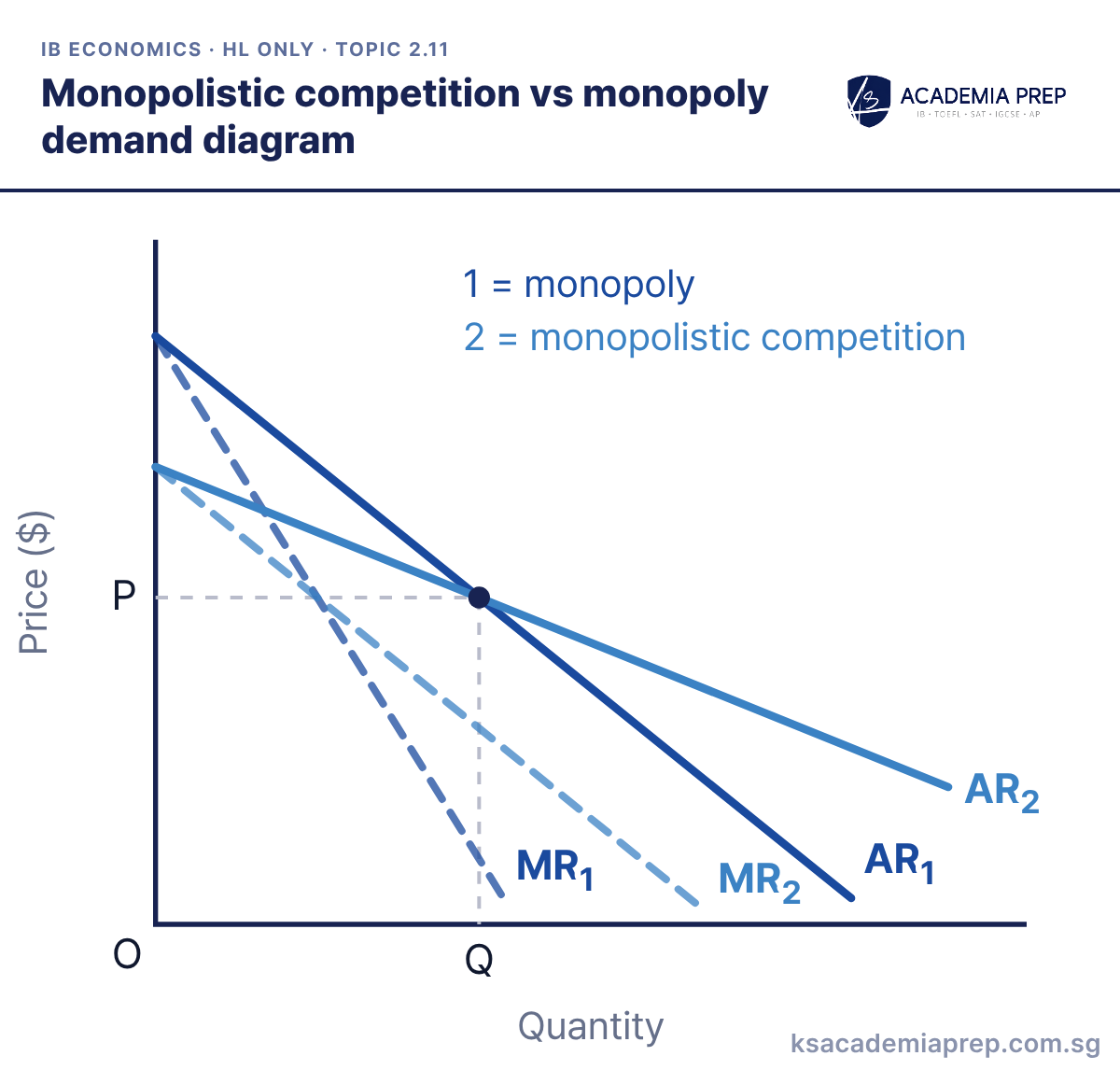
Monopolistic competition vs monopoly demand diagram
What it shows: Both firms face downward-sloping demand, but a monopolist (AR1) has no close substitutes while a monopolistically competitive firm (AR2) has many. At the same price P and output Q, AR2 is flatter, so demand is more price elastic and the firm has less power to raise price. Each MR is twice as steep as its AR.
How to draw it
Label the vertical axis Price ($) and the horizontal axis Quantity, with O at the origin.
Draw a steep AR₁ and a flatter AR₂ crossing at one point, each with its MR (MR₁, MR₂) twice as steep below it.
Dash from the crossing point to P and Q, and add the key: 1 = monopoly, 2 = monopolistic competition.
Draw the two demand curves crossing at one point so the difference in elasticity is clear at the same price. Paper 1: use it to compare the market power of the two structures.
Best for: Paper 1
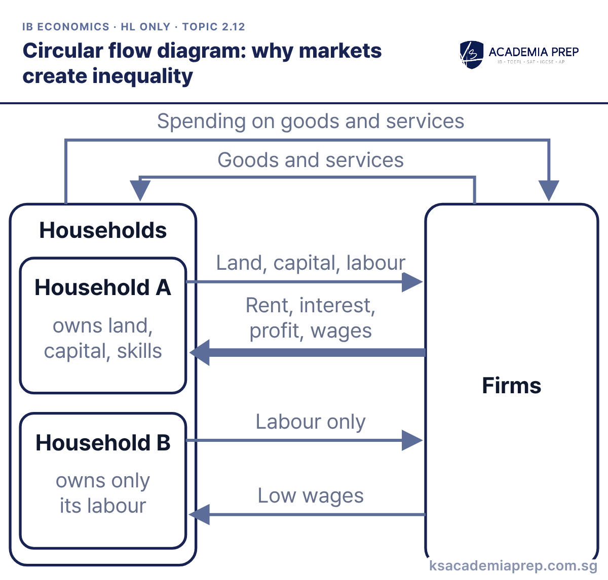
2.12 The market’s inability to achieve equity (HL)
What it shows: In the circular flow, households sell the services of their factors of production to firms and receive factor incomes: wages for labour, rent for land, interest for capital and profit for enterprise. Household A owns land, capital and scarce skills, so it receives a large flow of income. Household B owns only its labour and receives low wages. Because ownership of factors is unequal, the free market produces unequal incomes, and wealth builds up over time.
How to draw it
Draw a Households box and a Firms box, and show Household A and Household B inside Households.
Add the outer loop: Spending on goods and services flowing from Households to Firms, and Goods and services flowing back.
From Household A, draw Land, capital, labour to Firms with Rent, interest, profit, wages returning; from Household B, draw Labour only with Low wages returning.
Name all four factor incomes and link each to the factor that earns it. Paper 1: use it to open an essay on why governments redistribute income.
Best for: Paper 1
Unit 3: Macroeconomics
Macroeconomics is built on the AD/AS model, drawn in both its monetarist/new classical and Keynesian versions.
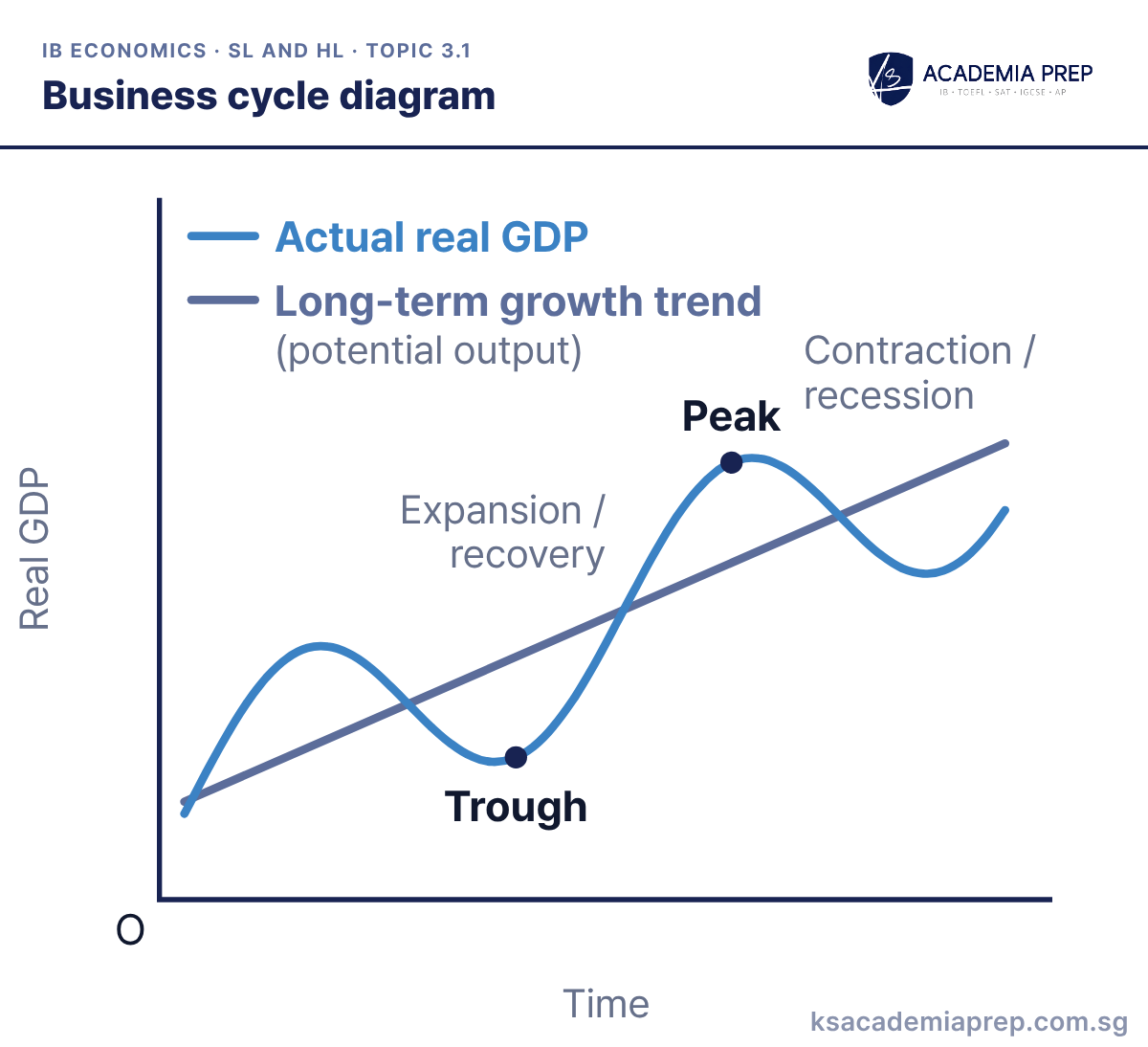
What it shows: Actual real GDP rises and falls in the short term around the long-term growth trend, which shows potential output. Output grows fastest in the expansion (recovery), tops out at the peak, falls in the contraction (recession) and bottoms out at the trough. The upward slope of the trend line is long-term economic growth.
How to draw it
Label the vertical axis Real GDP and the horizontal axis Time, with O at the origin; use real, not nominal, GDP.
Draw a straight, upward-sloping Long-term growth trend (potential output), then a wavy Actual real GDP line rising and falling around it.
Mark a Peak at the top of a wave and a Trough at the bottom, labelling the falls Contraction / recession and the rises Expansion / recovery.
Put real GDP (not nominal GDP) on the vertical axis and time on the horizontal axis, and draw the trend line rising. Paper 2: use it to say which phase an economy is in from the growth figures in the data.
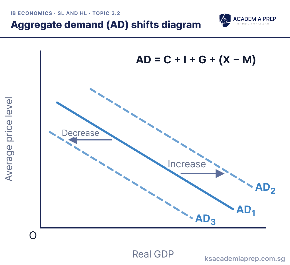
What it shows: AD is total planned spending on domestic output: AD = C + I + G + (X − M). It slopes downwards because a lower price level raises real wealth, lowers interest rates and makes exports more competitive. A rise in consumption, investment, government spending or net exports at every price level shifts AD right from AD1 to AD2; a fall shifts it left to AD3.
How to draw it
Label the vertical axis Average price level and the horizontal axis Real GDP, not price and quantity.
Draw a downward-sloping AD₁, then AD₂ to its right and AD₃ to its left.
Add an Increase arrow towards AD₂ and a Decrease arrow towards AD₃, and write AD = C + I + G + (X − M).
A change in the price level moves along AD; only a change in C, I, G or (X − M) for another reason shifts it. Paper 2: name the component that changed (for example investment after an interest rate cut) before shifting the curve.
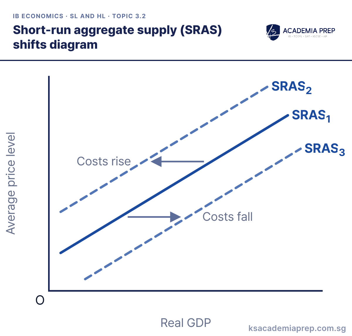
What it shows: SRAS slopes upwards because in the short run wages and other input prices are fixed, so a higher price level makes more output profitable. A rise in the costs of factors of production (wages, raw materials, oil) or in indirect taxes shifts SRAS left from SRAS1 to SRAS2. Lower costs, lower indirect taxes or subsidies shift it right to SRAS3.
How to draw it
Label the vertical axis Average price level and the horizontal axis Real GDP, with O at the origin.
Draw an upward-sloping SRAS₁, then SRAS₂ to its left and SRAS₃ to its right.
Add a Costs rise arrow towards SRAS₂ and a Costs fall arrow towards SRAS₃; a change in the price level moves along SRAS, it does not shift it.
Only changes in costs shift SRAS; a change in the price level moves along it. Paper 2: a rise in oil prices or the minimum wage in the text is your cue to shift SRAS left.
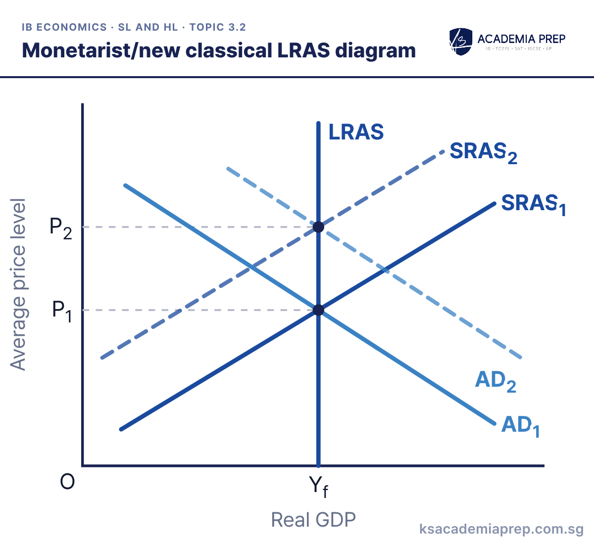
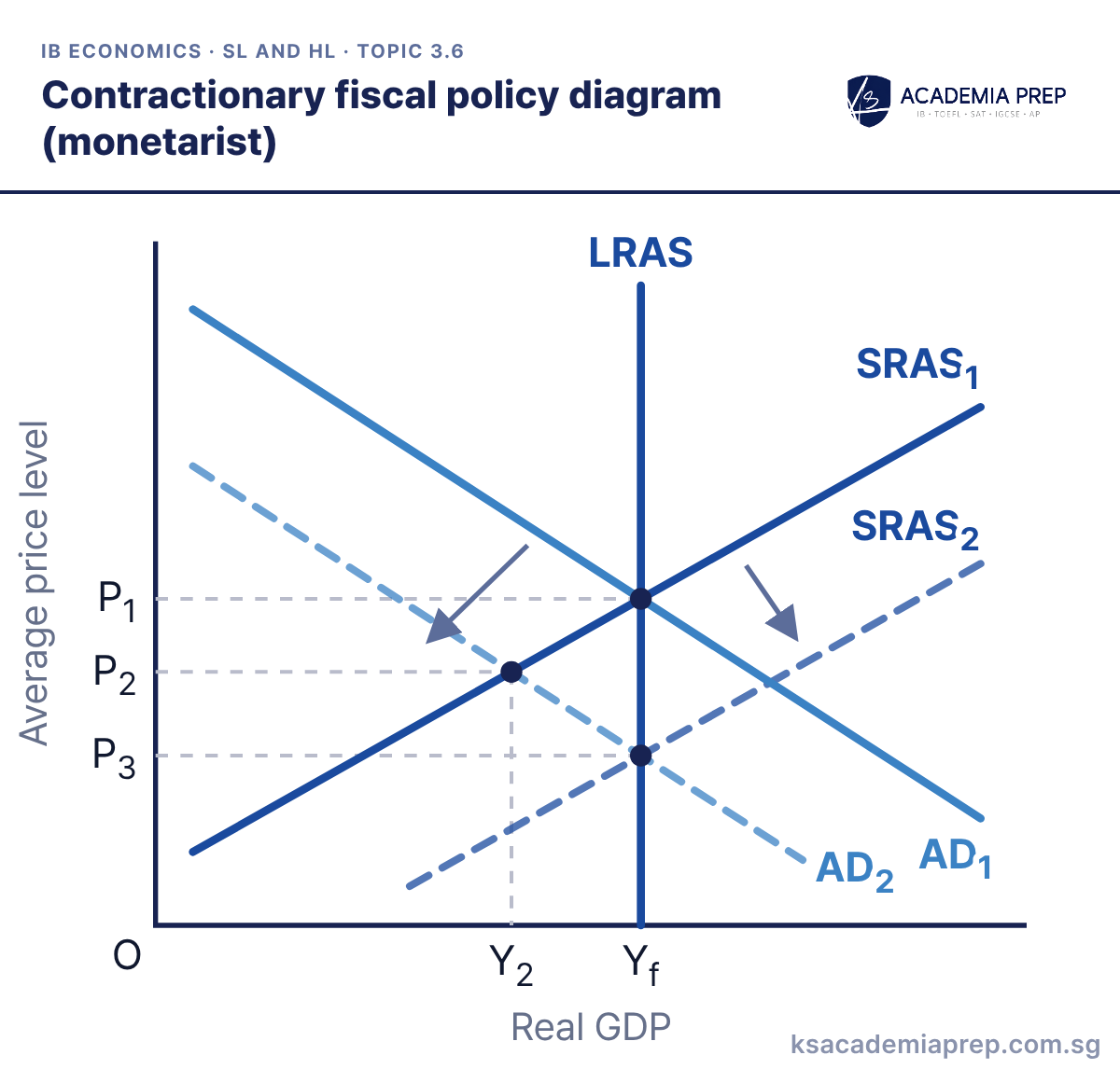
What it shows: In the monetarist/new classical model the long-run aggregate supply curve (LRAS) is vertical at full employment output Yf, because in the long run wages and other input prices adjust fully to the price level. The economy settles where AD = SRAS on LRAS. If AD rises from AD1 to AD2, costs rise and SRAS shifts from SRAS1 to SRAS2, so the only lasting effect is a higher price level (P1 to P2).
How to draw it
Label the vertical axis Average price level and the horizontal axis Real GDP, with O at the origin.
Draw a vertical LRAS at Yf, then AD₁ and SRAS₁ crossing on it, with AD₂ to the right and SRAS₂ to the left.
Mark P₁ where AD₁ and SRAS₁ meet on LRAS and P₂ where AD₂ and SRAS₂ meet on LRAS, dashing both across to the price axis.
Draw LRAS vertical at Yf and make every long-run equilibrium sit on it. Paper 1: use it to argue that demand-side policy cannot raise output above Yf in the long run.
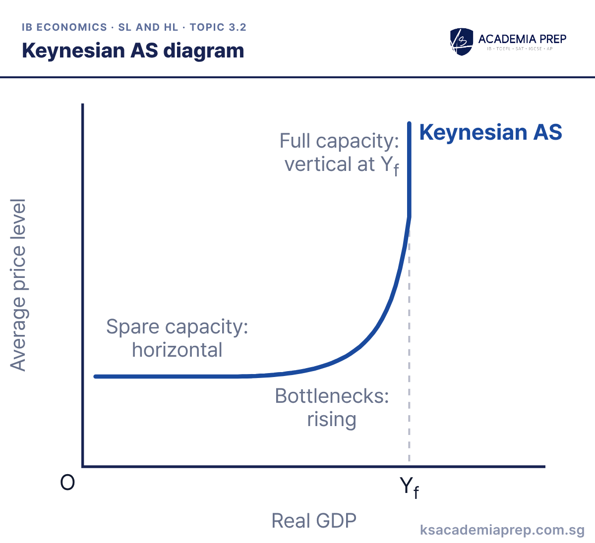
What it shows: The Keynesian AS curve has three sections. With lots of spare capacity it is horizontal, because output can rise without pushing up costs. As the economy nears full capacity, bottlenecks and labour shortages push up costs, so it slopes upwards more and more steeply. At full employment output Yf it becomes vertical, because output cannot rise further.
How to draw it
Label the vertical axis Average price level and the horizontal axis Real GDP, with O at the origin.
Draw Keynesian AS as one curve: horizontal at a low price level, then rising more and more steeply, then vertical at Yf.
Label the sections Spare capacity: horizontal, Bottlenecks: rising and Full capacity: vertical at Yf, bending smoothly into the vertical part.
Keep the horizontal section low and make the curve bend smoothly into the vertical section at Yf. Paper 1: use the section AD cuts to argue whether a rise in AD raises output, prices or both.
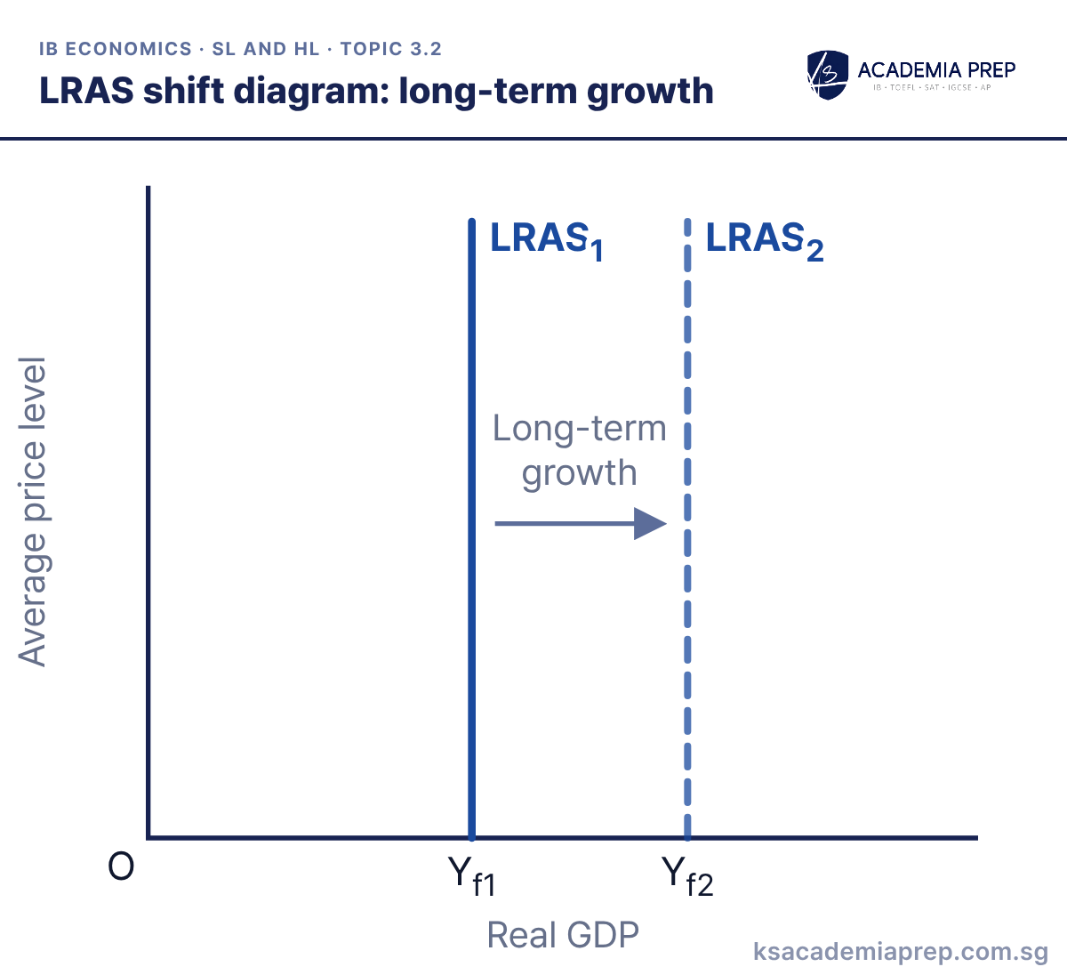
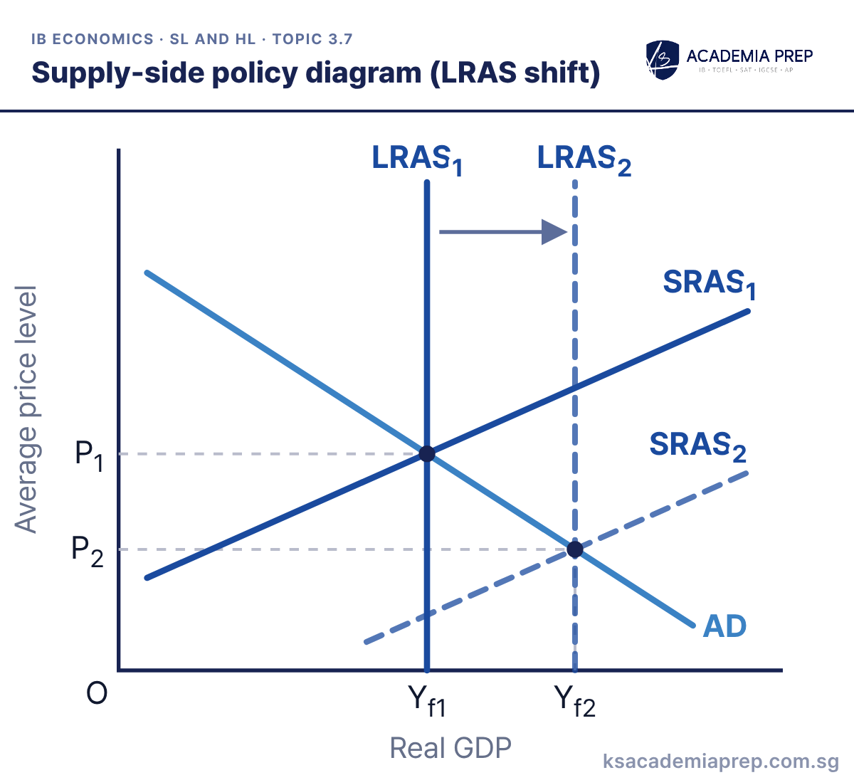
What it shows: Long-term growth is a rise in potential output, shown by LRAS shifting right from LRAS1 to LRAS2 and full employment output rising from Yf1 to Yf2. It comes from more or better factors of production (a larger or more skilled labour force, more capital), better technology, higher efficiency, and stronger institutions such as property rights and the rule of law.
How to draw it
Label the vertical axis Average price level and the horizontal axis Real GDP, with O at the origin.
Draw a vertical LRAS₁ at Yf1 and a second vertical LRAS₂ further right at Yf2.
Add a rightward arrow labelled Long-term growth between them, and mark both Yf1 and Yf2 on the Real GDP axis.
Shift the whole vertical line and label the new full employment output, not just the curve. Paper 1: link each supply-side policy to the factor it improves before you shift LRAS.
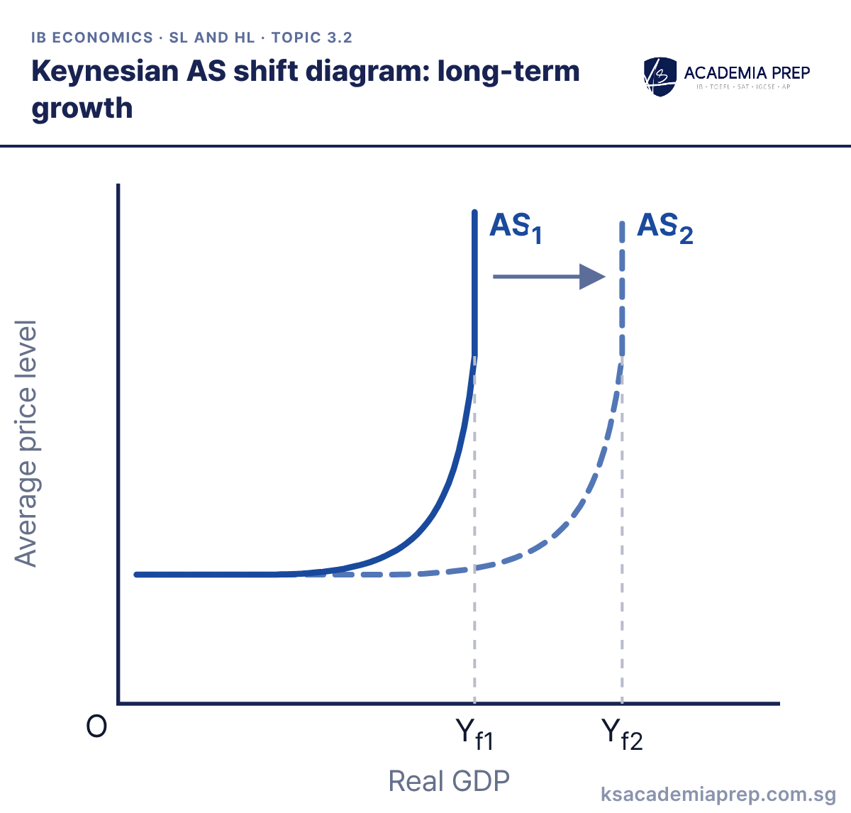
What it shows: In the Keynesian model long-term growth shifts the whole AS curve right, from AS1 to AS2. The vertical section moves out, so full employment output rises from Yf1 to Yf2, and the economy can produce more before bottlenecks push up costs. The causes are the same as for an LRAS shift: more or better factors, better technology, efficiency and institutions.
How to draw it
Label the vertical axis Average price level and the horizontal axis Real GDP, with O at the origin.
Draw AS₁ as a Keynesian AS curve, then AS₂ with the same horizontal section but its rising and vertical sections further right.
Mark Yf1 below the vertical part of AS₁ and Yf2 below the vertical part of AS₂, and add an arrow showing the rightward shift.
Shift the rising and vertical sections together, and keep the horizontal section at the same price level. Paper 1: pair this with the monetarist LRAS shift to show both schools agree on how growth happens.
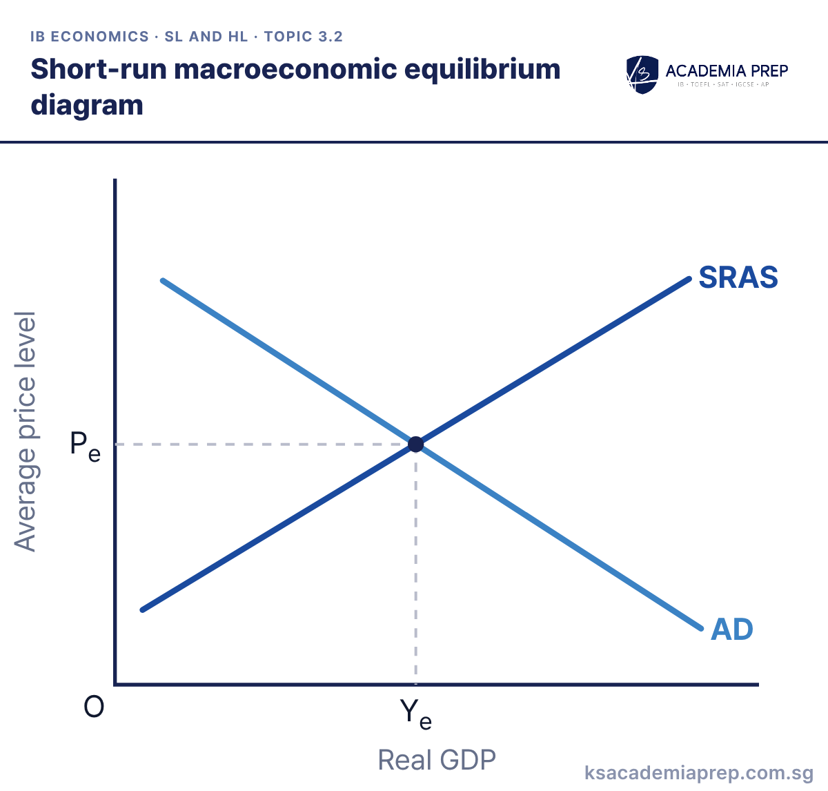
What it shows: Short-run equilibrium is where AD = SRAS, giving the average price level Pe and real GDP Ye. At any higher price level output supplied exceeds planned spending and firms cut prices; at any lower price level spending exceeds output. Short-run equilibrium can be above, below or at full employment output.
How to draw it
Label the vertical axis Average price level and the horizontal axis Real GDP, not price and quantity.
Draw an upward-sloping SRAS and a downward-sloping AD, and label both.
From the point where AD and SRAS cross, draw dashed lines to both axes and label them Pe and Ye.
Label the axes average price level and real GDP, not price and quantity. Paper 2: start every AD/AS answer from this equilibrium, then shift one curve at a time.
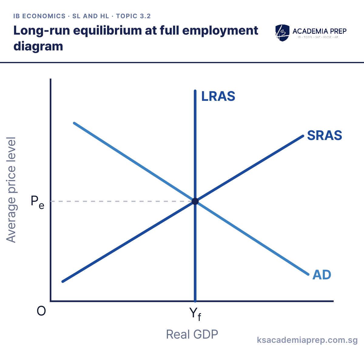
What it shows: Long-run equilibrium is where AD = SRAS = LRAS, so the economy produces full employment output Yf at price level Pe. Unemployment is at the natural rate (structural, frictional and seasonal unemployment only), and there is no inflationary or deflationary gap.
How to draw it
Label the vertical axis Average price level and the horizontal axis Real GDP, with O at the origin.
Draw a vertical LRAS, then an upward-sloping SRAS and a downward-sloping AD that cross exactly on it.
From the point where all three curves meet, draw dashed lines to both axes and label them Pe and Yf.
Full employment does not mean zero unemployment; say unemployment equals the natural rate. Paper 1: use it as the benchmark that inflationary and deflationary gaps are measured from.
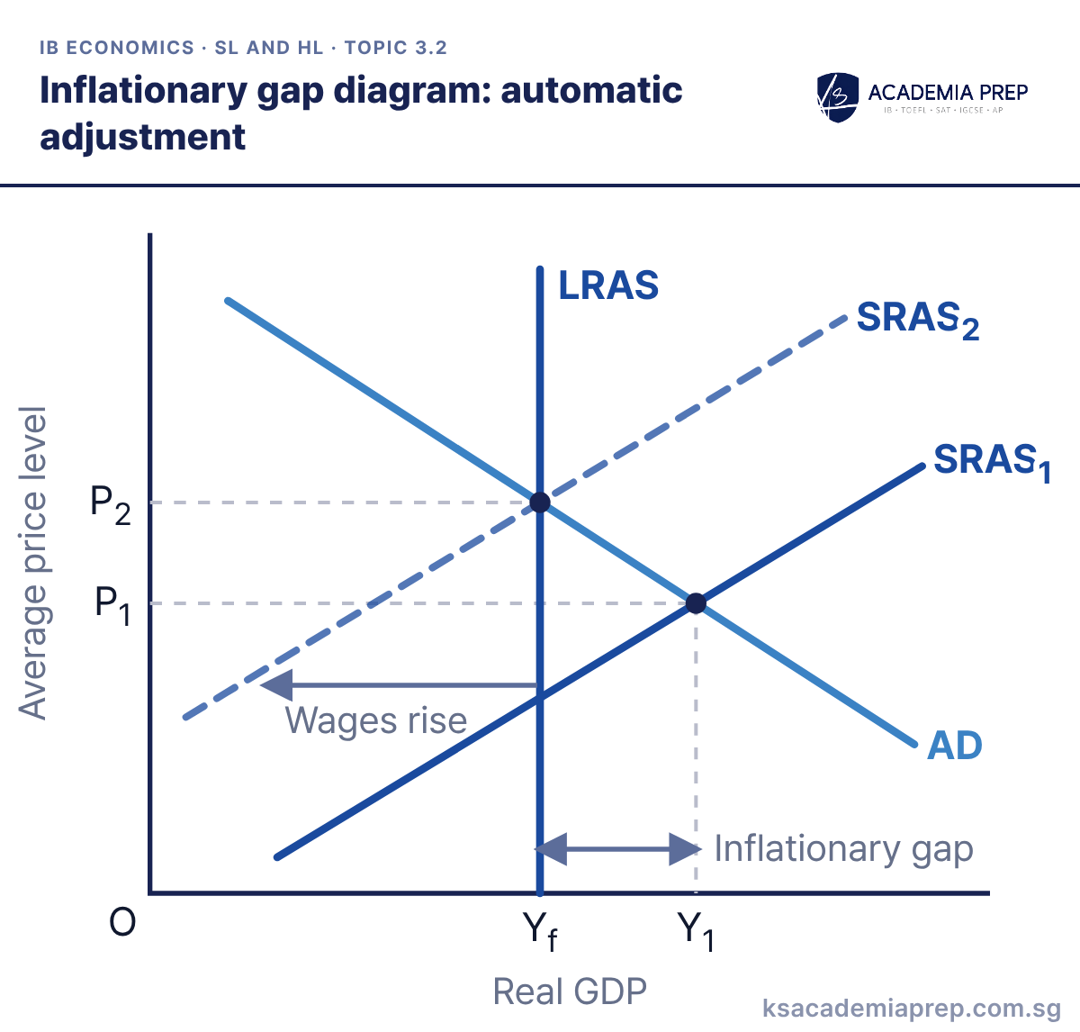
What it shows: AD cuts SRAS1 at Y1, above full employment output Yf, so there is an inflationary gap and unemployment is below its natural rate. In the monetarist/new classical model the tight labour market pushes up wages, so SRAS shifts left from SRAS1 to SRAS2. Output falls back to Yf and the price level rises from P1 to P2.
How to draw it
Label the vertical axis Average price level and the horizontal axis Real GDP, with O at the origin.
Draw a vertical LRAS at Yf, then AD crossing SRAS₁ to the right of LRAS, and SRAS₂ to the left of SRAS₁.
Mark P₁ and Y₁ where AD meets SRAS₁, label Yf to Y₁ the Inflationary gap, add a Wages rise arrow, and mark P₂ on LRAS.
The gap is measured along the real GDP axis, from Yf to Y1, not as a vertical distance. Paper 1: use the automatic adjustment to argue that policy intervention may be unnecessary in the long run.
Deflationary (recessionary) gap adjustment diagram
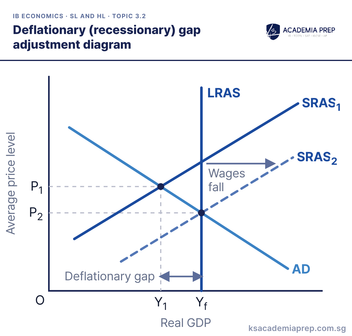
What it shows: AD cuts SRAS1 at Y1, below full employment output Yf, so there is a deflationary (recessionary) gap and unemployment is above its natural rate. In the monetarist/new classical model unemployed workers accept lower wages, so SRAS shifts right from SRAS1 to SRAS2. Output returns to Yf and the price level falls from P1 to P2.
How to draw it
Label the vertical axis Average price level and the horizontal axis Real GDP, with O at the origin.
Draw a vertical LRAS at Yf, then AD crossing SRAS₁ to the left of LRAS, and SRAS₂ to the right of SRAS₁.
Mark P₁ and Y₁ where AD meets SRAS₁, label Y₁ to Yf the Deflationary gap, add a Wages fall arrow, and mark P₂ on LRAS.
Say why SRAS shifts (wages and other costs fall), not just that it does. Paper 1: contrast this self-correction with the Keynesian view that the gap can persist.
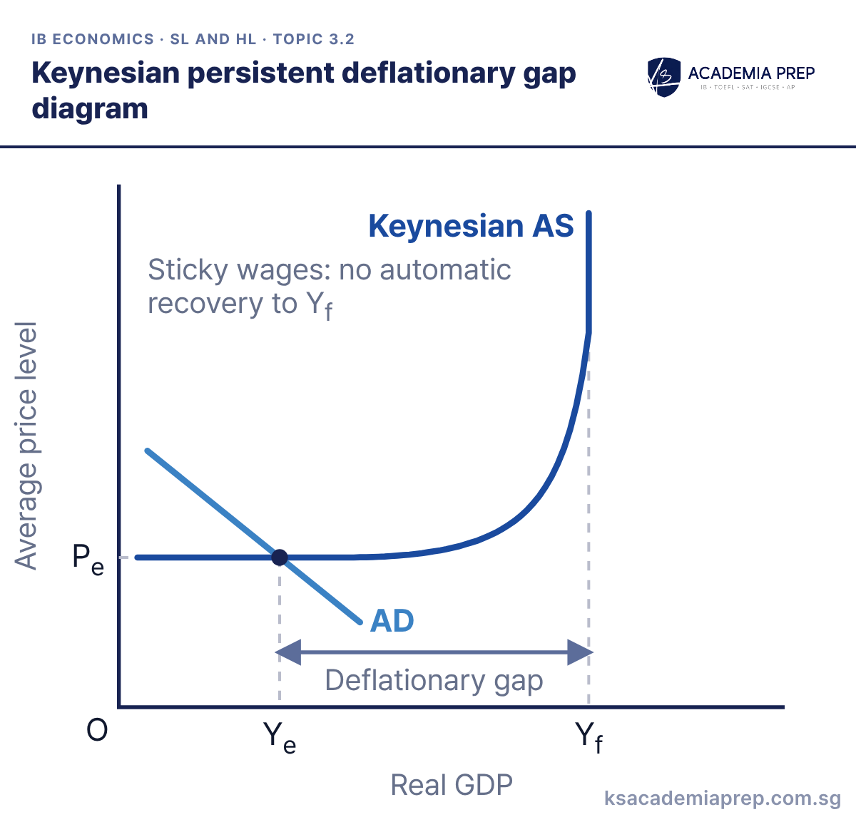
What it shows: AD is low and cuts the horizontal section of the Keynesian AS curve, so equilibrium output Ye is well below full employment output Yf. Because wages are sticky downwards, costs do not fall and AS does not shift, so the deflationary gap and high cyclical unemployment can last. Keynesians conclude that the government must raise AD to close the gap.
How to draw it
Label the vertical axis Average price level and the horizontal axis Real GDP, with O at the origin.
Draw Keynesian AS with a long horizontal section, then a low AD cutting that flat section, not the vertical one.
Dash from the crossing to Pe and Ye, mark Yf below the vertical section, and label Ye to Yf the Deflationary gap.
Draw AD cutting the flat section, not the vertical one, and label the gap from Ye to Yf. Paper 1: this is the diagram to justify expansionary fiscal policy in a recession.
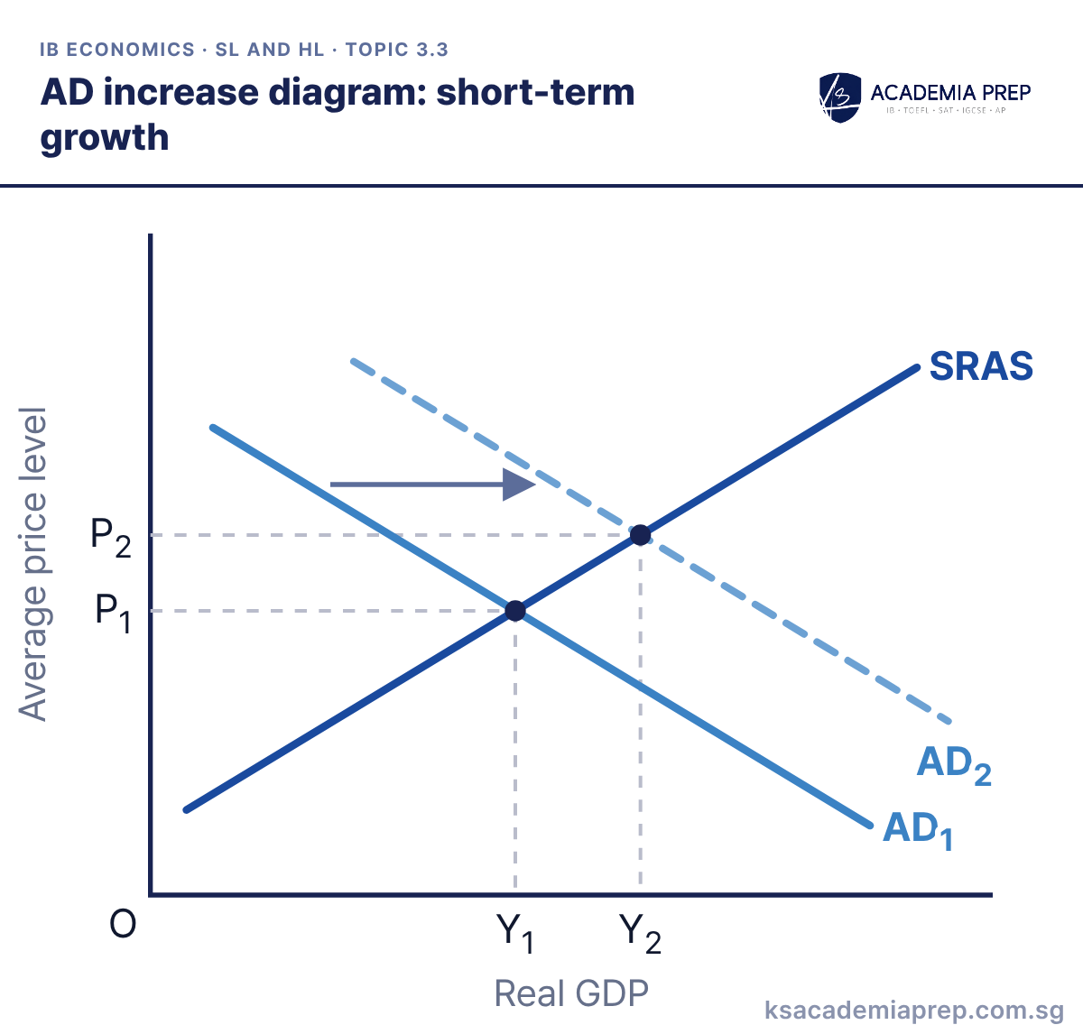
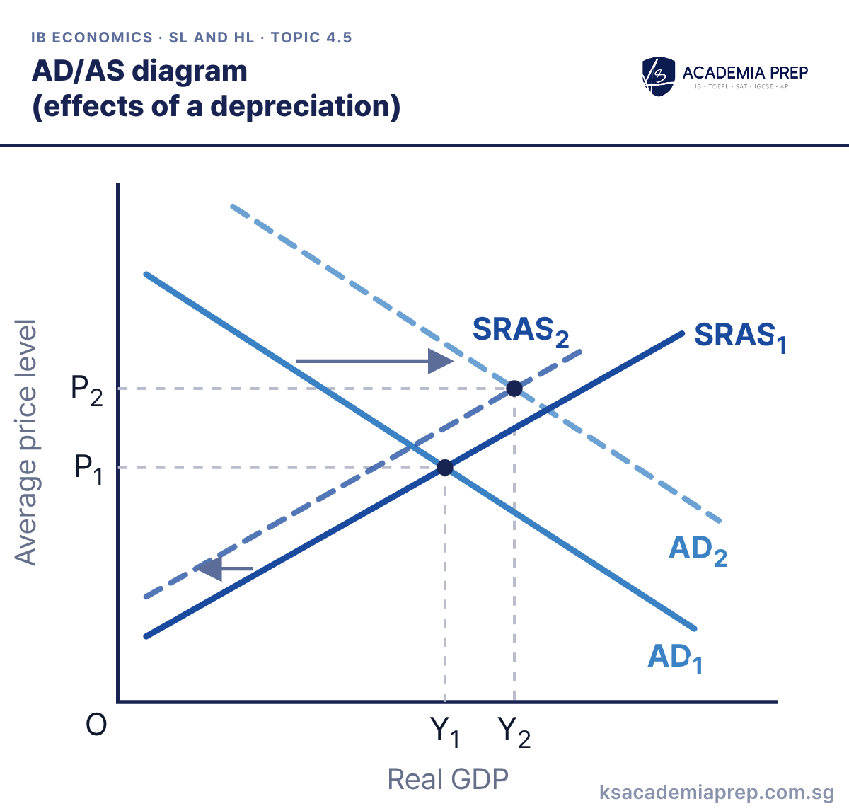
What it shows: A rise in consumption, investment, government spending or net exports shifts AD right from AD1 to AD2. Moving up SRAS, real GDP rises from Y1 to Y2: this is short-term economic growth, using spare capacity rather than raising potential output. The price level also rises from P1 to P2.
How to draw it
Label the vertical axis Average price level and the horizontal axis Real GDP, with O at the origin.
Draw an upward-sloping SRAS, then AD₁ and AD₂ to its right, with an arrow showing the shift.
Mark P₁ and Y₁ at the first equilibrium and P₂ and Y₂ at the second. Both are higher than before.
Short-term growth is a rise in actual output from an AD shift; long-term growth needs LRAS to shift. Paper 2: say which component of AD caused the shift, using a figure from the text.
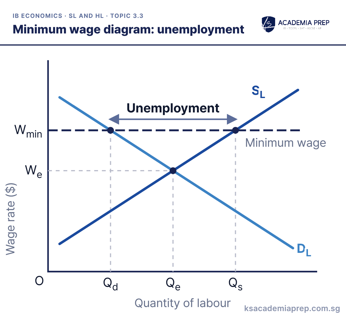
What it shows: A minimum wage Wmin set above the equilibrium wage We acts as a price floor (minimum price) in the labour market. Firms cut the labour they demand from Qe to Qd, while more people want work, raising labour supplied to Qs. The excess supply of labour, Qd to Qs, is unemployment. The same diagram is used for labour market regulation as a supply-side policy in 3.7.
How to draw it
Label the vertical axis Wage rate ($) and the horizontal axis Quantity of labour, with O at the origin.
Draw a downward-sloping DL and an upward-sloping SL, and mark We and Qe where they cross.
Draw a horizontal Minimum wage line at Wmin above We, mark Qd on DL and Qs on SL, and label Qd to Qs Unemployment, not Qd to Qe.
The unemployment is the horizontal gap between Qd and Qs at Wmin, not Qd to Qe. Paper 2: weigh this against higher incomes for the workers who keep their jobs.
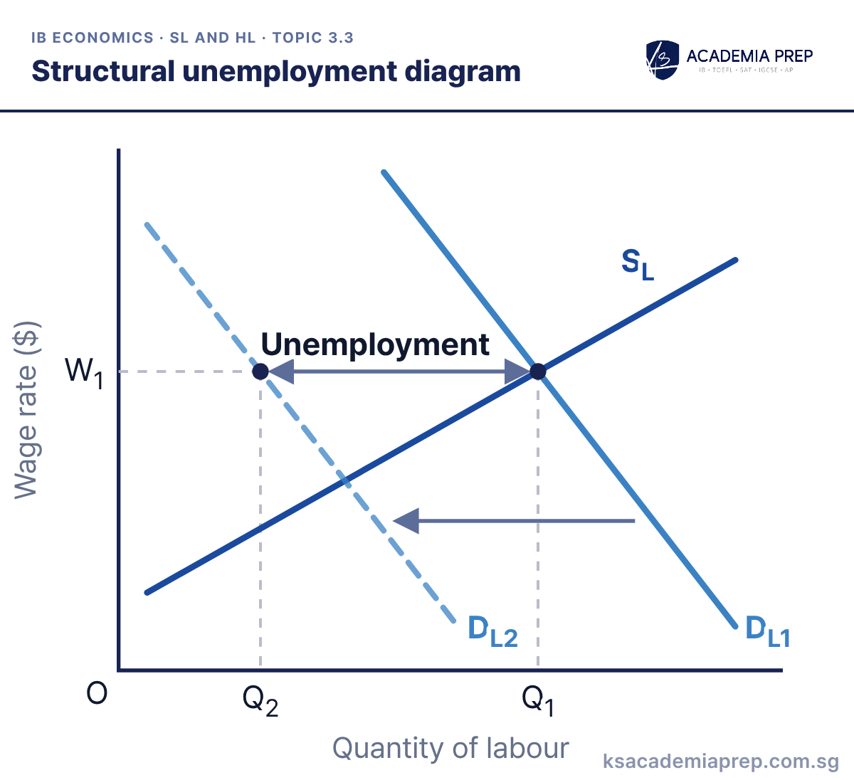
What it shows: Demand for labour in a particular industry or region falls from DL1 to DL2, for example because of new technology or a decline in the industry. If the wage stays at W1, firms hire only Q2 workers while Q1 still want work, so Q2 to Q1 are unemployed. These workers lack the skills or live in the wrong place for the jobs that exist, so the unemployment is structural.
How to draw it
Label the vertical axis Wage rate ($) and the horizontal axis Quantity of labour, with O at the origin.
Draw an upward-sloping SL and a downward-sloping DL1, then DL2 to the left of DL1.
Mark W₁ and Q₁ where DL1 meets SL, keep the wage at W₁, mark Q₂ on DL2, and label Q₂ to Q₁ Unemployment.
Explain why the workers cannot simply move to other jobs: a mismatch of skills or location. Paper 2: tie this to a named industry or region in the text, then suggest retraining or relocation support.
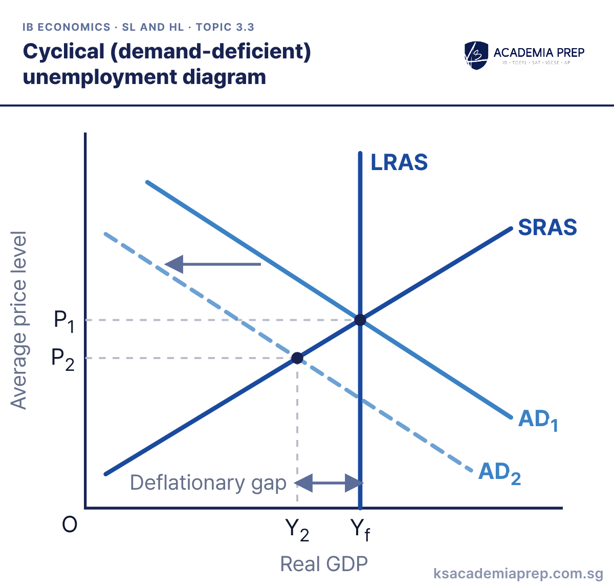
What it shows: A fall in AD from AD1 to AD2 cuts real GDP from Yf to Y2 and the price level from P1 to P2. Firms need fewer workers to produce the lower output, so unemployment rises above the natural rate. This extra unemployment is cyclical (demand-deficient) unemployment, and it matches the deflationary gap Y2 to Yf.
How to draw it
Label the vertical axis Average price level and the horizontal axis Real GDP, with O at the origin.
Draw a vertical LRAS and an upward-sloping SRAS, with AD₁ crossing both at Yf and AD₂ to the left of AD₁.
Mark P₁ and Yf at the first equilibrium, P₂ and Y₂ where AD₂ meets SRAS, and label Y₂ to Yf the Deflationary gap.
Link the output gap to jobs: labour is a derived demand, so less output means fewer workers. Paper 2: use it for recession data where unemployment rises as GDP growth turns negative.
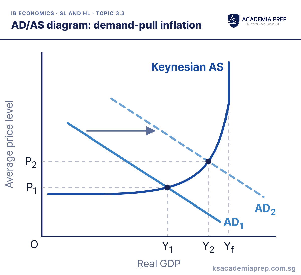
What it shows: Demand-pull inflation happens when AD grows faster than the economy's capacity to produce. AD shifts right from AD1 to AD2 into the rising section of Keynesian AS, where bottlenecks push up costs. The price level rises from P1 to P2 and real GDP rises from Y1 to Y2; the closer AD moves to Yf, the more of any further increase shows up as inflation rather than output.
How to draw it
Label the vertical axis Average price level and the horizontal axis Real GDP, with O at the origin.
Draw a Keynesian AS curve that turns vertical at Yf, then AD₁ and AD₂ both cutting its rising section.
Mark P₁ and Y₁ for AD₁ and P₂ and Y₂ for AD₂, keeping Y₂ below Yf so both the price level and real GDP rise.
Draw the shift into the rising section so both the price level and real GDP change. Paper 2: back it up with evidence of strong spending growth, such as rising consumer credit or a housing boom.
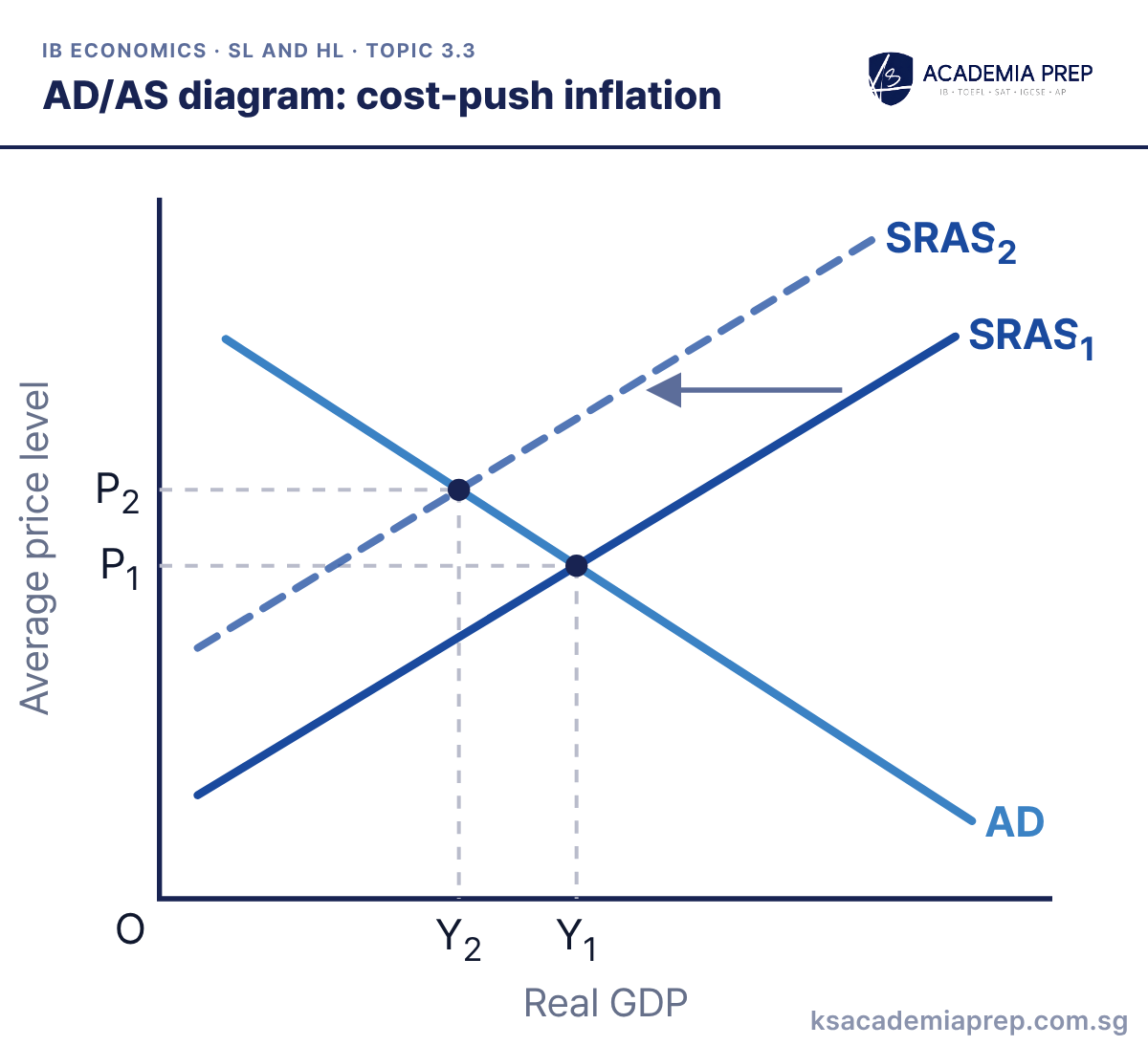
What it shows: Cost-push inflation starts on the supply side. Higher wages, oil or raw material prices, a weaker currency raising import costs, or higher indirect taxes shift SRAS left from SRAS1 to SRAS2. The price level rises from P1 to P2 while real GDP falls from Y1 to Y2, so inflation comes with rising unemployment (stagflation).
How to draw it
Label the vertical axis Average price level and the horizontal axis Real GDP, with O at the origin.
Draw a downward-sloping AD and an upward-sloping SRAS₁, then SRAS₂ to the left of SRAS₁.
Mark P₁ and Y₁ at the first equilibrium and P₂ and Y₂ at the second, showing Y₂ below Y₁ because output falls as prices rise.
Show output falling as well as prices rising; that is what separates cost-push from demand-pull. Paper 2: an oil or food price shock in the text is your cue, and note that raising interest rates would deepen the fall in output.
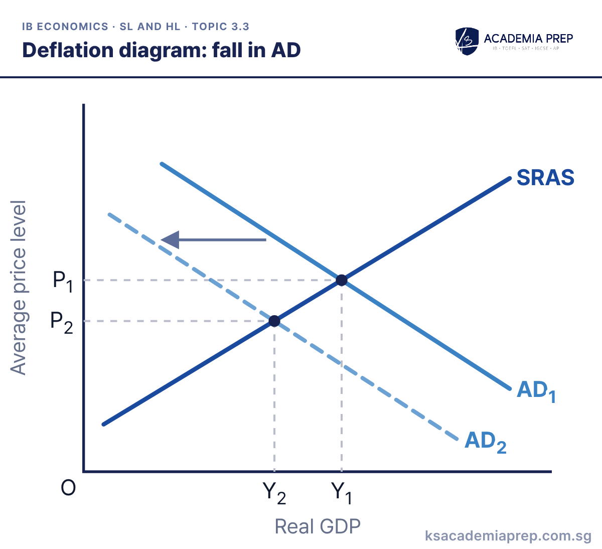
What it shows: A fall in consumption, investment, government spending or net exports shifts AD left from AD1 to AD2. The price level falls from P1 to P2 and real GDP falls from Y1 to Y2, so unemployment rises. This is harmful deflation: consumers delay spending while they expect prices to fall further, which can deepen the recession.
How to draw it
Label the vertical axis Average price level and the horizontal axis Real GDP, with O at the origin.
Draw an upward-sloping SRAS, then AD₁ and AD₂ to its left, with an arrow showing the shift.
Mark P₁ and Y₁ at the first equilibrium and P₂ and Y₂ at the second. Both are lower than before.
Deflation is a fall in the price level, not a fall in the inflation rate (that is disinflation). Paper 1: contrast this with deflation from a rise in AS to show that not all deflation is harmful.
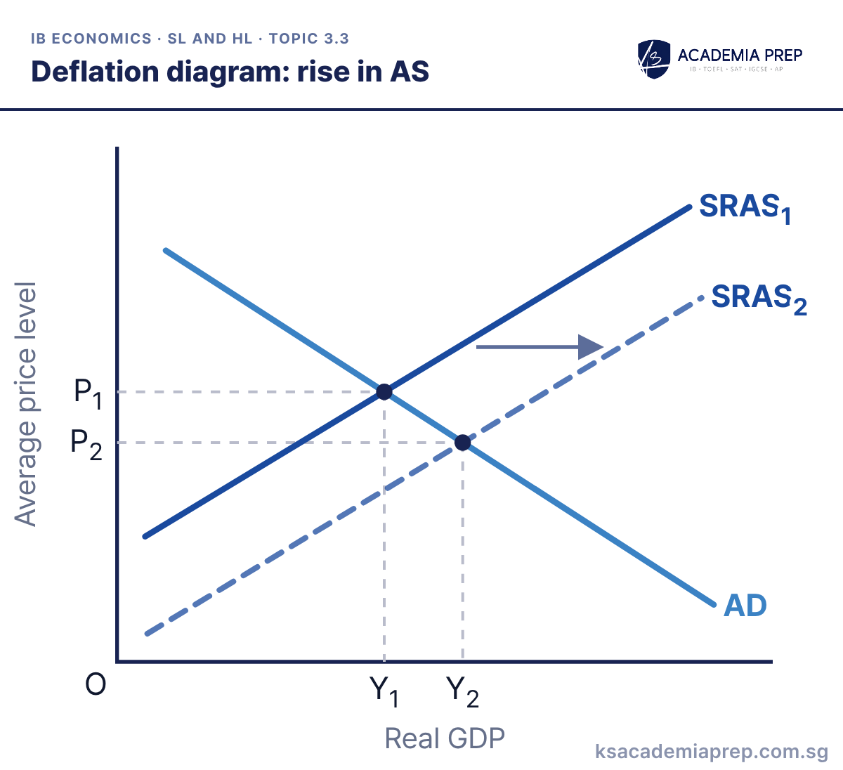
What it shows: Lower costs of production, for example cheaper energy or faster productivity growth from new technology, shift SRAS right from SRAS1 to SRAS2. The price level falls from P1 to P2 while real GDP rises from Y1 to Y2. This is often called good (benign) deflation, because output and employment grow as prices fall.
How to draw it
Label the vertical axis Average price level and the horizontal axis Real GDP, with O at the origin.
Draw a downward-sloping AD and an upward-sloping SRAS₁, then SRAS₂ to the right of SRAS₁.
Mark P₁ and Y₁ at the first equilibrium and P₂ and Y₂ at the second; P₂ is lower than P₁ but Y₂ is higher than Y₁.
Show real GDP rising; if it falls you have drawn deflation from a fall in AD instead. Paper 1: use it to evaluate whether deflation is always a problem.
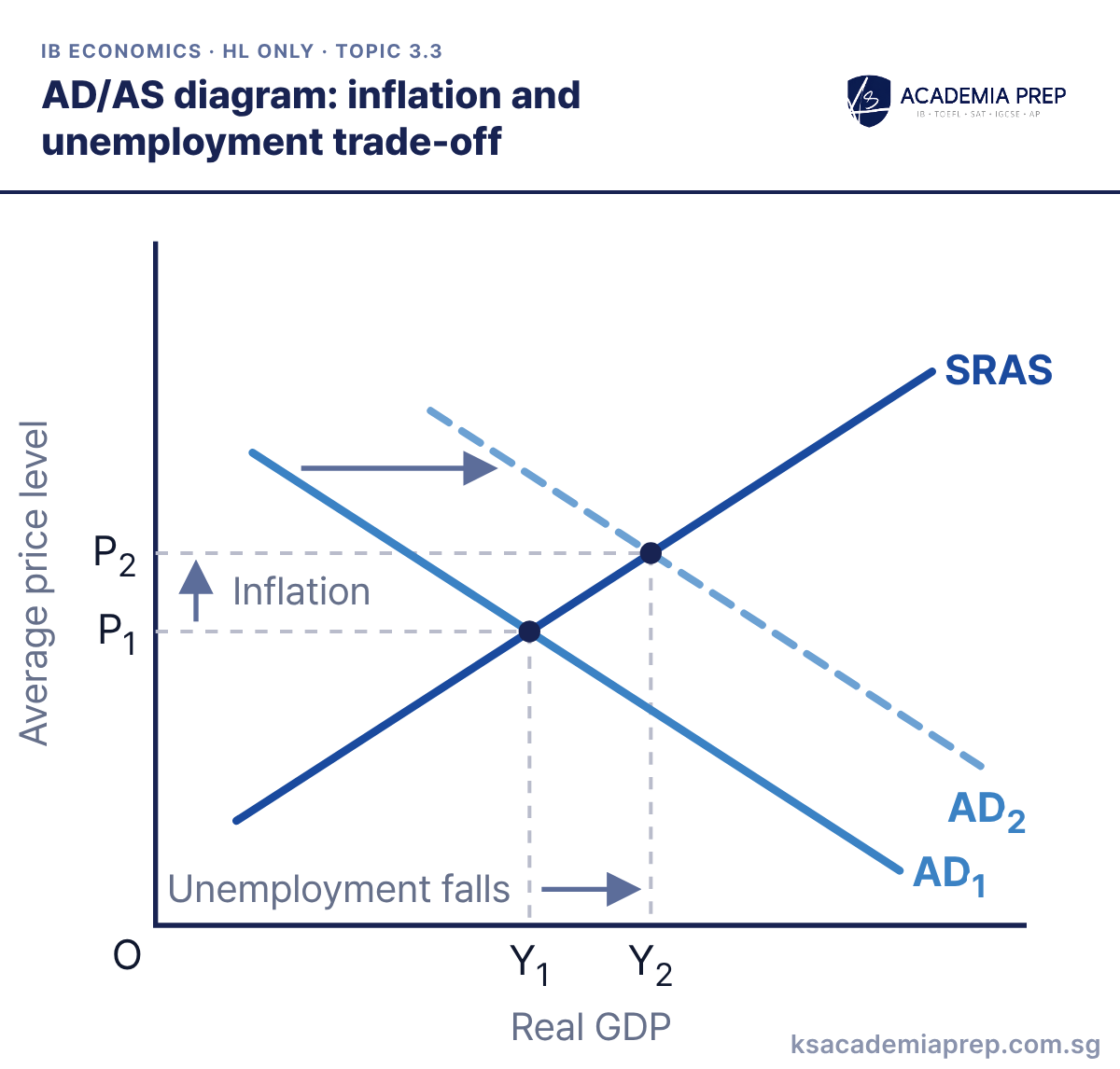
AD/AS diagram: inflation and unemployment trade-off
What it shows: AD shifts right from AD1 to AD2 along an upward-sloping SRAS curve. Real GDP rises from Y1 to Y2, so firms hire more workers and unemployment falls. But the price level also rises from P1 to P2, so lower unemployment comes at the cost of higher inflation. This is the AD/AS basis of the short-run Phillips curve.
How to draw it
Label the vertical axis Average price level and the horizontal axis Real GDP, with O at the origin.
Draw an upward-sloping SRAS, then AD₁ and AD₂ to its right, with an arrow showing the shift.
Mark P₁, Y₁, P₂ and Y₂, then label the rise in real GDP Unemployment falls and the rise in the price level Inflation.
Connect the two axes explicitly: higher real GDP means lower unemployment, higher price level means inflation. Paper 1: pair it with the short-run Phillips curve to show the same trade-off two ways.
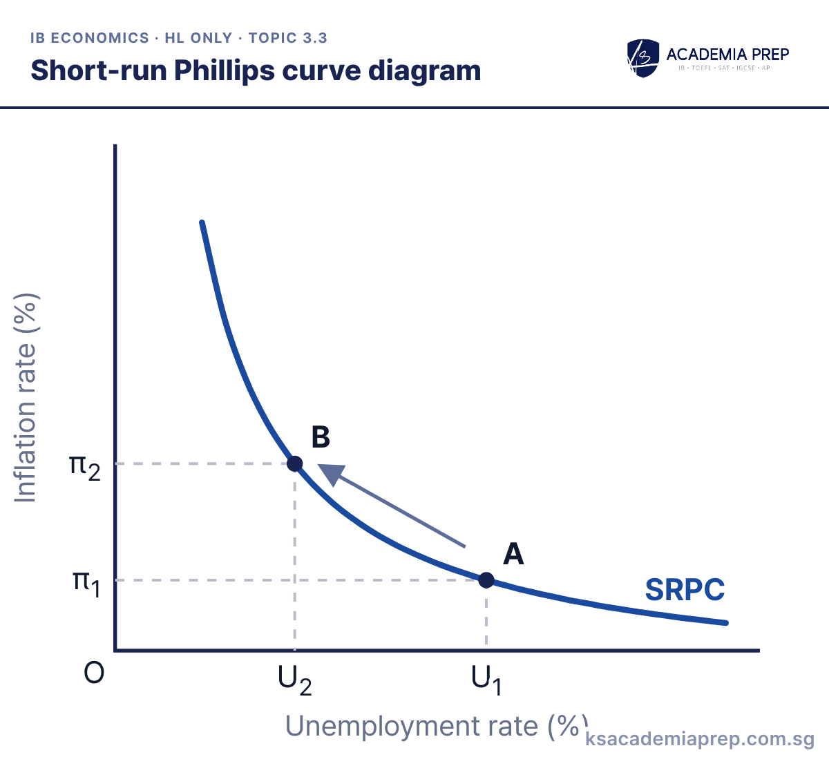
What it shows: The short-run Phillips curve (SRPC) shows an inverse relationship between the unemployment rate and the inflation rate. When AD rises, the economy moves from A to B: unemployment falls from U1 to U2 while inflation rises from π1 to π2. The curve is convex because pushing unemployment ever lower causes bigger rises in inflation as the labour market tightens.
How to draw it
Label the vertical axis Inflation rate (%) and the horizontal axis Unemployment rate (%); do not swap them.
Draw a downward-sloping, convex SRPC that is steep at low unemployment and flatter at high unemployment.
Mark A at U₁ and π₁ and B at U₂ and π₂, with dashed lines to both axes and U₂ to the left of U₁.
Put inflation on the vertical axis and unemployment on the horizontal axis; swapping them is a common slip. Paper 1: stagflation (both rising) shows the SRPC shifting, so the trade-off is not stable.
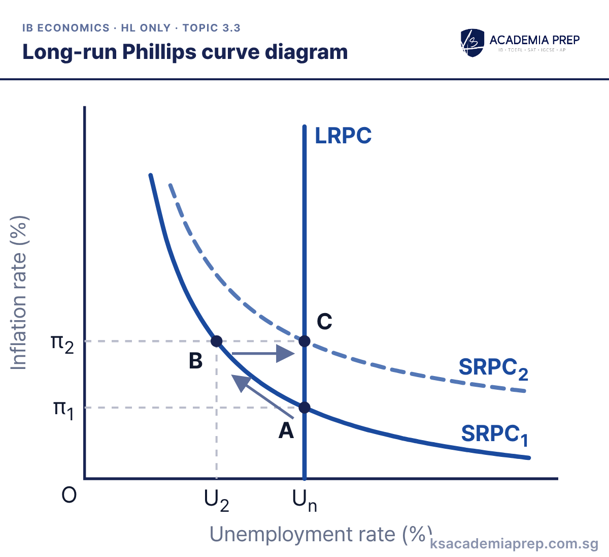
What it shows: The long-run Phillips curve (LRPC) is vertical at the natural rate of unemployment Un. Higher AD moves the economy from A to B on SRPC1, cutting unemployment to U2 and raising inflation to π2. Workers then expect inflation of π2 and push for higher wages, so SRPC shifts up to SRPC2 and unemployment returns to Un at C, with permanently higher inflation.
How to draw it
Label the vertical axis Inflation rate (%) and the horizontal axis Unemployment rate (%); do not swap them.
Draw a vertical LRPC at Un, then a downward-sloping SRPC₁ through it and a parallel SRPC₂ higher up.
Mark A on SRPC₁ at Un and π₁, B on SRPC₁ at U₂ and π₂, and C on SRPC₂ at Un and π₂, directly above A.
Label the curves SRPC1 and SRPC2, state the expected inflation rate each one assumes, and make C sit directly above A on the LRPC. Paper 1: use it to argue that demand-side policy cannot keep unemployment below the natural rate in the long run.
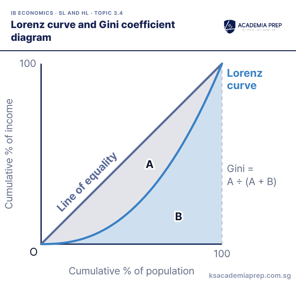
What it shows: The line of equality shows perfect equality, where each x% of the population receives x% of income. The Lorenz curve plots the actual cumulative share of income and sags below it. Area A lies between the two lines and area B lies under the Lorenz curve, so the Gini coefficient is A ÷ (A + B), from 0 (perfect equality) to 1 (perfect inequality).
How to draw it
Draw a square plot, labelling the vertical axis Cumulative % of income and the horizontal axis Cumulative % of population, both to 100.
Draw a straight Line of equality from O to the top corner, then a Lorenz curve sagging below it between the same two points.
Label the area between the two lines A and the area under the Lorenz curve B, then write Gini = A ÷ (A + B).
Draw the plot square, run both lines from O to (100, 100) and label both axes as cumulative percentages. Paper 1: compare two countries by drawing both curves; the one further from the diagonal has the higher Gini coefficient.
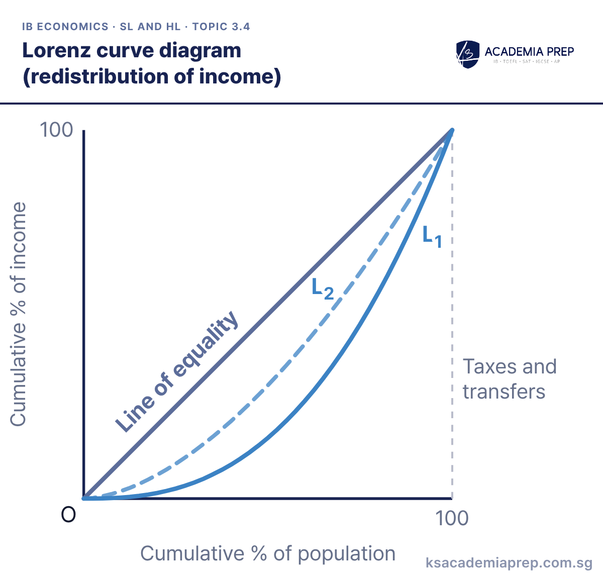
What it shows: Progressive income taxes and transfer payments take a larger share of income from the rich and give it to the poor. The Lorenz curve moves from L1 to L2, closer to the line of equality at every point. Area A shrinks, so the Gini coefficient falls and income is more equally distributed.
How to draw it
Label the axes Cumulative % of income and Cumulative % of population, both from O to 100.
Draw the Line of equality as a straight diagonal from O to (100, 100), then draw L₁ sagging well below it.
Draw L₂ between L₁ and the Line of equality and label the change Taxes and transfers. Keep both curves starting at O and ending at (100, 100).
The new curve must stay below the line of equality and still start at O and end at (100, 100). Paper 2: use it to show the effect of a redistribution policy named in the text, then evaluate its cost to incentives.
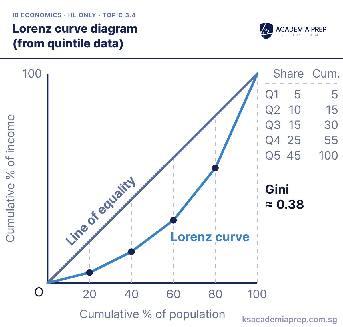
What it shows: The poorest to richest quintiles receive 5%, 10%, 15%, 25% and 45% of income. Adding them up gives cumulative shares of 5, 15, 30, 55 and 100, plotted against 20, 40, 60, 80 and 100% of the population. Splitting the area under the curve into five trapezia gives B ≈ 0.31, so A = 0.5 − 0.31 = 0.19 and the Gini coefficient is about 0.19 ÷ 0.5 ≈ 0.38.
How to draw it
Label the axes Cumulative % of income and Cumulative % of population, and mark 20, 40, 60, 80 and 100 on the population axis.
Add up the quintile shares to get cumulative values 5, 15, 30, 55 and 100, and draw the Line of equality from O to (100, 100).
Plot each cumulative point against its population share and join them from O as the Lorenz curve. Do not plot the raw quintile shares.
Plot cumulative shares, not the raw quintile shares, and join the points from O. Paper 3: you may be asked to plot the curve from a table and use it to compare inequality before and after a policy.
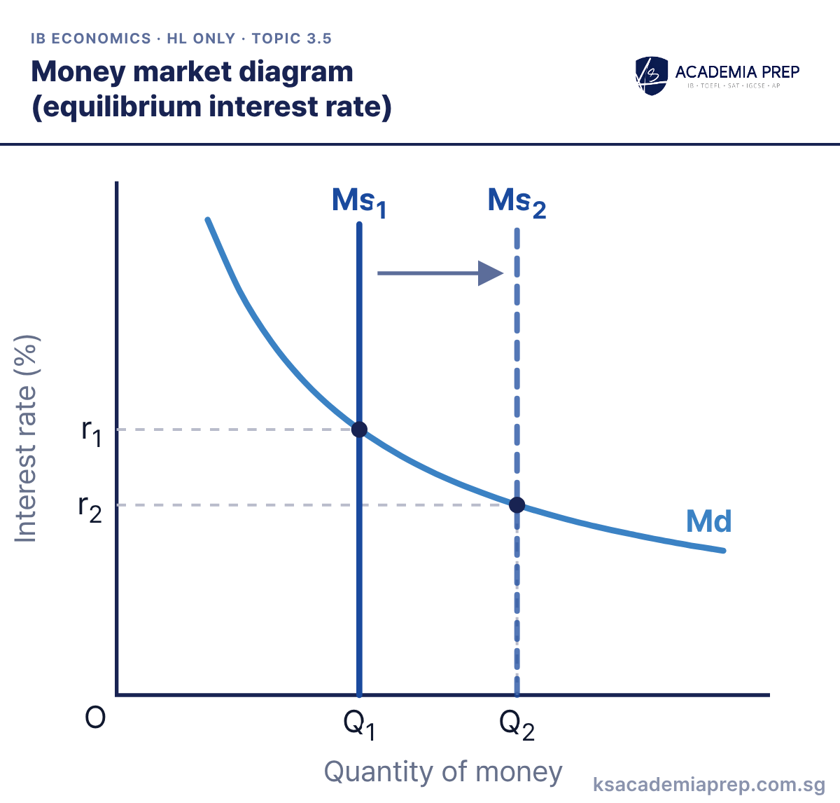
What it shows: The central bank sets the money supply, so Ms is vertical. Money demand (Md) slopes down because a lower interest rate lowers the opportunity cost of holding money. The equilibrium interest rate is r1 where Md meets Ms1. When the central bank increases the money supply to Ms2, the interest rate falls to r2 and the quantity of money rises from Q1 to Q2.
How to draw it
Label the axes Interest rate (%) and Quantity of money.
Draw Md sloping downwards and Ms₁ as a vertical line, because the central bank sets the money supply.
Mark r₁ and Q₁ with dashed lines, then draw Ms₂ to the right and mark the lower rate r₂ and Q₂. Never draw Ms upward sloping.
Draw Ms vertical, not upward sloping, because it does not depend on the interest rate. Paper 1: use it to explain how open market operations change the interest rate before moving to the AD/AS diagram.
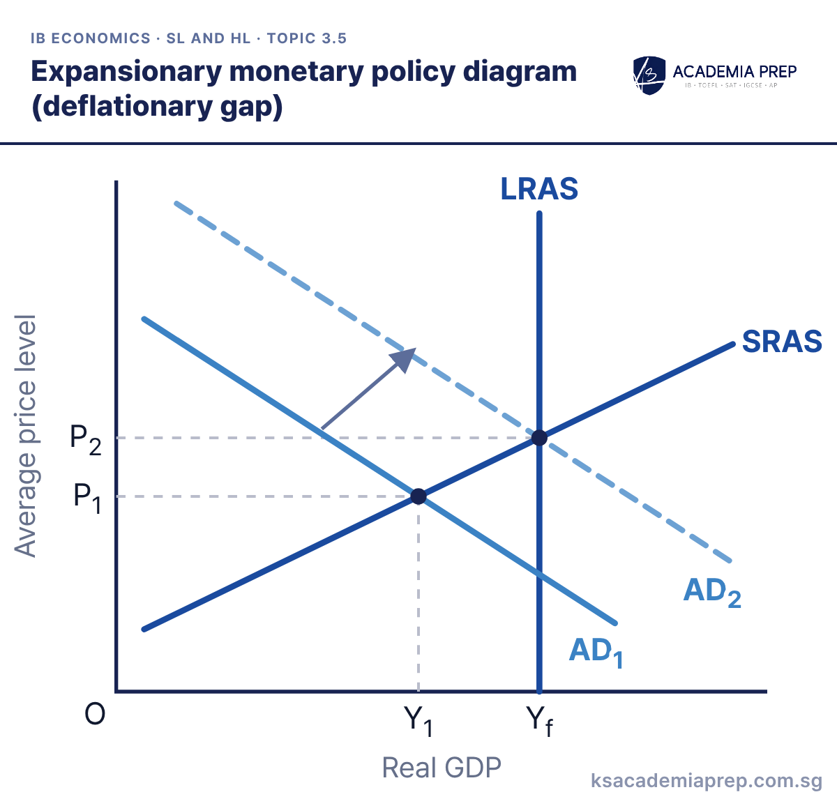
What it shows: The economy starts at Y1, below full employment output Yf, so there is a deflationary (recessionary) gap. The central bank cuts interest rates, which makes borrowing cheaper and raises consumption and investment. AD shifts right from AD1 to AD2, real GDP rises to Yf and the price level rises from P1 to P2.
How to draw it
Label the axes Average price level and Real GDP.
Draw a vertical LRAS at Yf, an upward-sloping SRAS, and AD₁ crossing SRAS to the left of LRAS at Y₁ and P₁.
Draw AD₂ to the right with an arrow, meeting SRAS on LRAS. Mark P₂ and Yf with dashed lines to show the gap closed.
Name the transmission route (lower interest rates, then higher C and I) before shifting AD. Paper 2: link the diagram to a rate cut in the text, then evaluate time lags and low business confidence.
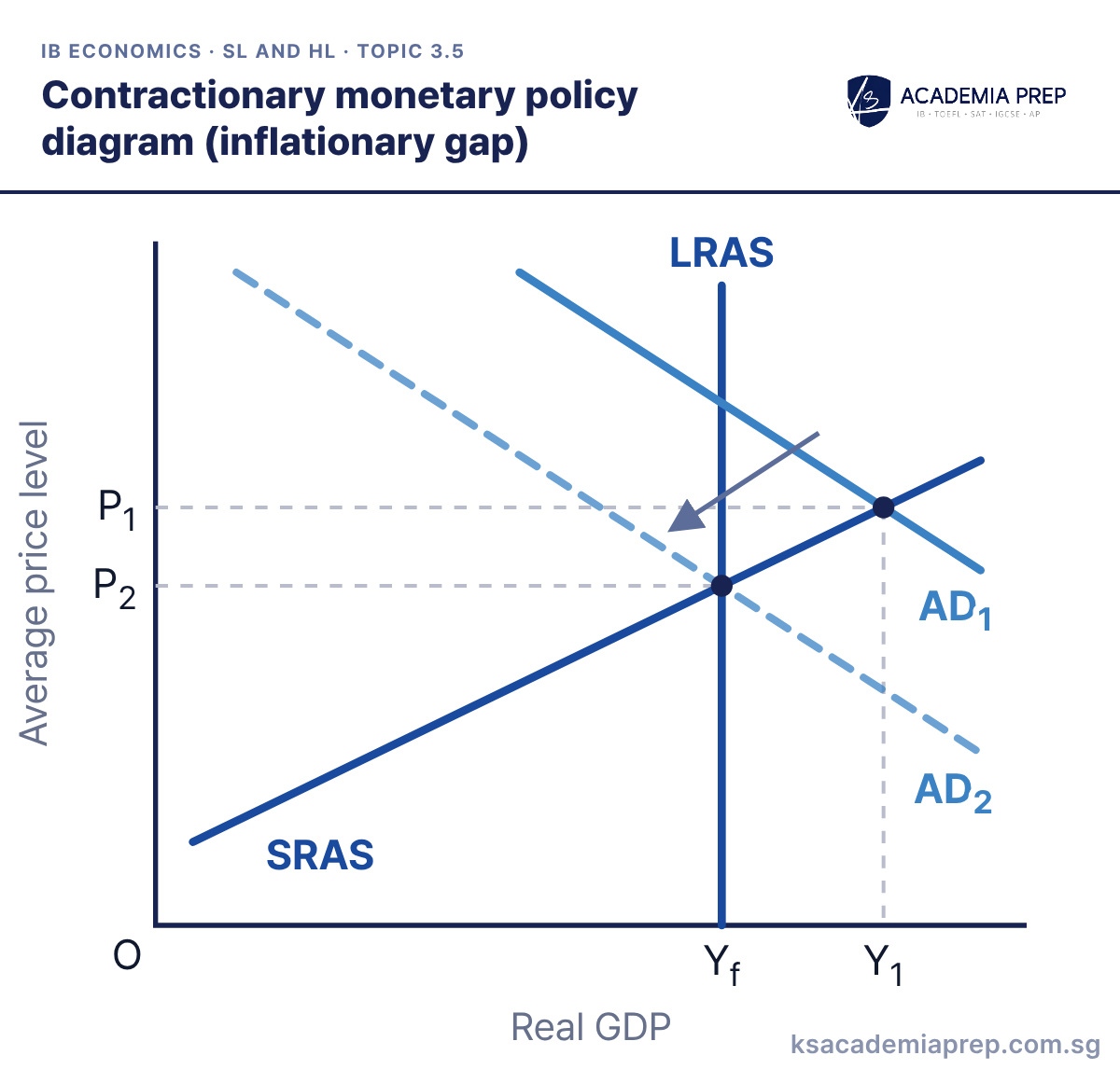
What it shows: The economy starts at Y1, above full employment output Yf, so there is an inflationary gap. The central bank raises interest rates, which makes borrowing dearer and rewards saving, so consumption and investment fall. AD shifts left from AD1 to AD2, real GDP falls back to Yf and the price level falls from P1 to P2.
How to draw it
Label the axes Average price level and Real GDP.
Draw a vertical LRAS at Yf, an upward-sloping SRAS, and AD₁ crossing SRAS to the right of LRAS at Y₁ and P₁.
Draw AD₂ to the left with an arrow, meeting SRAS on LRAS. Mark the lower price level P₂ and Yf with dashed lines.
Show the starting point to the right of LRAS so the gap is clearly inflationary. Paper 2: use it for questions on central banks raising rates to meet an inflation target.
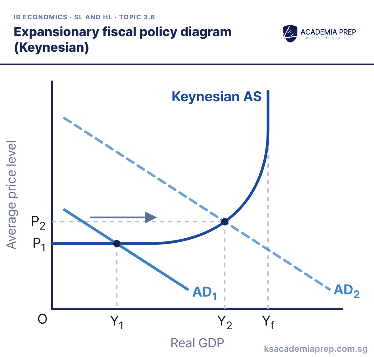
What it shows: The economy is in the horizontal section of Keynesian AS at Y1, with lots of spare capacity. Higher government spending or lower taxes shift AD right from AD1 to AD2. Real GDP rises from Y1 to Y2 while the price level rises only slightly from P1 to P2, because firms can use idle resources without bidding up costs.
How to draw it
Label the axes Average price level and Real GDP.
Draw Keynesian AS with a horizontal section, an upward-curving section and a vertical section at Yf.
Draw AD₁ and AD₂ crossing the flat or early curving part, then mark P₁, P₂, Y₁ and Y₂ with dashed lines. Keep AD₂ left of the vertical section.
Keep AD2 to the left of the vertical section, or the diagram shows inflation not growth. Paper 1: use it to argue that fiscal policy works best in a deep recession, and at HL add the multiplier to show the final rise in real GDP.
What it shows: Starting at Yf and P1, higher government spending shifts AD right from AD1 to AD2. In the short run real GDP rises above full employment output to Y2 and the price level rises to P2. Workers then demand higher wages, so SRAS shifts left from SRAS1 to SRAS2. In the long run output returns to Yf and only the price level is higher, at P3.
How to draw it
Label the axes Average price level and Real GDP. Draw a vertical LRAS at Yf.
Draw SRAS₁ and AD₁ meeting on LRAS at P₁, then shift AD to AD₂ and mark the short-run point Y₂ and P₂.
Draw SRAS₂ to the left so it meets AD₂ on LRAS, and mark P₃. Show both stages, not just the final point.
Show both stages: the short-run move along SRAS1, then the SRAS shift back to LRAS. Paper 1: contrast it with the Keynesian model to evaluate whether fiscal stimulus raises output for long.
What it shows: AD1 meets the vertical section of Keynesian AS, so the economy is at full employment output (Y1 = Yf) with a high price level P1 and inflationary pressure. Lower government spending or higher taxes shift AD left from AD1 to AD2. The price level falls sharply from P1 to P2 while real GDP falls only a little, from Yf to Y2.
How to draw it
Label the axes Average price level and Real GDP.
Draw Keynesian AS with horizontal, curving and vertical sections, and draw AD₁ meeting the vertical section at P₁ and Y₁ = Yf.
Draw AD₂ to the left with an arrow, meeting the steep part of AS. Mark P₂ well below P₁ and Y₂ just below Yf.
Start AD1 in the steep or vertical section; a cut in AD in the horizontal section only causes lost output. Paper 1: use it to evaluate austerity, since the output cost rises the further the economy is from Yf.
What it shows: Starting at Yf and P1, cuts in government spending or higher taxes shift AD left from AD1 to AD2. In the short run real GDP falls below full employment output to Y2 and the price level falls to P2. Unemployment pushes wages and costs down, so SRAS shifts right from SRAS1 to SRAS2. In the long run output returns to Yf and only the price level is lower, at P3.
How to draw it
Label the axes Average price level and Real GDP. Draw a vertical LRAS at Yf.
Draw SRAS₁ and AD₁ meeting on LRAS at P₁, then shift AD to AD₂ and mark the short-run point Y₂ and P₂.
Draw SRAS₂ to the right so LRAS, AD₂ and SRAS₂ meet at one point, and mark the lower price level P₃.
Make the long-run equilibrium lie on LRAS, AD2 and SRAS2 at the same point. Paper 1: use it to argue that the output cost of austerity is temporary if wages are flexible.
What it shows: A budget deficit financed by borrowing adds government demand to private demand, so demand for loanable funds shifts from D1 to D2. The real interest rate rises from r1 to r2. At the higher rate firms borrow only Q3 instead of Q1, so private investment falls by Q1Q3 while total borrowing rises to Q2.
How to draw it
Label the axes Real interest rate (%) and Quantity of loanable funds.
Draw SLF sloping upwards, D₁ (private) sloping downwards, and D₂ (private + govt) to the right of D₁.
Mark r₁ and Q₁, then r₂ and Q₂ with dashed lines. Read Q₃ off D₁ at r₂ and label Q₁Q₃ as Fall in private investment.
Label the fall in private borrowing on the original demand curve, not the new one. Paper 1: use it to evaluate expansionary fiscal policy, noting crowding out is weaker when the economy has spare capacity.
What it shows: Market-based policies such as labour market reform and deregulation, and interventionist policies such as spending on education and infrastructure, raise the quantity or quality of factors of production. Potential output rises from Yf1 to Yf2, so LRAS shifts right from LRAS1 to LRAS2 and SRAS shifts with it. Real GDP rises and the price level falls from P1 to P2. Interventionist spending also raises AD first, long before its supply-side effect arrives.
How to draw it
Label the axes Average price level and Real GDP.
Draw vertical LRAS₁ at Yf₁, SRAS₁ and AD meeting on LRAS₁ at P₁, then draw LRAS₂ at Yf₂ and SRAS₂ to the right.
Mark the new equilibrium on LRAS₂ at the lower price level P₂ with dashed lines. Shift LRAS itself, not only SRAS.
Shift LRAS itself, not only SRAS, because supply-side policy raises potential output. Paper 2: say which policy type the text describes and evaluate the long time lag before LRAS moves.
Best for: Paper 2Paper 1IA
Unit 4: The global economy
The global economy unit reuses demand and supply analysis for trade protection and exchange rates.
What it shows: Without trade the market clears at Pe and Qe. Opening to trade at the higher world price Pw raises domestic output to Q2 and cuts domestic consumption to Q1. The gap Q1Q2 is exported, so producers gain and domestic consumers lose.
How to draw it
Label the vertical axis Price ($) and the horizontal axis Quantity.
Draw Ddom and Sdom meeting at Pe and Qe, then draw a horizontal World price line at Pw above Pe.
Mark Q₁ where Pw meets Ddom and Q₂ where it meets Sdom, with dashed lines, and label the gap Q₁Q₂ as Exports.
The world price line is horizontal because a small country is a price taker. Paper 2: use it to show who gains and who loses when a country opens up to trade in its export good.
What it shows: Without trade the market clears at Pe and Qe. At the lower world price Pw, domestic output falls to Q1 while consumption rises to Q2. The gap Q1Q2 is imported, so consumers gain and domestic producers lose.
How to draw it
Label the vertical axis Price ($) and the horizontal axis Quantity.
Draw Ddom and Sdom meeting at Pe and Qe, then draw Sworld as a horizontal line at Pw below Pe.
Mark Q₁ where Pw meets Sdom and Q₂ where it meets Ddom, with dashed lines, and label the gap Q₁Q₂ as Imports.
Draw Sworld as a horizontal line below Pe: world supply is perfectly elastic at Pw. Paper 2: this is the starting diagram for every tariff, quota and subsidy question.
What it shows: Country A gives up 3 cloth for each unit of wheat, while country B gives up only 0.5 cloth, so B has the comparative advantage in wheat and A in cloth. A specialises in 9 cloth and B in 8 wheat, then they trade at 1 wheat for 1 cloth, which lies between the two opportunity costs. A consumes at CA (2 wheat, 7 cloth) and B at CB (6 wheat, 2 cloth), both beyond their own PPCs.
How to draw it
Label the axes Cloth (units) and Wheat (units).
Draw PPCA as a straight line from 9 cloth to 3 wheat, and PPCB from 4 cloth to 8 wheat.
Show the trade at 1 wheat for 1 cloth and mark CA (2 wheat, 7 cloth) and CB (6 wheat, 2 cloth), both outside their own PPCs.
Show the terms of trade lying between the two opportunity costs, or there are no gains. Paper 3: calculate each country’s opportunity cost from the PPC intercepts and the gain in consumption from trade.
What it shows: A tariff raises the price of imports from Pw to Pw + t. Domestic output rises from Q1 to Q2, consumption falls from Q4 to Q3, and imports shrink to Q2Q3. The government collects the tariff revenue rectangle; the two grey triangles are the welfare loss.
How to draw it
Label the vertical axis Price ($) and the horizontal axis Quantity.
Draw Ddom and Sdom, then Sworld as a horizontal line at Pw and Sworld + tariff as a horizontal line at Pw + t.
Mark Q₁ to Q₄ with dashed lines, shade the Tariff revenue rectangle between Q₂ and Q₃, and shade the two welfare loss triangles.
Label imports before and after the tariff. Paper 3: calculate revenue as t × (Q3 − Q2) and each welfare-loss triangle as ½ × base × height.
What it shows: The quota caps imports, so total supply becomes domestic supply plus the fixed quota (Sdom + quota), and the price rises from Pw to Pq. Domestic output rises from Q1 to Q2, consumption falls from Q4 to Q3, and imports shrink to the quota Q2Q3. The rectangle is quota rent earned by foreign exporters or licensed domestic importers, not the government; the two grey triangles are the welfare loss.
How to draw it
Label the vertical axis Price ($) and the horizontal axis Quantity.
Draw Ddom, Sdom and Sworld at Pw. Draw Sdom + quota parallel to Sdom, starting at Pw, the quota's width to the right.
Mark Pq where Sdom + quota meets Ddom, mark Q₁ to Q₄, shade the Quota rent rectangle and the two welfare loss triangles.
Start Sdom + quota at Pw, the quota’s width to the right of Sdom, and keep it parallel. Paper 3: compare with a tariff: the same rectangle is government revenue under a tariff but quota rent under a quota.
What it shows: A subsidy of s per unit shifts domestic supply right to Sdom + s, so domestic firms, now receiving Pw + s, raise output from Q1 to Q2. Consumers still pay Pw and buy Q3, so imports fall from Q1Q3 to Q2Q3. The government pays s × Q2 (the shaded rectangle), and the grey triangle is the welfare loss from producing at a higher cost than the world price.
How to draw it
Label the vertical axis Price ($) and the horizontal axis Quantity.
Draw Ddom, Sdom and Sworld at Pw, then draw Sdom + s to the right of Sdom by the subsidy per unit.
Mark Q₁, Q₂ and Q₃, shade the Subsidy cost rectangle between Pw and Pw + s up to Q₂, and shade one welfare loss triangle.
Consumption does not change, so there is only one welfare-loss triangle, unlike a tariff. Paper 3: calculate the subsidy cost as s × Q2 and the fall in imports as Q2 − Q1.
What it shows: Exporters now earn Pw + s on each unit sold abroad, so they will only sell at home for that price and the domestic price rises by the full subsidy. Domestic consumption falls from Q1 to Q3, output rises from Q2 to Q4, and exports grow from Q1Q2 to Q3Q4. The government pays s × Q3Q4 (the shaded rectangle); the two grey triangles are the welfare loss.
How to draw it
Label the vertical axis Price ($) and the horizontal axis Quantity.
Draw Ddom and Sdom, then horizontal lines at Pw and at the higher price Pw + s.
Mark Q₁ and Q₂ at Pw, then Q₃ and Q₄ at Pw + s. Shade the Subsidy cost rectangle over Q₃Q₄ and the two welfare loss triangles.
Domestic consumers lose here because they pay more, which students often miss. Paper 3: calculate the subsidy cost as s × (Q4 − Q3) and the welfare loss as the two triangles.
What it shows: Demand for S$ comes from foreigners buying Singapore’s exports, inward FDI and portfolio investment, and remittances sent into Singapore. Supply of S$ comes from Singapore residents buying imports and investing abroad. The floating rate settles at ERe, where the quantity of S$ demanded equals the quantity supplied at Qe. In practice the Monetary Authority of Singapore (MAS) manages the S$ within a band, so this diagram shows how the rate would be set if it floated freely.
How to draw it
Label the axes Price of S$ (US$ per S$) and Quantity of S$.
Draw DS$ sloping downwards and SS$ sloping upwards, and label both.
Mark the equilibrium exchange rate ERe and quantity Qe with dashed lines.
Label the axes with the price of one currency in terms of the other, not just "price". Paper 1: list the sources of demand and supply before shifting either curve.
What it shows: Higher demand for S$, for example from rising exports, more inward investment or higher Singapore interest rates attracting hot money, shifts demand from D1 to D2. The S$ appreciates from ER1 to ER2, and the quantity traded rises from Q1 to Q2.
How to draw it
Draw D₁ and S for S$ on axes labelled Price of S$ (US$ per S$) and Quantity of S$, then mark ER₁ and Q₁.
Draw D₂ to the right of D₁ with an arrow.
Mark the new equilibrium ER₂ and Q₂, above and to the right of ER₁ and Q₁. The S$ has appreciated.
Name the specific cause of the shift and say which curve moves. Paper 2: link the stronger S$ to cheaper imports and lower imported inflation.
What it shows: More S$ are supplied when Singapore residents buy more imports or invest more abroad, or when lower Singapore interest rates push money out. Supply shifts from S1 to S2, so the S$ depreciates from ER1 to ER2 and the quantity traded rises from Q1 to Q2.
How to draw it
Draw D and S₁ for S$ on axes labelled Price of S$ (US$ per S$) and Quantity of S$, then mark ER₁ and Q₁.
Draw S₂ to the right of S₁ with an arrow. Do not shift it left.
Mark the new equilibrium ER₂, below ER₁, and Q₂ with dashed lines. The S$ has depreciated.
A rightward supply shift lowers the exchange rate; students often shift it the wrong way. Paper 2: follow through to dearer imports and more competitive exports.
What it shows: A weaker currency makes exports cheaper abroad and imports dearer at home, so net exports rise and AD shifts from AD1 to AD2. Dearer imported raw materials raise firms’ costs, which may shift SRAS from SRAS1 to SRAS2. The price level rises from P1 to P2; real GDP rises from Y1 to Y2 if the AD effect is larger. An appreciation has the opposite effects: net exports fall, AD shifts left and cheaper imports lower costs.
How to draw it
Label the axes Average price level and Real GDP.
Draw AD₁ and SRAS₁ meeting at P₁ and Y₁, then draw AD₂ to the right and SRAS₂ a smaller distance to the left.
Mark the new equilibrium P₂ and Y₂ with dashed lines. P₂ is above P₁ either way; Y₂ exceeds Y₁ only if the AD shift is larger.
Say that the output effect depends on which shift is larger, but inflation rises either way. Paper 1: use it to evaluate a deliberate depreciation for a country that imports most of its raw materials.
What it shows: The currency is pegged at the fixed rate ERf. A rise in supply from S1 to S2 would push the rate down to ER2. To defend the peg, the central bank buys its own currency with foreign reserves or raises interest rates, shifting demand from D1 to D2. The market clears again at ERf, now with Q3 traded.
How to draw it
Label the axes Price of S$ (US$ per S$) and Quantity of S$. Draw the Fixed rate as a horizontal line at ERf.
Draw D₁ and S₁ meeting at ERf and Q₁, then draw S₂ to the right and mark the pressure point ER₂ and Q₂.
Draw D₂ to the right so it meets S₂ at ERf, and mark Q₃. This shows the central bank buying its own currency.
Show the pressure point ER2 and then the intervention that cancels it. Paper 1: evaluate the peg by noting that reserves run out and higher interest rates hurt domestic growth.
What it shows: The central bank lets the rate float between an upper and a lower limit, starting at ER1 and Q1. When demand rises from D1 to D2, the rate would climb to ER2, above the upper limit. The central bank sells its own currency, shifting supply from S1 to S2, so the rate stays at the upper limit with Q2 traded; at the lower limit it would buy instead.
How to draw it
Label the axes Price of S$ (US$ per S$) and Quantity of S$. Draw the Upper limit and Lower limit as horizontal lines.
Draw D₁ and S₁ meeting at ER₁ and Q₁ inside the band, then draw D₂ to the right and mark ER₂ above the Upper limit.
Draw S₂ to the right so it meets D₂ on the Upper limit, and mark Q₂. Only intervene when a limit is breached.
Draw both limits as horizontal lines and only intervene when a limit is breached. Paper 2: Singapore’s MAS manages the S$ within an undisclosed band, a good real-world example.
What it shows: When spending on imports grows faster than export earnings, residents supply more S$ to buy foreign currency, shifting supply from S1 to S2. At the old rate ER1 the quantity supplied (Q3) exceeds the quantity demanded (Q1). Under a floating system the S$ depreciates to ER2, which makes exports cheaper and imports dearer and helps narrow the deficit.
How to draw it
Label the axes Price of S$ (US$ per S$) and Quantity of S$.
Draw DS$ and S₁ meeting at ER₁ and Q₁, then draw S₂ to the right with an arrow.
Mark Q₃ on S₂ at ER₁ and label Q₁Q₃ as Excess supply, then mark the new equilibrium ER₂ and Q₂ with dashed lines.
Tie the current account to the currency market: imports supply the currency, exports demand it. Paper 1: use it to explain why a persistent deficit puts downward pressure on the exchange rate.
What it shows: Straight after a depreciation, import and export volumes barely change because contracts are fixed and buyers take time to switch, so dearer imports make the current account deficit worse. Over time demand becomes more price elastic, and once PEDx + PEDm > 1 (the Marshall-Lerner condition) export earnings rise and import spending falls. The balance then improves, crosses zero and moves towards surplus, tracing the J shape.
How to draw it
Label the vertical axis Current account balance and the horizontal axis Time, with 0 in the middle, Surplus above and Deficit below.
Mark the point of Depreciation on the curve, then draw the curve dipping down first and label the dip Deficit worsens.
Draw the curve rising, crossing 0 into surplus, and label PEDx + PEDm > 1 and J-curve. Do not put the exchange rate on the horizontal axis.
Put time, not the exchange rate, on the horizontal axis and start the dip at the depreciation. Paper 1: use it to evaluate depreciation as a cure for a deficit, since the short run makes it worse.
What it shows: Low incomes leave little to save, so there are few funds for investment in physical capital. Low investment keeps productivity low, which keeps incomes low and closes the loop. Low incomes also limit spending on health and education, so human capital stays low and productivity cannot rise.
How to draw it
Write Low incomes, Low saving, Low investment and Low productivity around a circle, in that order.
Join them with arrows so Low productivity leads back to Low incomes and the loop is closed.
Add Low human capital (health, education) as a branch from Low incomes to Low productivity.
Show the loop as a closed circle and say where a policy breaks it, such as aid, microcredit or spending on education. Paper 1: use it to explain why poverty persists without outside intervention.
Best for: Paper 1Paper 2
What IB Economics students say
★★★★★Rated 5.0 on Google
Showing 3 Google reviews from IB Economics students, as published and in the language they were written. All three name a 7 in IB Economics.
Google review
“The best econs tuition you can find in Singapore. I started taking lessons from here since IGCSE econs all the way upto IB econs. I successfully managed to gain both a 7 in HL econs and A for econs extended essay.”
정유찬 · 18 July 2026Google review
“Taking classes from Jason tutor was an amazing experience. He focuses on both the intuitive understanding of economic concepts and the practical methods to score high marks in the actual exam. Thanks for Jason, I was able to get a 7 for economics on the IB Final exam.”
JiHo JEONG · 21 July 2026Google review · 中文
“在KS Academia Prep的学习体验真的非常棒!Jason老师的教学方法特别有帮助。他教给我的论文结构、答题技巧、IA写作方法和高效记忆法,让我在IB HL经济中拿到了7分。”
By our count, the IB Economics guide (first assessment 2022) lists 108 diagrams across its four units: 81 for both SL and HL, and 27 for HL only. This page also includes three extension diagrams that are useful for evaluation but are not named in the guide, and each is clearly marked.
Which IB Economics diagrams are HL only?
All the market structure diagrams in 2.11 and the inequality circular flow in 2.12, plus PED along a straight-line demand curve, the Phillips curves and the AD/AS trade-off, constructing a Lorenz curve from data, the money market, crowding out, comparative advantage on linear PPCs, the current account and exchange rate, and the J-curve. Use the “SL only” filter above to hide them.
How do you draw a tariff diagram for IB Economics?
Label the axes Price ($) and Quantity, and draw domestic demand and supply. Draw world supply as a horizontal line at the world price, then a second horizontal line above it at the world price plus the tariff. Mark the four quantities where the two lines meet domestic supply and demand, shade the tariff revenue rectangle between the middle two, and shade the two welfare loss triangles on either side.
How do you draw a monopoly diagram for IB Economics HL?
Label the axes Costs, revenue ($) and Output. Draw a downward-sloping AR = D, an MR curve twice as steep that starts at the same point on the vertical axis, and a U-shaped AC with MC cutting it at its lowest point. Find the profit-maximising output where MC = MR, go up to AR for the price and to AC for the average cost, and shade the rectangle between them as abnormal profit.
What is the difference between the Keynesian and monetarist AS diagrams?
The monetarist/new classical model has an upward-sloping SRAS and a vertical LRAS at full employment output, so the economy returns to full employment on its own. The Keynesian AS curve is one curve that is horizontal when there is spare capacity, rises as bottlenecks appear and becomes vertical at full employment, so a deflationary gap can persist. IB questions often reward showing both.
How do you show a negative externality of production on a diagram?
Draw MPB = MSB = D sloping down and MPC = S sloping up, then draw MSC above MPC. The market produces where MPC meets demand (Qm), but the social optimum is where MSC meets demand (Qopt), so there is overproduction. Shade the welfare loss triangle between Qopt and Qm.
Do I need diagrams in Paper 1 and Paper 2?
Yes. The top markbands for Paper 1 parts (a) and (b) and for Paper 2 part (g) require relevant diagrams that are included and fully explained, and several Paper 2 parts ask you directly to draw an appropriately labelled diagram.
Which diagrams matter most for Paper 3?
The ones you calculate from: consumer and producer surplus, taxes, subsidies and price controls, welfare loss, tariffs and quotas, constructing a Lorenz curve, and comparative advantage. The cards with a Paper 3 tag show which diagrams to practise with numbers.
Do diagrams count towards the IA word limit?
No. Diagrams, labels of five words or fewer and diagram headings of ten words or fewer are excluded from each 800-word commentary. Criterion A awards up to 3 marks for relevant, accurate, correctly labelled diagrams with a full explanation. See our IB Economics IA guide.
When are the November 2026 IB Economics exams?
Paper 2 is on Tuesday 10 November 2026 in the afternoon. Paper 1, and Paper 3 for HL students, are on Wednesday 11 November 2026 in the morning. Always confirm the times with your school. Our IB exam calendar also lists the May 2027 dates.
Is there a new IB Economics syllabus for 2027?
No. The November 2026 and May 2027 papers are both set on the guide for first assessment 2022, which this page follows.
Can I download these diagrams?
Yes. You can download every diagram in one PDF, save any single diagram as an image, or download all 111 diagrams as a ZIP file of images. They are free for personal revision.
Where can I get IB Economics tuition in Singapore?
KS Academia Prep teaches IB Economics at SL and HL at Far East Shopping Centre, #15-06, 545 Orchard Road, with online places for students outside Singapore. Classes are capped at eight students, and lessons are available in English, Mandarin and Korean. See our IB Economics tuition page or message us on WhatsApp at +65 8129 8782.
Next steps
Once you can draw every diagram from memory, practise explaining each one in a full answer: our complete guide to IB Economics covers how Papers 1, 2 and 3 are structured, and the IA guide shows how to use diagrams in your commentaries. Use the IB points calculator to see what your Economics grade means for your total.

 By Kirby Ng, Lead IGCSE Economics Tutor at KS Academia Prep, who also teaches IB Economics at SL and HL · Updated 6 October 2026