By Kirby Ng, Lead IGCSE Economics Tutor at KS Academia Prep · Updated 6 October 2026
Every diagram the Cambridge IGCSE Economics 0455 syllabus asks you to draw and interpret, with what each one shows and the labelling mistakes that cost marks. If you would like one-to-one help drawing and explaining them, see our IGCSE Economics tuition in Singapore.
There are 42 diagrams on the 2027 to 2029 syllabus, plus 1 extension diagram that is clearly marked. In the exam, Paper 1 may ask you to analyse diagrams in its multiple-choice questions, and Paper 2 may ask you to draw them.
Original curveNew or shifted curveGovernment price or wage control
How diagrams are marked
I tell students in my IGCSE Economics classes that diagram marks are free marks: once you can draw a diagram properly, it gives you a reliable 4-mark boost. Most diagram questions are worth 4 marks, often with an extra mark for a short explanation. 6-mark diagram questions are rarer.
In Cambridge’s 2027 specimen Paper 2, Question 1(d) asks you to draw a demand and supply diagram for 4 marks. The mark scheme gives one mark each for:
correctly labelled axes
the original demand and supply curves, labelled
the new curve, shifted in the right direction
both equilibria shown, with dashed lines or marked points
For that question, the mark scheme states that no marks are awarded for written analysis. When a question only says draw, spend your time on the diagram, not on paragraphs.
The slips we see most often in students’ practice answers: shifting the wrong curve, or shifting both; drawing two diagrams when one is asked for; and labelling the axes with something from the question, such as tax, instead of price and quantity (or wage rate and quantity of labour in a labour market).
Free for personal revision. Download the full page as a PDF, all 42 syllabus diagrams plus the extension as images, or tap “Save image” on any diagram.
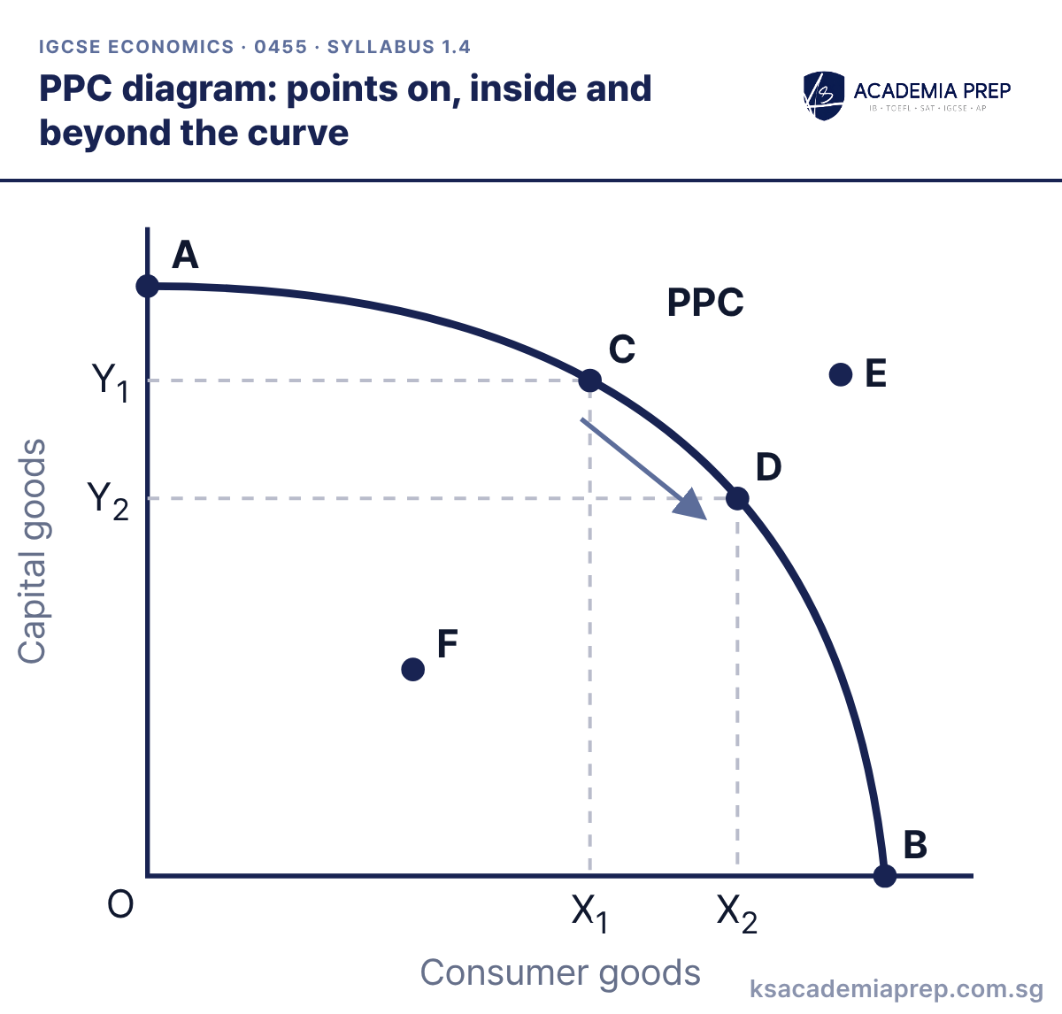
PPC diagram: points on, inside and beyond the curve
What it shows: A–D lie on the PPC, so all resources are fully and efficiently used. F lies inside the curve, so some resources are unemployed. E lies beyond the curve and is unattainable with current resources and technology. Moving from C to D gains X₁X₂ consumer goods at an opportunity cost of Y₁Y₂ capital goods. For a fuller explanation of scarcity, choice and opportunity cost, read the basic economic problem explained.
How to draw it
Label the axes with the two goods, e.g. capital goods and consumer goods.
Draw one curve bowed out from the origin that meets both axes, and label it PPC.
Mark points on the curve (A to D), one inside it (F) and one beyond it (E). Show the opportunity cost of moving from C to D with dashed lines to both axes.
Label the axes with the two goods, never price and quantity.
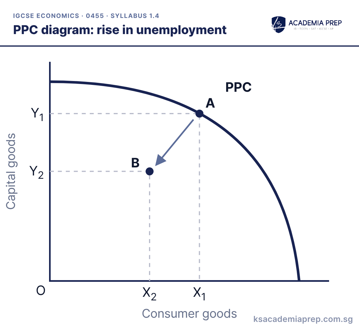
What it shows: A rise in unemployment moves the economy from point A on the PPC to point B inside it. Output of both goods falls (Y₁ to Y₂ and X₁ to X₂) because some resources are now unused, but the economy’s productive capacity has not changed, so the PPC stays where it is.
How to draw it
Draw and label one PPC.
Mark point A on the curve and point B inside it.
Draw an arrow from A to B and dashed lines showing output of both goods falling. Do not draw a second curve.
Do not shift the PPC inwards for unemployment. Only a fall in the quantity or quality of resources shifts the curve. This distinction has been tested in Paper 2, as our past paper question breakdown shows.
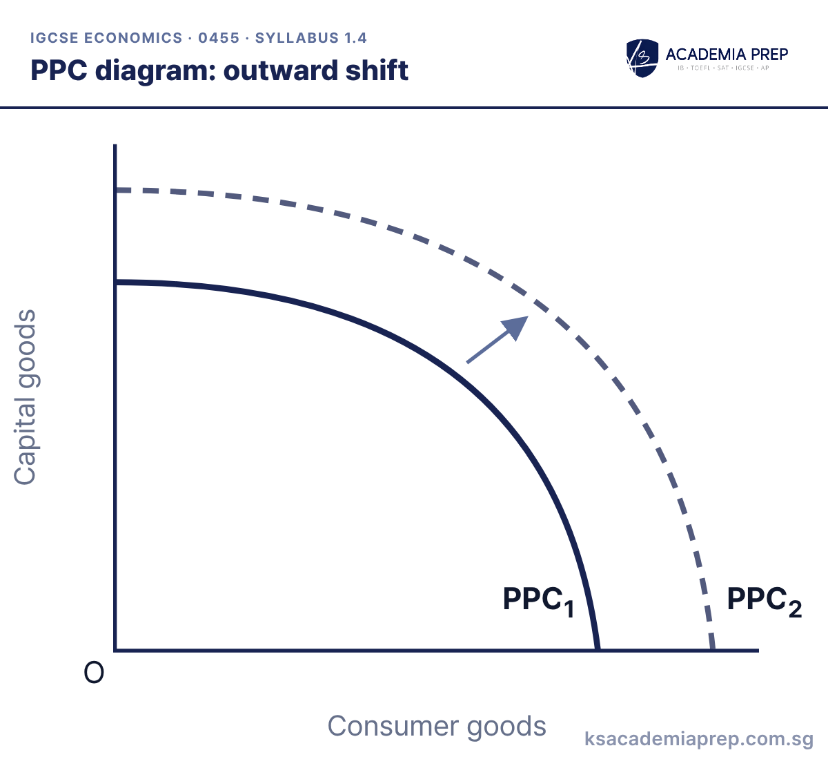
What it shows: An outward shift from PPC₁ to PPC₂ shows economic growth: the economy can now produce more of both goods. It is caused by an increase in the quantity or quality of resources, e.g. more workers, more capital goods, better education and training, or improved technology.
How to draw it
Draw the original curve and label it PPC₁.
Draw a second curve further from the origin, meeting both axes, and label it PPC₂.
Add an arrow pointing outwards between the two curves.
Shift the whole curve outwards and label both curves. Moving a single point is not a shift.
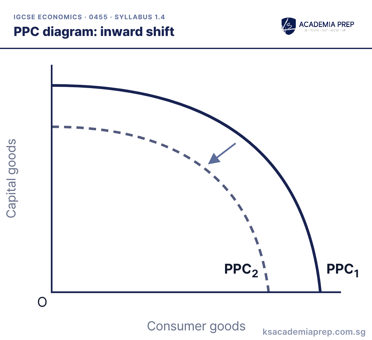
What it shows: An inward shift from PPC₁ to PPC₂ shows a fall in the economy’s productive capacity, e.g. after a natural disaster, a war, emigration of workers or the depletion of natural resources.
How to draw it
Draw the original curve and label it PPC₁.
Draw a second curve closer to the origin, meeting both axes, and label it PPC₂.
Add an arrow pointing inwards between the two curves.
A move from a point on the curve to a point inside it (e.g. a recession raising unemployment) is not an inward shift, because capacity has not changed.
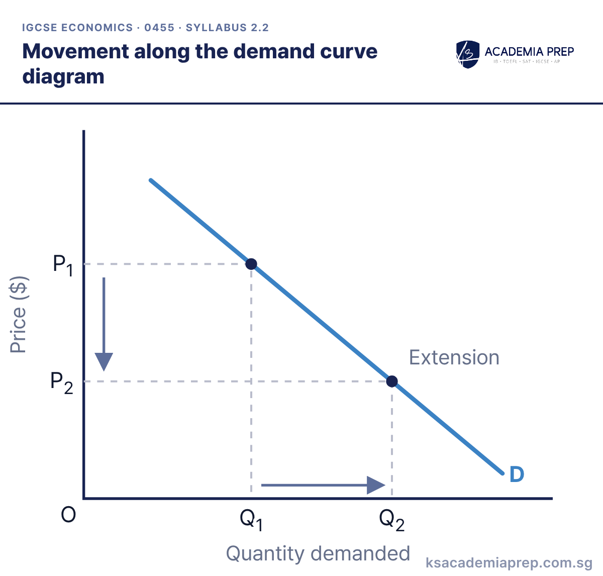
What it shows: A fall in price from P₁ to P₂ causes an extension in demand from Q₁ to Q₂, a movement down the curve. A rise in price causes a contraction. Only a change in the good’s own price causes a movement along the curve.
How to draw it
Label the axes Price ($) and Quantity demanded.
Draw one downward-sloping curve and label it D.
Mark P₁ and P₂ on the price axis and Q₁ and Q₂ on the quantity axis with dashed lines. Add arrows and label the movement extension or contraction.
Use “extension” and “contraction” for movements, and “increase” and “decrease” for shifts.
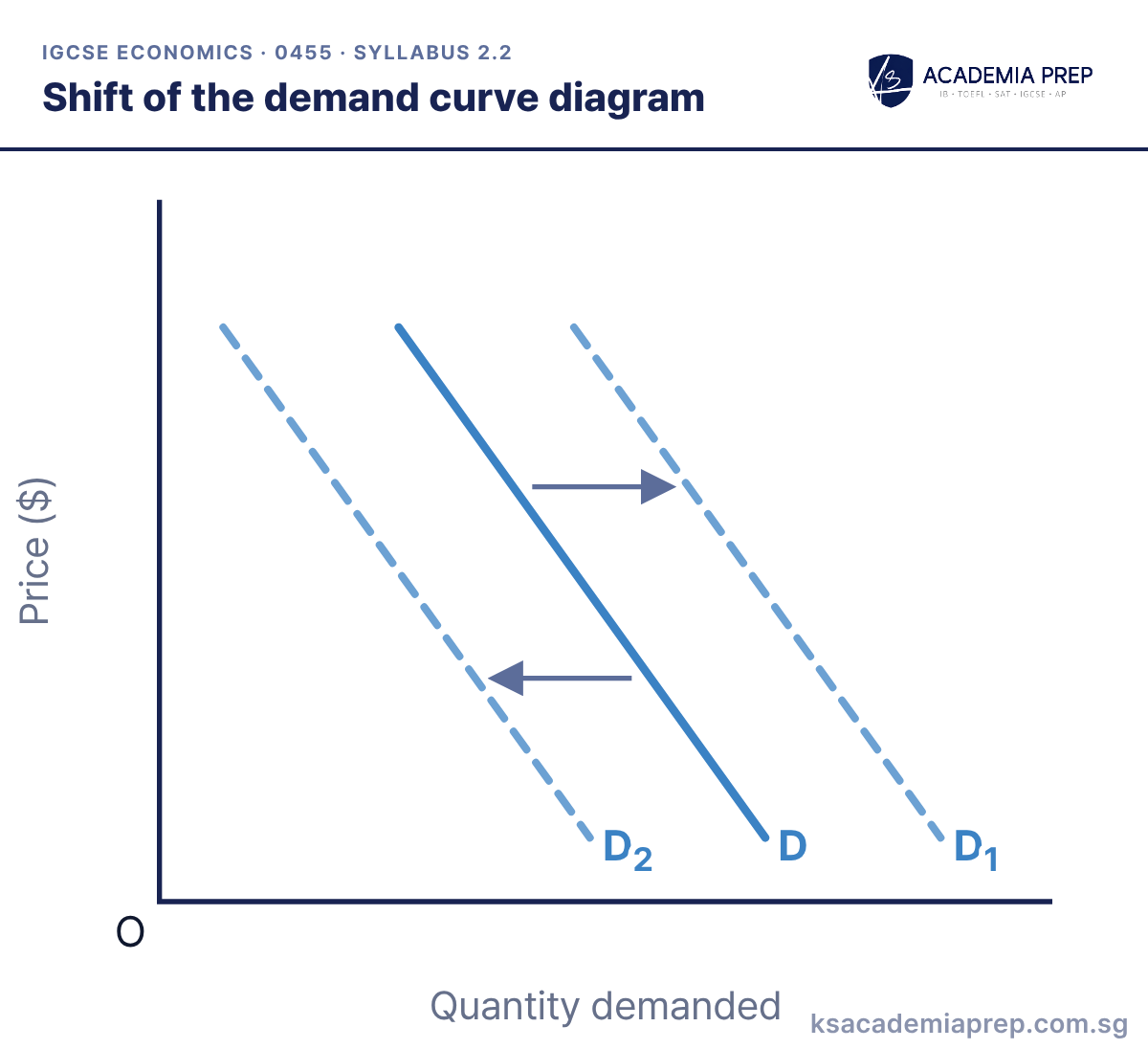
What it shows: A shift from D to D₁ is an increase in demand: more is demanded at every price. A shift to D₂ is a decrease. Shifts are caused by non-price factors, e.g. income, the prices of substitutes and complements, tastes and fashion, advertising and population.
How to draw it
Label the axes Price ($) and Quantity demanded.
Draw the original curve D.
Draw D₁ parallel and to the right for an increase, or D₂ to the left for a decrease. Add an arrow showing the direction of the shift.
Label the original and new curves (D and D₁) and add an arrow to show the direction of the shift.
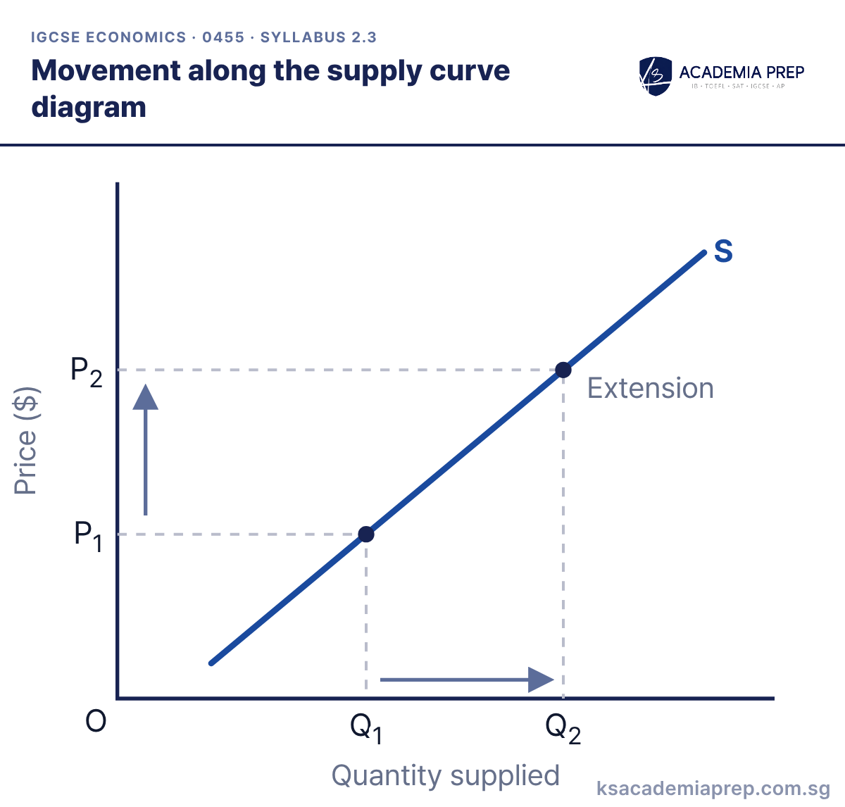
What it shows: A rise in price from P₁ to P₂ causes an extension in supply from Q₁ to Q₂, because producing more becomes more profitable. A fall in price causes a contraction.
How to draw it
Label the axes Price ($) and Quantity supplied.
Draw one upward-sloping curve and label it S.
Mark P₁ and P₂ and Q₁ and Q₂ with dashed lines. Add arrows and label the movement extension or contraction.
The supply curve slopes upwards from left to right. Only a change in the good’s own price moves along it.
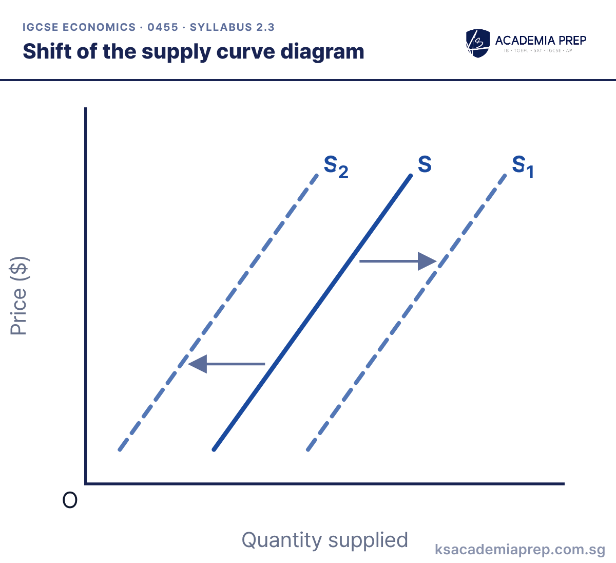
What it shows: A shift from S to S₁ is an increase in supply: more is supplied at every price. A shift to S₂ is a decrease. Shifts are caused by non-price factors, e.g. costs of production, technology, indirect taxes and subsidies, weather and the number of firms.
How to draw it
Label the axes Price ($) and Quantity supplied.
Draw the original curve S.
Draw S₁ to the right for an increase, or S₂ to the left for a decrease, and add an arrow.
A rise in costs of production shifts supply to the left: a decrease in supply.
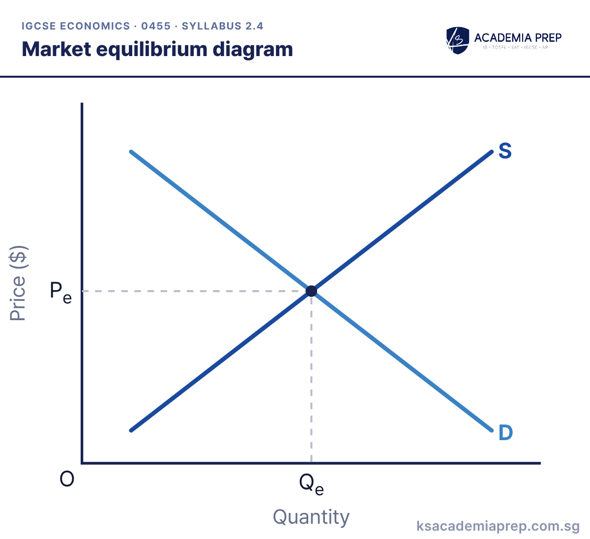
What it shows: Equilibrium is where demand equals supply, at price Pe and quantity Qe. There is no excess demand or excess supply, so the market clears and there is no pressure for the price to change.
How to draw it
Label the axes Price ($) and Quantity.
Draw a downward-sloping D and an upward-sloping S, and label both.
From the point where they cross, draw dashed lines to both axes and label them Pe and Qe.
Mark the equilibrium price and quantity on the axes with dashed lines.
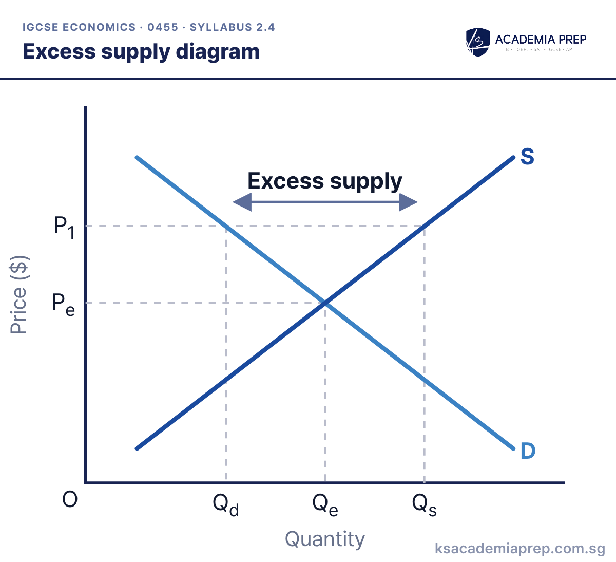
What it shows: At P₁, above the equilibrium price Pe, quantity supplied (Qs) exceeds quantity demanded (Qd). The gap between Qs and Qd is excess supply. Unsold stock pushes the price back down towards Pe.
How to draw it
Draw and label D and S, and mark Pe and Qe.
Draw a horizontal dashed line at P₁, above Pe.
Mark Qd where the line meets D and Qs where it meets S. Label the gap between them excess supply.
Excess supply is a horizontal distance at a given price, not a shaded area.
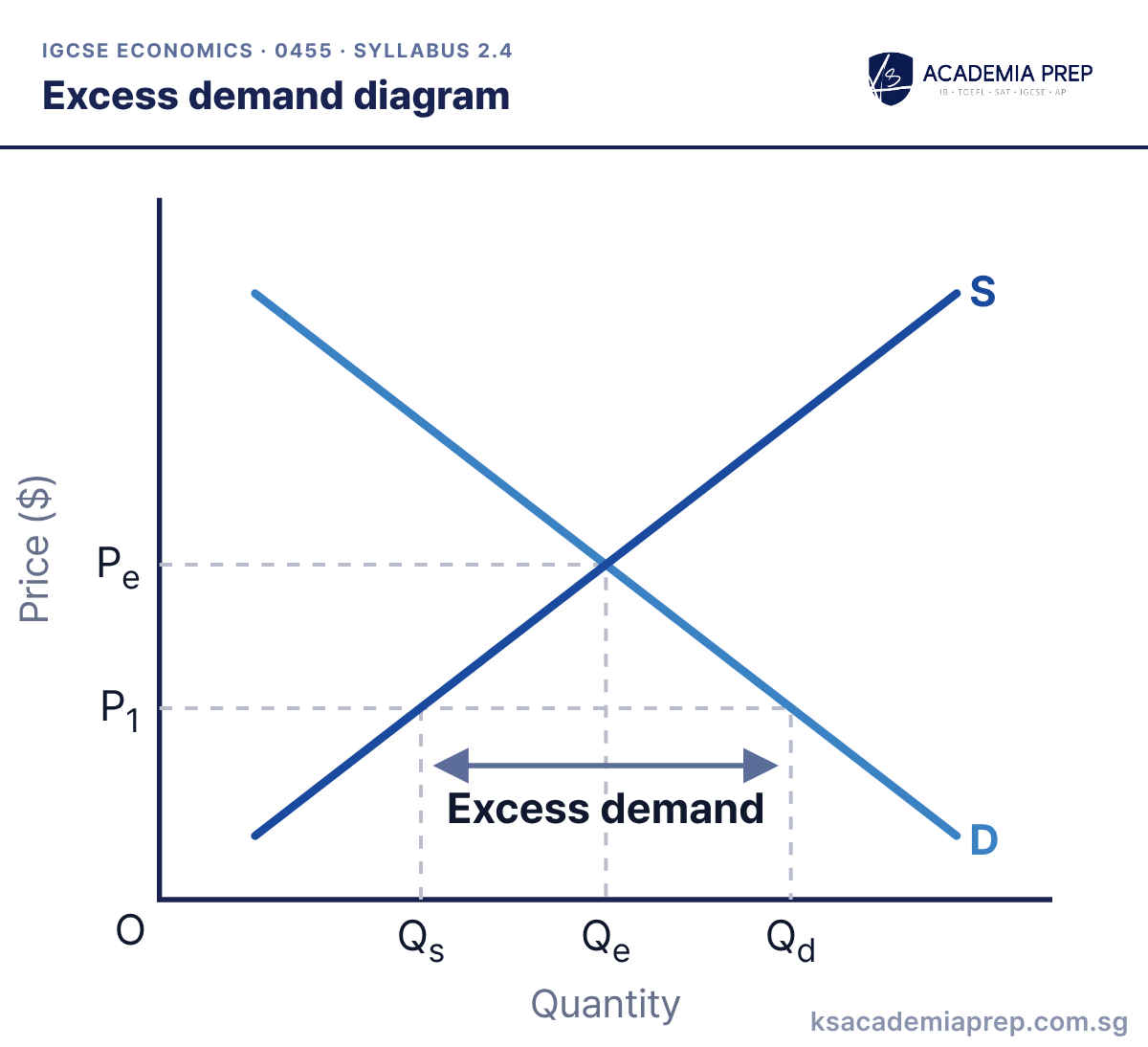
What it shows: At P₁, below the equilibrium price Pe, quantity demanded (Qd) exceeds quantity supplied (Qs). The gap is excess demand, a shortage. Consumers compete for the limited stock, pushing the price up towards Pe.
How to draw it
Draw and label D and S, and mark Pe and Qe.
Draw a horizontal dashed line at P₁, below Pe.
Mark Qs where the line meets S and Qd where it meets D. Label the gap between them excess demand.
Excess demand is also a horizontal gap, measured at the price below equilibrium.
Reading a demand and supply schedule
The syllabus asks you to find equilibrium and disequilibrium from a schedule as well as a diagram. In this market, equilibrium is at $4, where quantity demanded equals quantity supplied at 60 units.
Demand and supply schedule for one market
Price ($)
Quantity demanded
Quantity supplied
Market
2
100
20
Shortage of 80
3
80
40
Shortage of 40
4
60
60
Equilibrium
5
40
80
Surplus of 40
6
20
100
Surplus of 80
At any price below $4 there is a shortage (excess demand), and at any price above $4 there is a surplus (excess supply). The size of the shortage or surplus is the difference between the two quantity columns at that price.
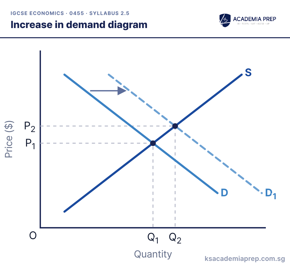
What it shows: Demand increases from D to D₁. At the original price there is now excess demand, so the price rises from P₁ to P₂. This causes an extension in supply, and quantity rises from Q₁ to Q₂.
How to draw it
Draw D and S and mark the first equilibrium at P₁ and Q₁.
Draw D₁ to the right of D and add an arrow.
Mark the new equilibrium at P₂ and Q₂. Both are higher than before.
A shift of one curve causes a movement along the other. Here demand shifts and supply extends.
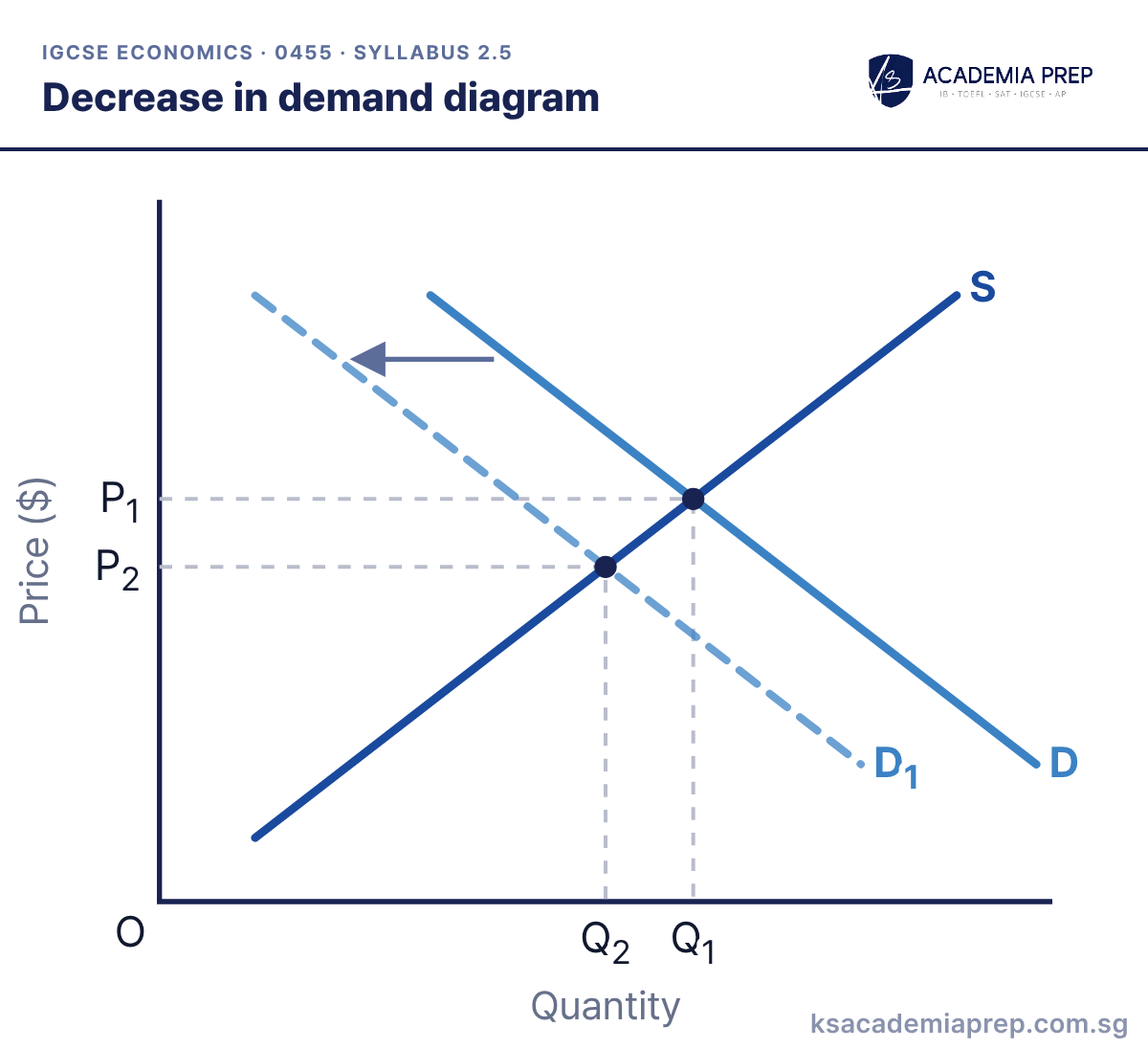
What it shows: Demand decreases from D to D₁. At the original price there is now excess supply, so the price falls from P₁ to P₂. Supply contracts and quantity falls from Q₁ to Q₂.
How to draw it
Draw D and S and mark the first equilibrium at P₁ and Q₁.
Draw D₁ to the left of D and add an arrow.
Mark the new equilibrium at P₂ and Q₂. Both are lower than before.
Explain the adjustment in steps: shift, excess supply at the old price, price falls, contraction in supply.
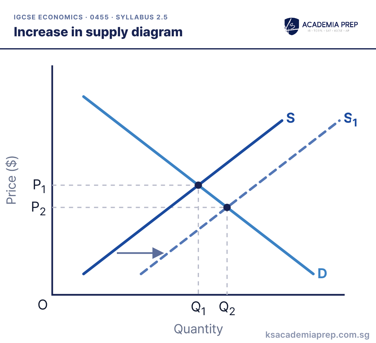
What it shows: Supply increases from S to S₁. At the original price there is now excess supply, so the price falls from P₁ to P₂. Demand extends and quantity rises from Q₁ to Q₂.
How to draw it
Draw D and S and mark the first equilibrium at P₁ and Q₁.
Draw S₁ to the right of S and add an arrow.
Mark the new equilibrium: price falls to P₂ and quantity rises to Q₂.
When supply increases, price and quantity move in opposite directions.
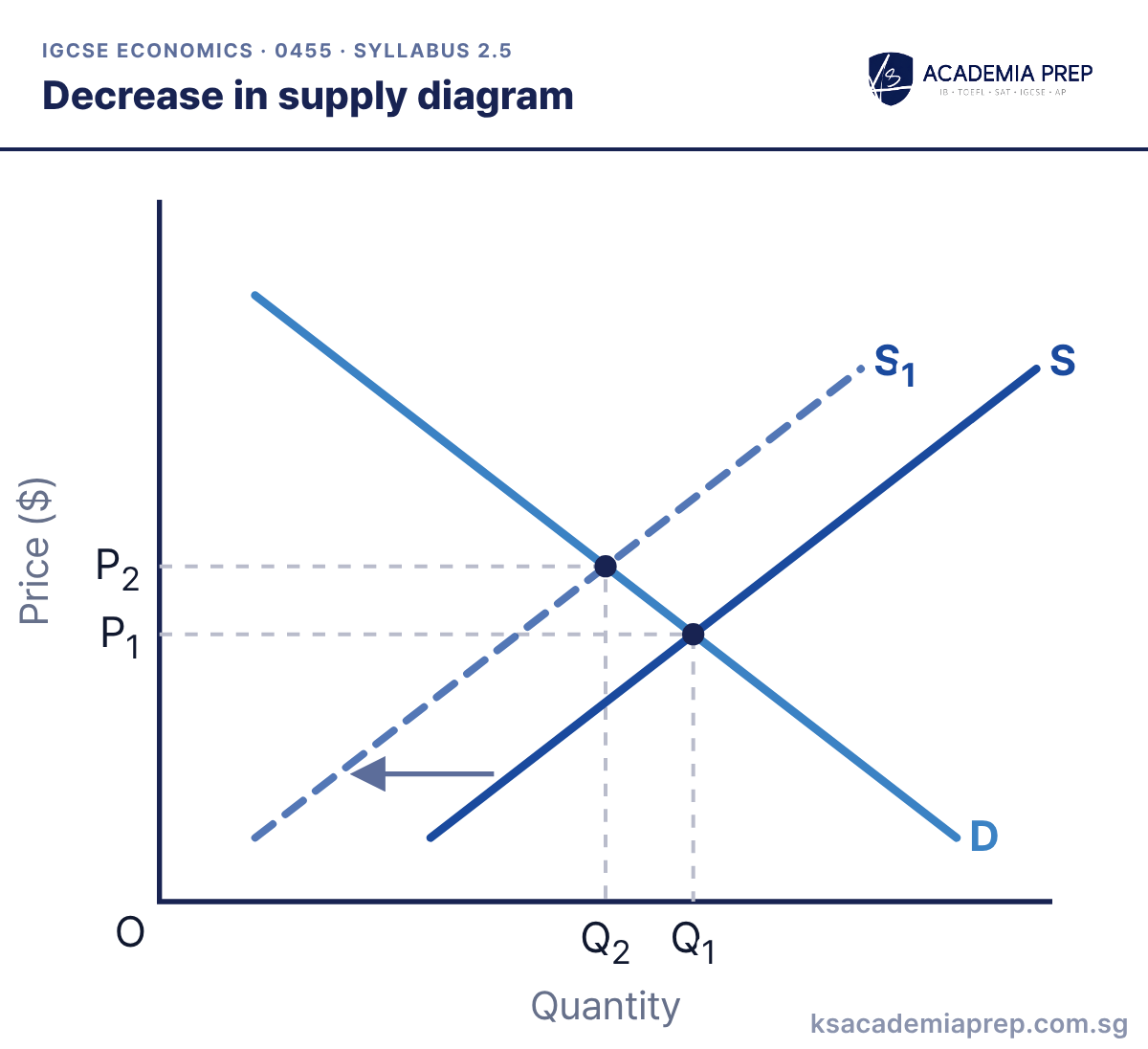
What it shows: Supply decreases from S to S₁, e.g. after a rise in costs of production. At the original price there is now excess demand, so the price rises from P₁ to P₂. Demand contracts and quantity falls from Q₁ to Q₂.
How to draw it
Draw D and S and mark the first equilibrium at P₁ and Q₁.
Draw S₁ to the left of S and add an arrow.
Mark the new equilibrium: price rises to P₂ and quantity falls to Q₂.
Check the direction of the shift: a decrease in supply moves the curve to the left.
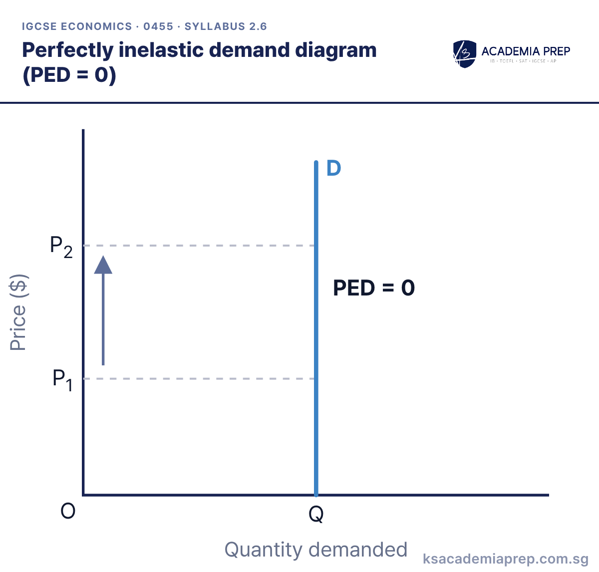
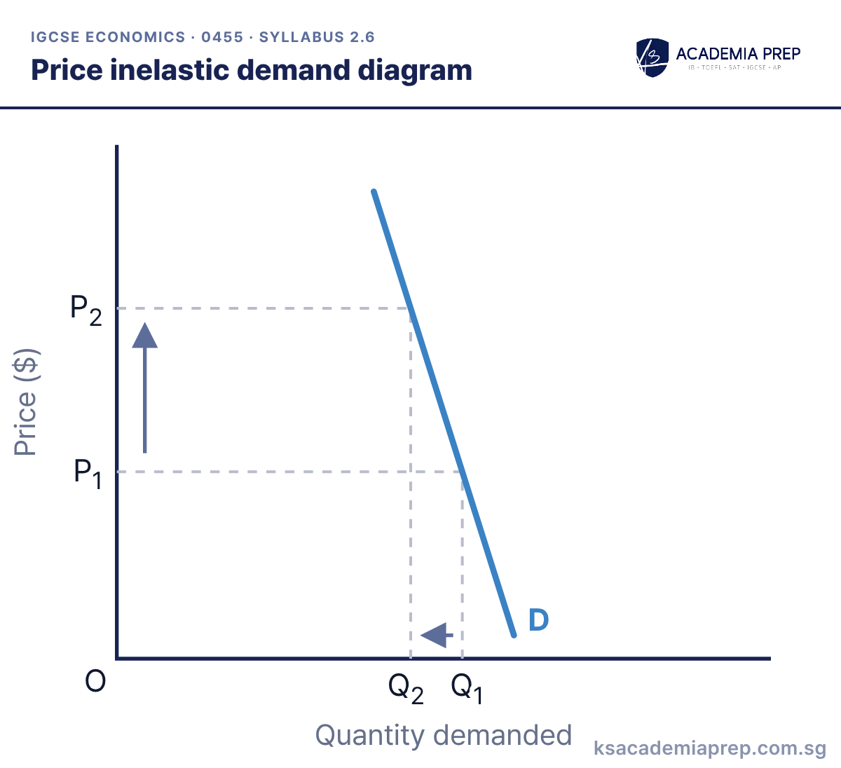
What it shows: A rise in price from P₁ to P₂ causes a proportionately smaller fall in quantity demanded, from Q₁ to Q₂. Total revenue rises when price rises.
How to draw it
Label the axes Price ($) and Quantity demanded.
Draw a steep demand curve and label it D.
Mark a large price change (P₁ to P₂) and the smaller change in quantity (Q₁ to Q₂) with dashed lines.
Draw the curve steep, and mark both price levels and both quantities.
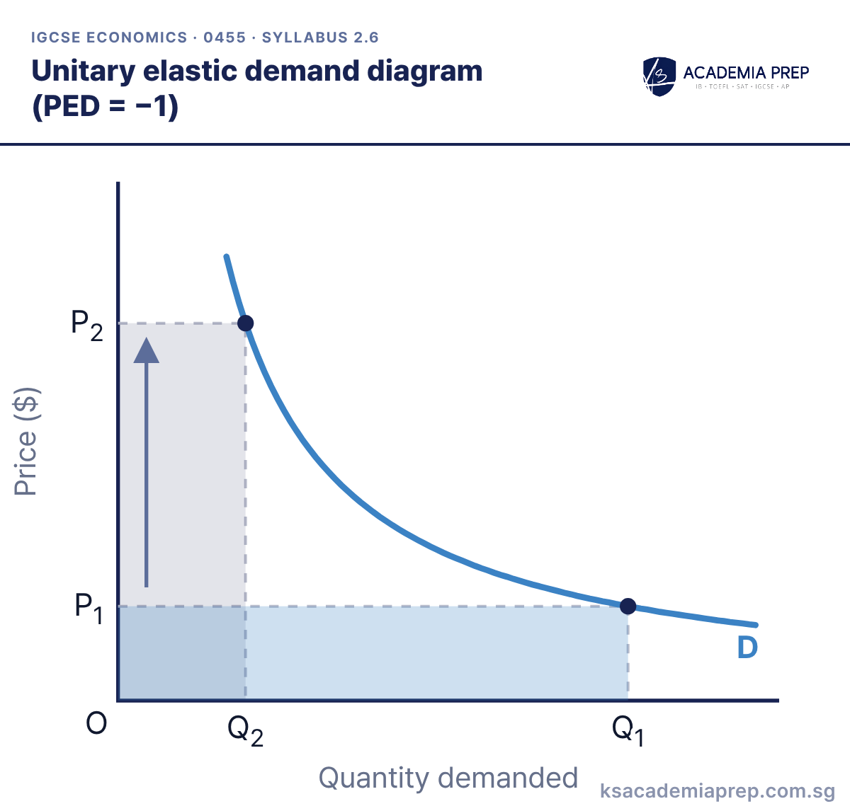
What it shows: A change in price causes an equal percentage change in quantity demanded. The two shaded rectangles (P × Q) have the same area, so consumer spending and firms’ revenue do not change when the price changes.
How to draw it
Label the axes Price ($) and Quantity demanded.
Draw a curve that bends towards both axes without touching them. Do not draw a straight line.
Mark two points and shade the two price × quantity rectangles. They should have the same area.
Draw unitary elastic demand as a curve (a rectangular hyperbola), not a straight line.
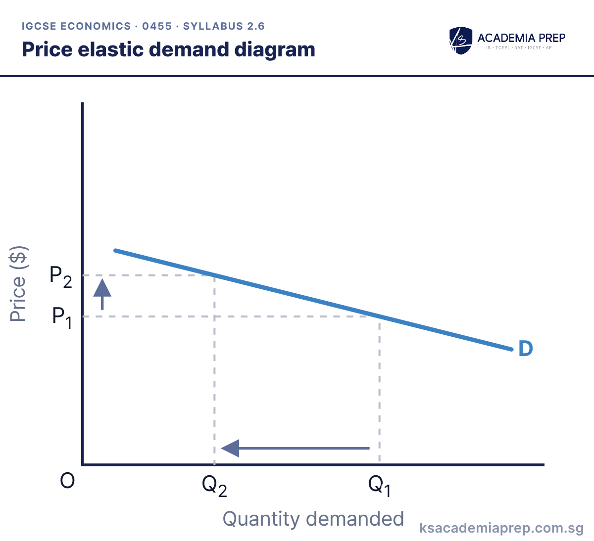
What it shows: A small rise in price from P₁ to P₂ causes a proportionately larger fall in quantity demanded, from Q₁ to Q₂. PED is between −1 and minus infinity. Total revenue falls when price rises.
How to draw it
Label the axes Price ($) and Quantity demanded.
Draw a flat demand curve and label it D.
Mark a small price change (P₁ to P₂) and the larger change in quantity (Q₁ to Q₂) with dashed lines.
Draw the curve flat and make the change in quantity visibly larger than the change in price.
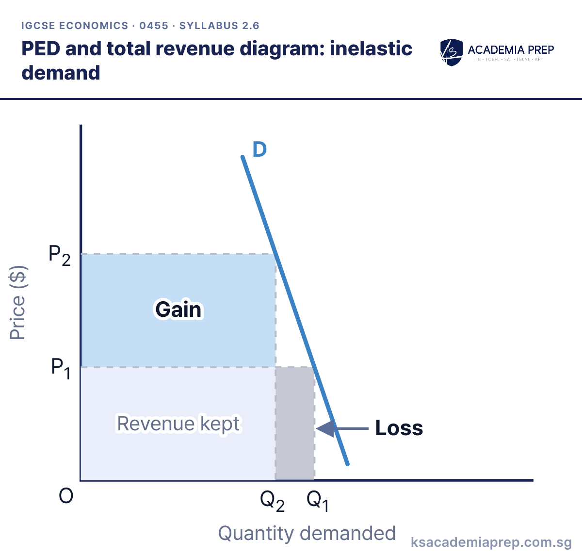
What it shows: Total revenue is price × quantity, the rectangle under a point on the demand curve. Demand here is price inelastic, so when price rises from P₁ to P₂ the revenue gained (blue) is larger than the revenue lost (grey), and total revenue rises. With elastic demand the loss would be larger, so total revenue would fall.
How to draw it
Draw a steep demand curve and mark P₁, Q₁ and P₂, Q₂.
Shade the gain: the rectangle between P₁ and P₂, up to Q₂.
Shade the loss: the rectangle between Q₂ and Q₁, up to P₁. The gain is bigger, so total revenue rises.
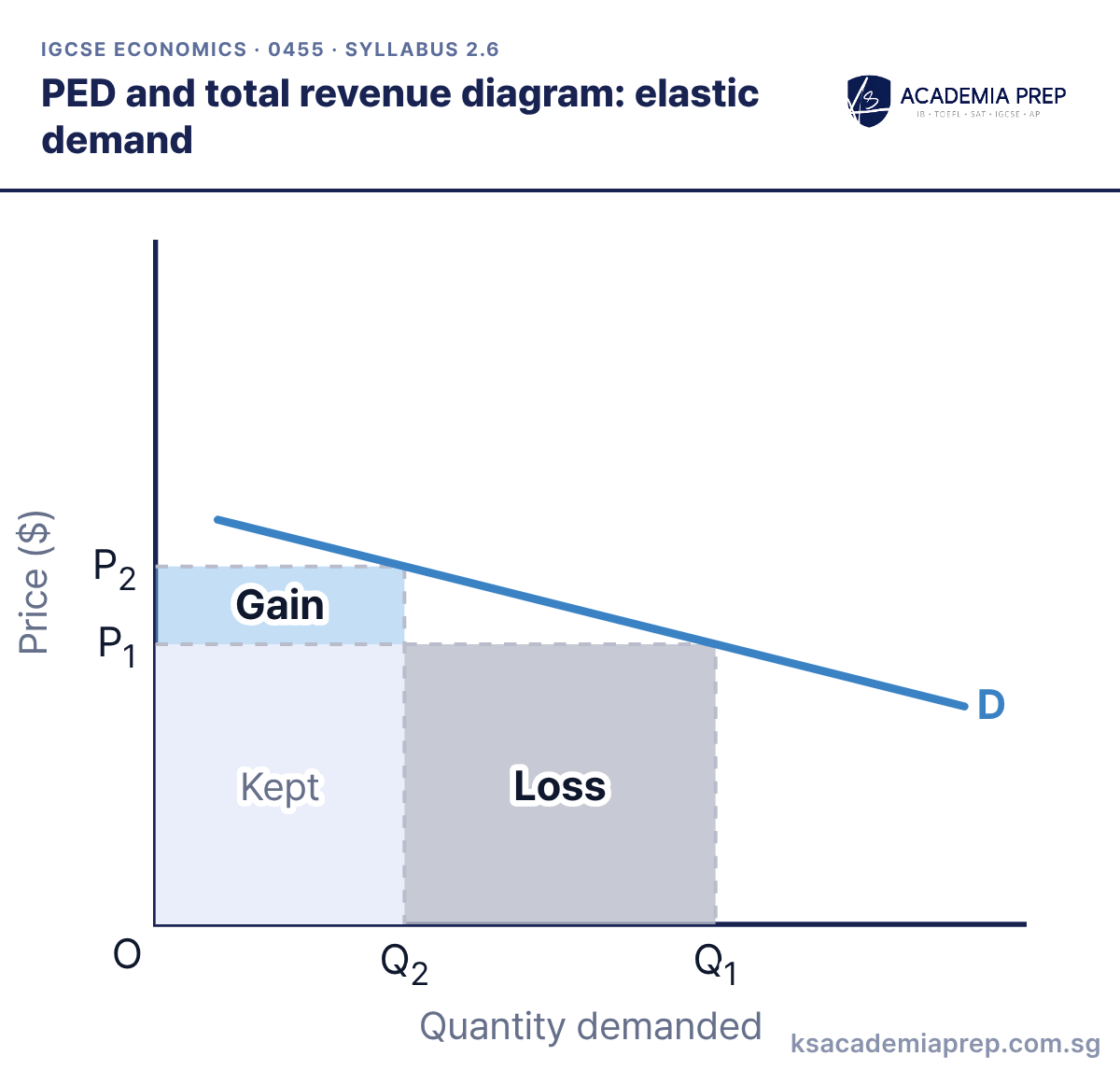
What it shows: Demand here is price elastic. When price rises from P₁ to P₂, the revenue gained on the units still sold (blue) is smaller than the revenue lost on the units no longer sold (grey), so total revenue falls. To raise revenue, a firm with elastic demand should lower its price instead.
How to draw it
Draw a flat demand curve and mark P₁, Q₁ and P₂, Q₂.
Shade the gain: the rectangle between P₁ and P₂, up to Q₂.
Shade the loss: the rectangle between Q₂ and Q₁, up to P₁. The loss is bigger, so total revenue falls.
Compare the two rectangles directly: if the grey loss is bigger than the blue gain, total revenue falls.
Working out the change in total revenue
Total revenue = price × quantity. Compare it before and after the price change.
Inelastic demand (PED = −0.2)
Price
Quantity
Total revenue (P × Q)
Before
$2
100
$200
After
$3
90
$270
Price rises by 50% and quantity falls by only 10%, so total revenue rises by $70.
Elastic demand (PED = −3)
Price
Quantity
Total revenue (P × Q)
Before
$10
100
$1,000
After
$11
70
$770
Price rises by 10% and quantity falls by 30%, so total revenue falls by $230.
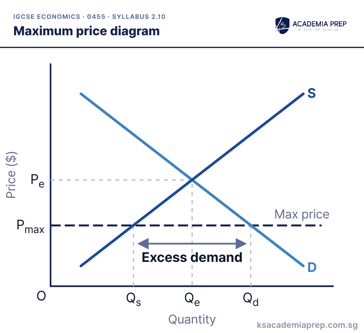
What it shows: A maximum price is a legal limit set below the equilibrium price Pe. Quantity demanded (Qd) exceeds quantity supplied (Qs), creating excess demand. This can lead to queues, rationing and black markets.
How to draw it
Draw and label D and S, and mark Pe and Qe.
Draw a horizontal line below Pe and label it maximum price.
Read off Qs on the supply curve and Qd on the demand curve at that price. Label the gap excess demand. Do not shift either curve.
Draw the maximum price as a horizontal line below Pe, then read Qd and Qs off the curves you already have. Do not shift either curve: a price control changes the price, not demand or supply.
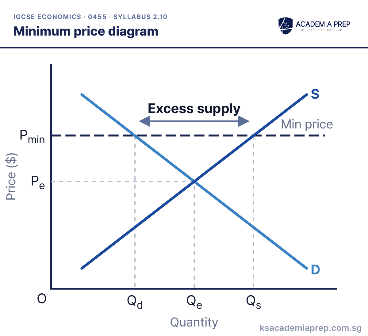
What it shows: A minimum price is a legal floor set above the equilibrium price Pe. Quantity supplied (Qs) exceeds quantity demanded (Qd), creating excess supply. The government may have to buy and store the surplus.
How to draw it
Draw and label D and S, and mark Pe and Qe.
Draw a horizontal line above Pe and label it minimum price.
Read off Qd on the demand curve and Qs on the supply curve at that price. Label the gap excess supply. Do not shift either curve.
Draw the minimum price as a horizontal line above Pe, then read Qd and Qs off the curves you already have. Do not shift either curve.
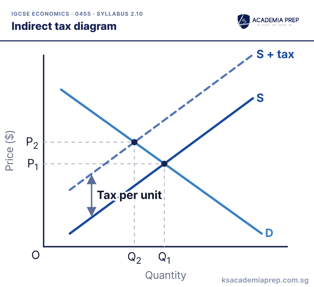
What it shows: A specific (per-unit) indirect tax raises firms’ costs, so supply decreases from S to S + tax. The vertical distance between the curves is the tax per unit. Price rises from P₁ to P₂ and quantity falls from Q₁ to Q₂.
How to draw it
Draw D and S and mark the first equilibrium at P₁ and Q₁.
Draw a new supply curve above S, parallel for a specific tax, and label it S + tax. Mark the vertical gap as the tax per unit.
Mark the new equilibrium: price rises to P₂, by less than the tax, and quantity falls to Q₂.
The price rises by less than the tax per unit: consumers pay part of the tax and producers pay the rest.
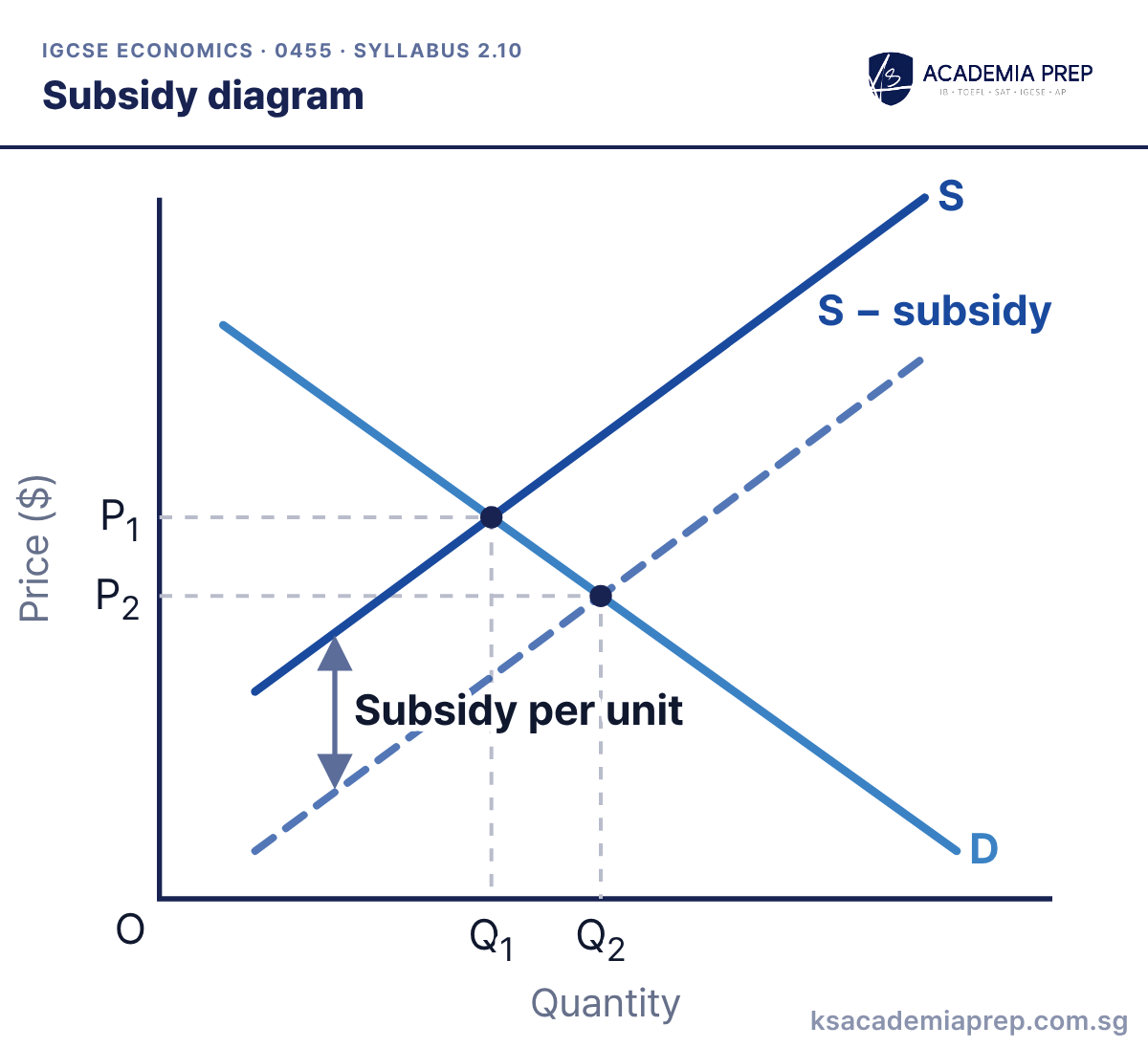
What it shows: A subsidy lowers firms’ costs, so supply increases from S to S − subsidy. The vertical distance between the curves is the subsidy per unit. Price falls from P₁ to P₂ and quantity rises from Q₁ to Q₂.
How to draw it
Draw D and S and mark the first equilibrium at P₁ and Q₁.
Draw a new supply curve below S and label it S − subsidy. Mark the vertical gap as the subsidy per unit.
Mark the new equilibrium: price falls to P₂, by less than the subsidy, and quantity rises to Q₂.
The price falls by less than the subsidy per unit, so part of the subsidy benefits producers.
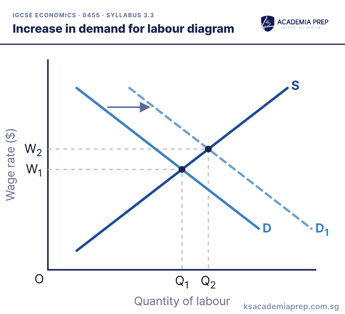
What it shows: The demand for labour increases from D to D₁, e.g. because demand for the product workers make has risen or workers have become more productive. The wage rate rises from W₁ to W₂ and employment rises from Q₁ to Q₂.
How to draw it
Label the axes Wage rate ($) and Quantity of labour.
Draw D and S, mark W₁ and Q₁, then draw D₁ to the right with an arrow.
Mark the new equilibrium: the wage rises to W₂ and employment rises to Q₂.
Label the axes “wage rate” and “quantity of labour”, not price and quantity.
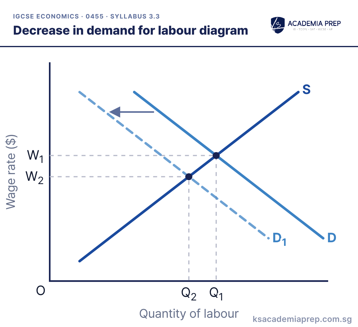
What it shows: The demand for labour decreases from D to D₁, e.g. because demand for the product workers make has fallen or firms have replaced workers with machines. The wage rate falls from W₁ to W₂ and employment falls from Q₁ to Q₂.
How to draw it
Label the axes Wage rate ($) and Quantity of labour.
Draw D and S, mark W₁ and Q₁, then draw D₁ to the left with an arrow.
Mark the new equilibrium: the wage falls to W₂ and employment falls to Q₂.
Demand for labour is a derived demand: it depends on demand for the product that labour helps to make.
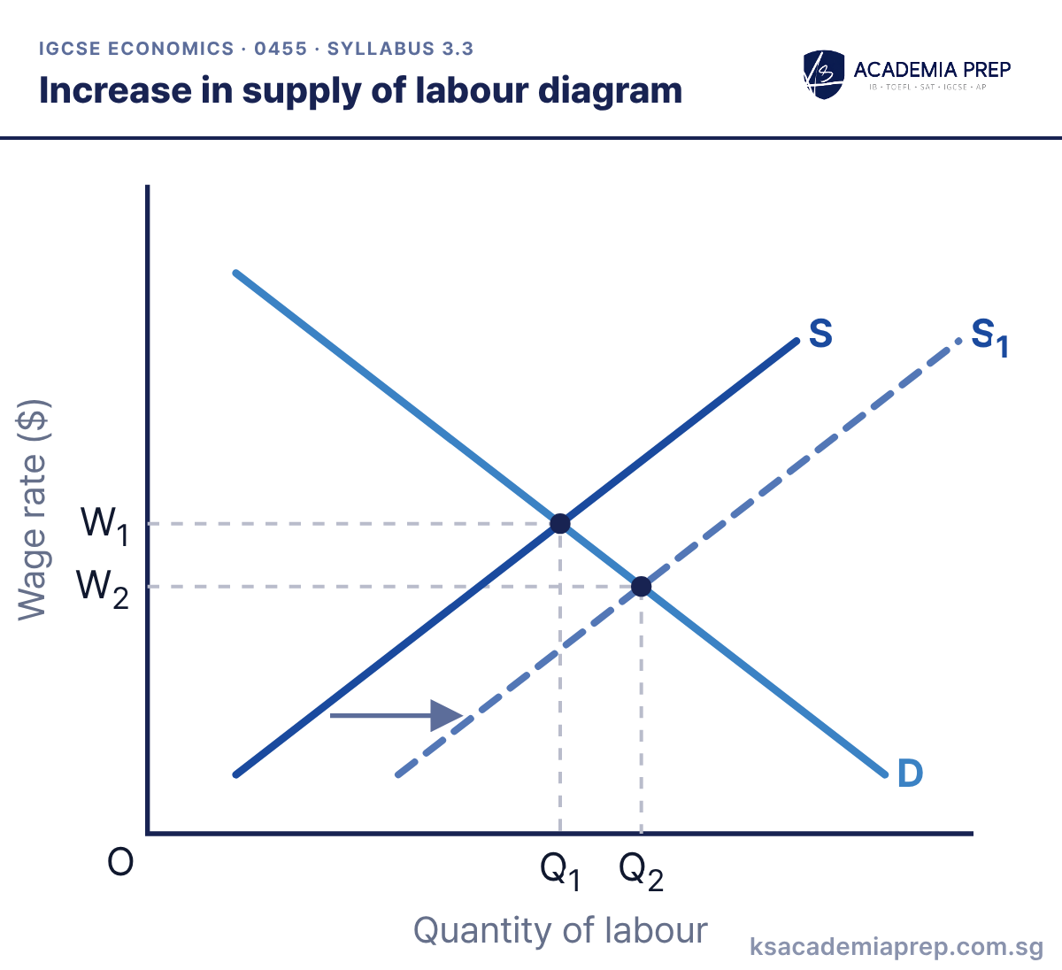
What it shows: The supply of labour increases from S to S₁, e.g. because more people have trained for the job or more workers have migrated into the country. The wage rate falls from W₁ to W₂ and employment rises from Q₁ to Q₂.
How to draw it
Label the axes Wage rate ($) and Quantity of labour.
Draw D and S, mark W₁ and Q₁, then draw S₁ to the right with an arrow.
Mark the new equilibrium: the wage falls to W₂ and employment rises to Q₂.
Name a specific cause of the shift in your answer, not just “supply increases”.
What it shows: The supply of labour decreases from S to S₁, e.g. because workers emigrate, fewer people train for the job or working conditions become less attractive. The wage rate rises from W₁ to W₂ and employment falls from Q₁ to Q₂.
How to draw it
Label the axes Wage rate ($) and Quantity of labour.
Draw D and S, mark W₁ and Q₁, then draw S₁ to the left with an arrow.
Mark the new equilibrium: the wage rises to W₂ and employment falls to Q₂.
When supply of labour falls, the wage rate and employment move in opposite directions.
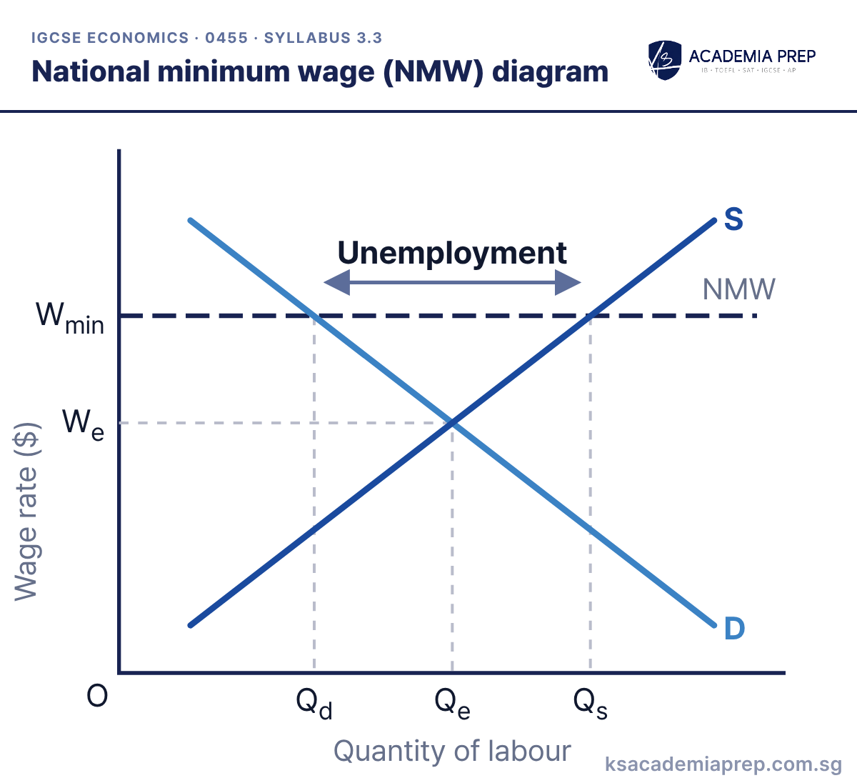
What it shows: A national minimum wage set above the equilibrium wage We raises the wage for workers who keep their jobs. Firms demand less labour (Qd) while more people want to work (Qs), so there is an excess supply of labour, i.e. unemployment. From 2027, NMW diagrams are listed under wage determination (3.3.2), one of several changes to the 0455 syllabus. In the 2026 syllabus, the same diagram appears as a minimum price in the labour market (2.11.2).
How to draw it
Label the axes Wage rate ($) and Quantity of labour. Draw D and S and mark We.
Draw a horizontal line above We and label it national minimum wage.
Read off Qd on the demand curve and Qs on the supply curve at that wage. Label the gap unemployment.
An NMW set below the equilibrium wage has no effect, so draw it above We.
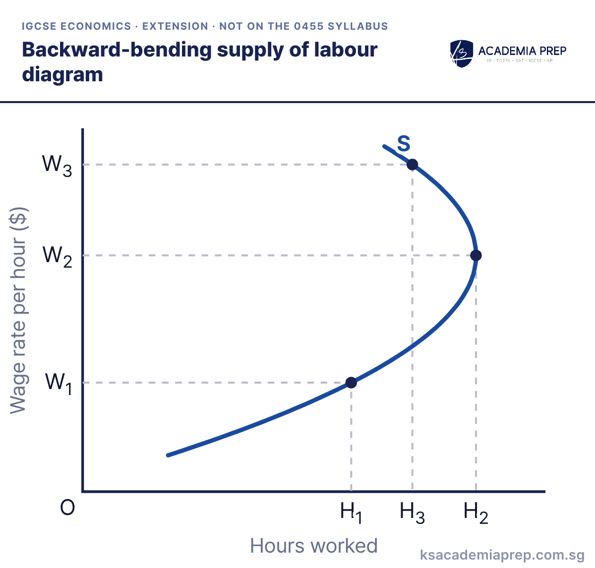
What it shows: As the wage rate rises from W₁ to W₂, the worker offers more hours (H₁ to H₂). Above W₂, the worker may choose more leisure because they can earn enough in fewer hours, so hours worked fall to H₃ at W₃.
How to draw it
Label the axes Wage rate per hour ($) and Hours worked.
Draw a supply curve that rises to the right, then bends back to the left at high wage rates.
Mark W₁, W₂ and W₃ with hours H₁, H₂ and H₃. H₃ is less than H₂.
Extension only: not an explicit 0455 requirement, but useful when evaluating how workers respond to higher wages.
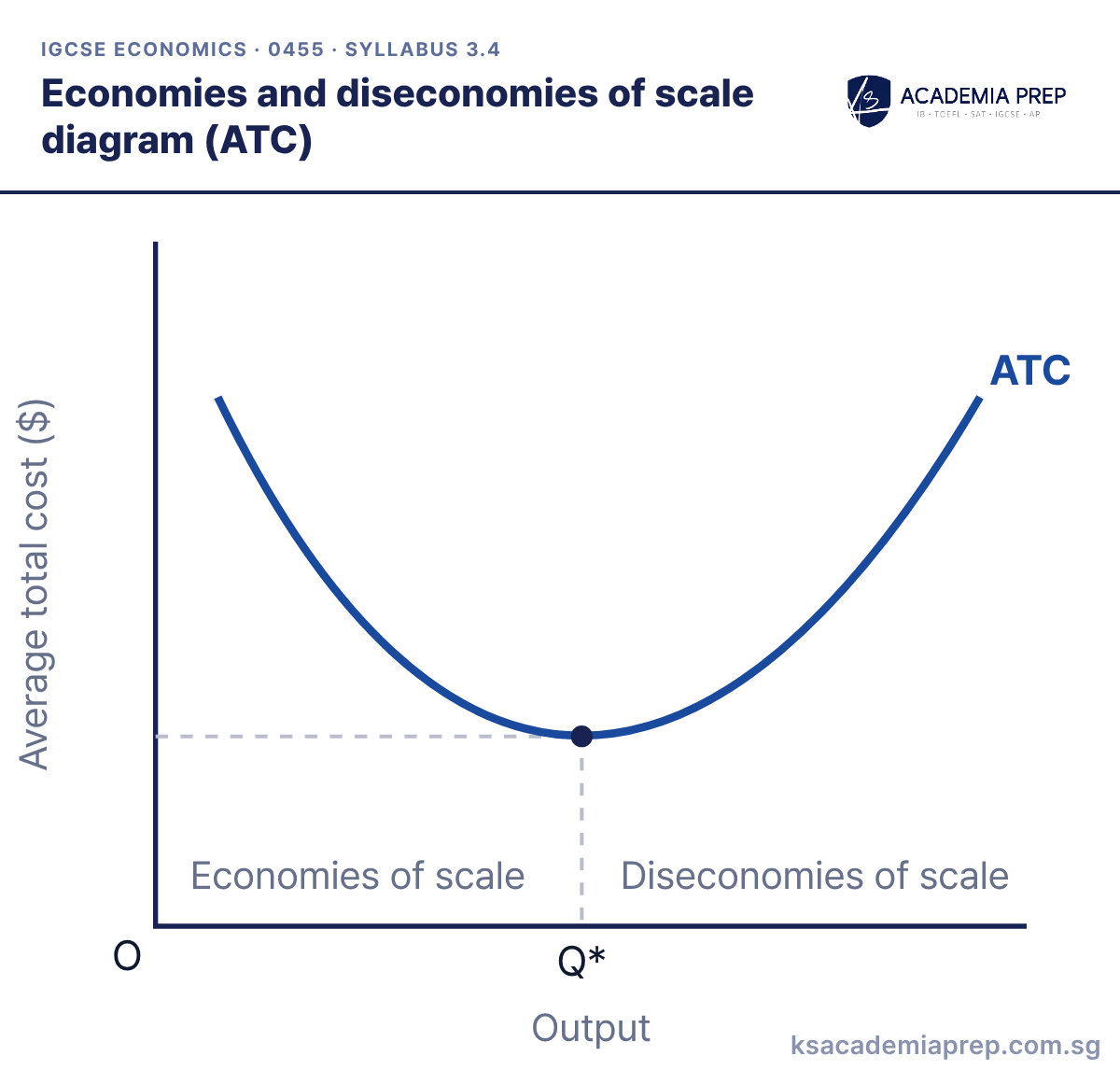
What it shows: As output rises, ATC falls because of economies of scale, e.g. bulk buying, specialisation and cheaper finance. Q* is the output with the lowest ATC. Beyond Q*, diseconomies of scale, e.g. poor communication and coordination problems, make ATC rise.
How to draw it
Label the axes Average total cost ($) and Output.
Draw a U-shaped curve and label it ATC.
Mark the lowest point at Q*. Label the falling part economies of scale and the rising part diseconomies of scale.
Economies of scale mean falling average total cost, not falling total cost. Drawing ATC diagrams is a new requirement in the 2027 syllabus.
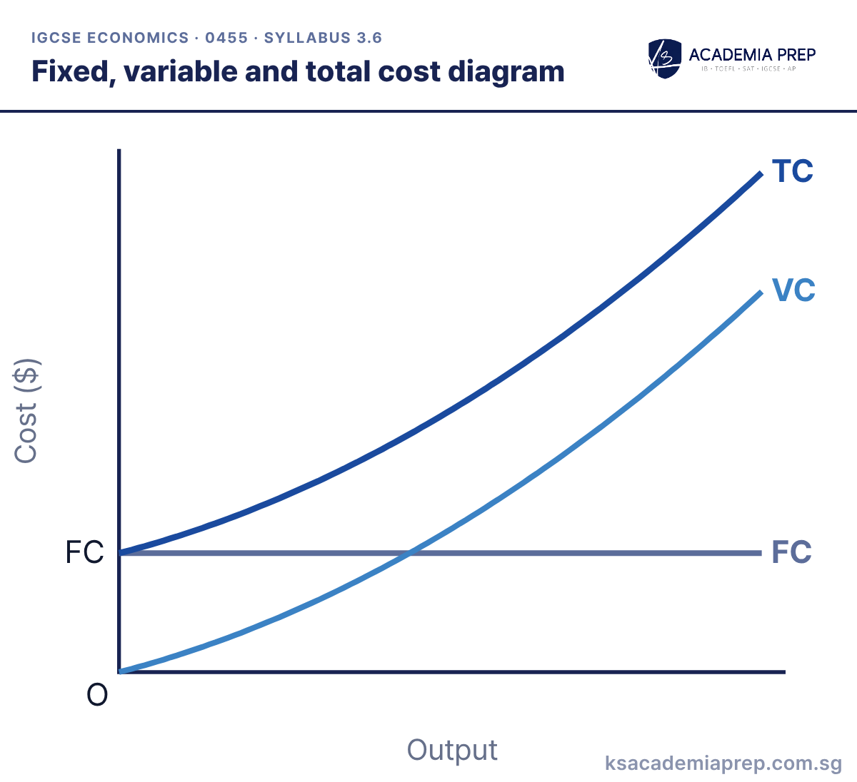
What it shows: Fixed cost does not change with output, so FC is horizontal. Variable cost starts at zero and rises as output rises. Total cost equals FC plus VC, so TC starts at the level of FC and the gap between TC and VC is always equal to FC.
How to draw it
Label the axes Cost ($) and Output.
Draw FC as a horizontal line and VC as a curve rising from the origin.
Draw TC starting at the FC level and staying the same distance above VC all the way.
Start TC at the FC level on the cost axis, not at the origin.
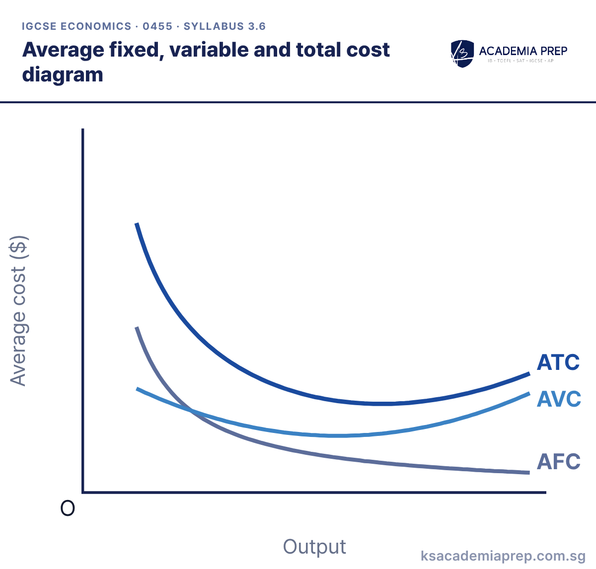
What it shows: AFC falls continuously as output rises, because the same fixed cost is spread over more units. AVC and ATC are U-shaped. ATC equals AFC plus AVC, so the gap between ATC and AVC narrows as output rises.
How to draw it
Label the axes Average cost ($) and Output.
Draw AFC falling continuously, and AVC as a U shape.
Draw ATC as a U shape above AVC. The gap between them is AFC, so it narrows as output rises.
ATC always lies above AVC and the two curves never touch.
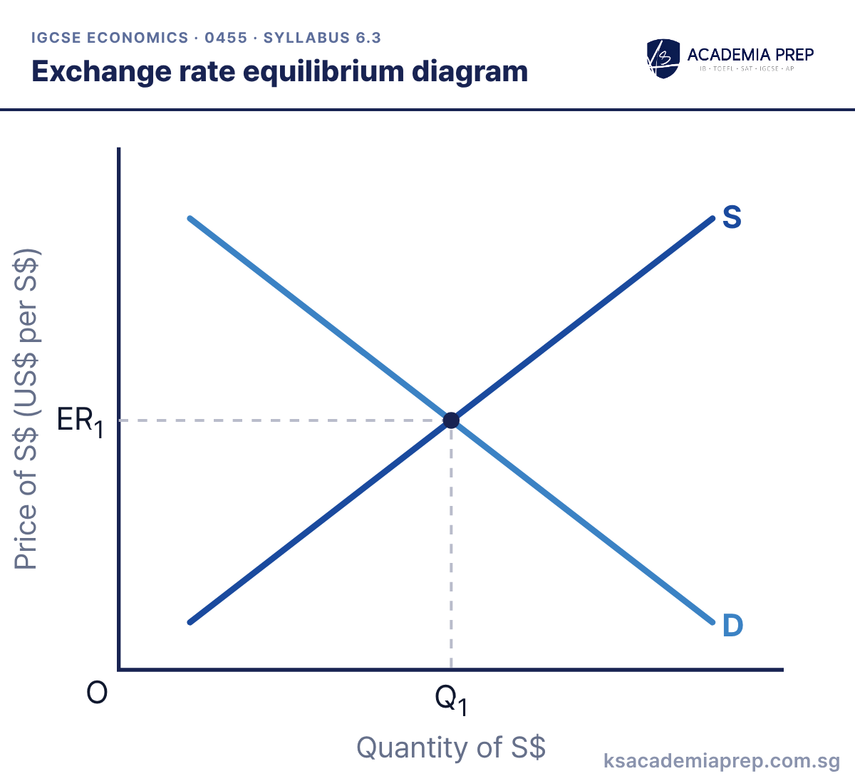
What it shows: Under a floating exchange rate, the price of a currency is set by demand and supply. Demand for S$ comes from foreigners buying Singapore exports, visiting Singapore and investing there. Supply of S$ comes from Singapore residents buying imports and investing abroad.
How to draw it
Label the axes Price of S$ (US$ per S$) and Quantity of S$.
Draw D and S for the currency and label both.
Mark the equilibrium exchange rate ER₁ and quantity Q₁ with dashed lines.
Label the vertical axis as the price of one currency in terms of another.
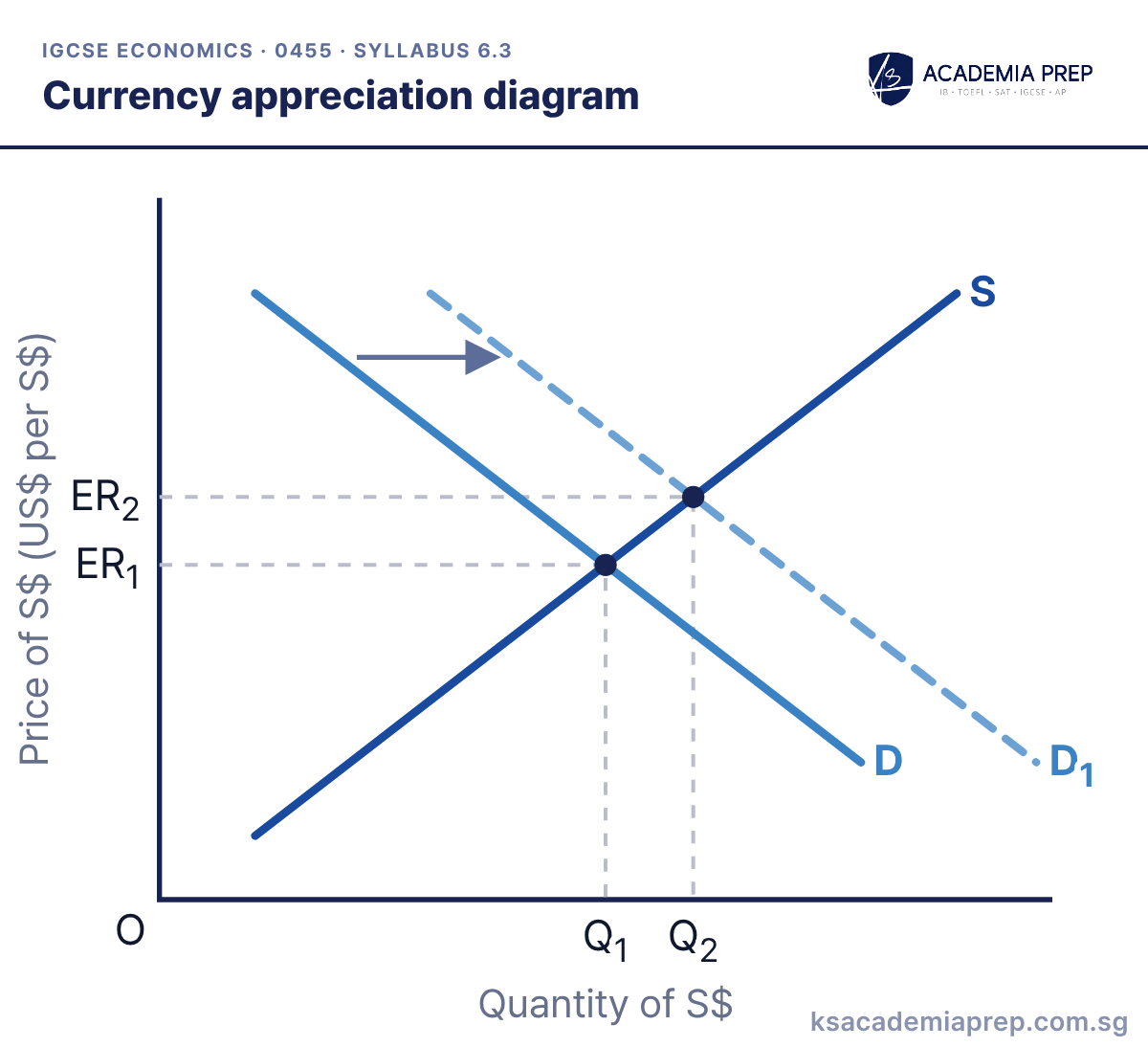
What it shows: An increase in demand for S$ from D to D₁, e.g. because of higher demand for Singapore’s exports, raises the exchange rate from ER₁ to ER₂: the S$ appreciates. A rise in Singapore’s interest rates can have the same effect, because foreign savers buy S$ to earn the higher return. So can speculation: speculators buy S$ when they expect it to rise.
How to draw it
Draw D and S for S$ and mark ER₁ and Q₁.
Draw D₁ to the right with an arrow.
Mark the new equilibrium ER₂, above ER₁. The S$ has appreciated.
Always state which currency has appreciated or depreciated.
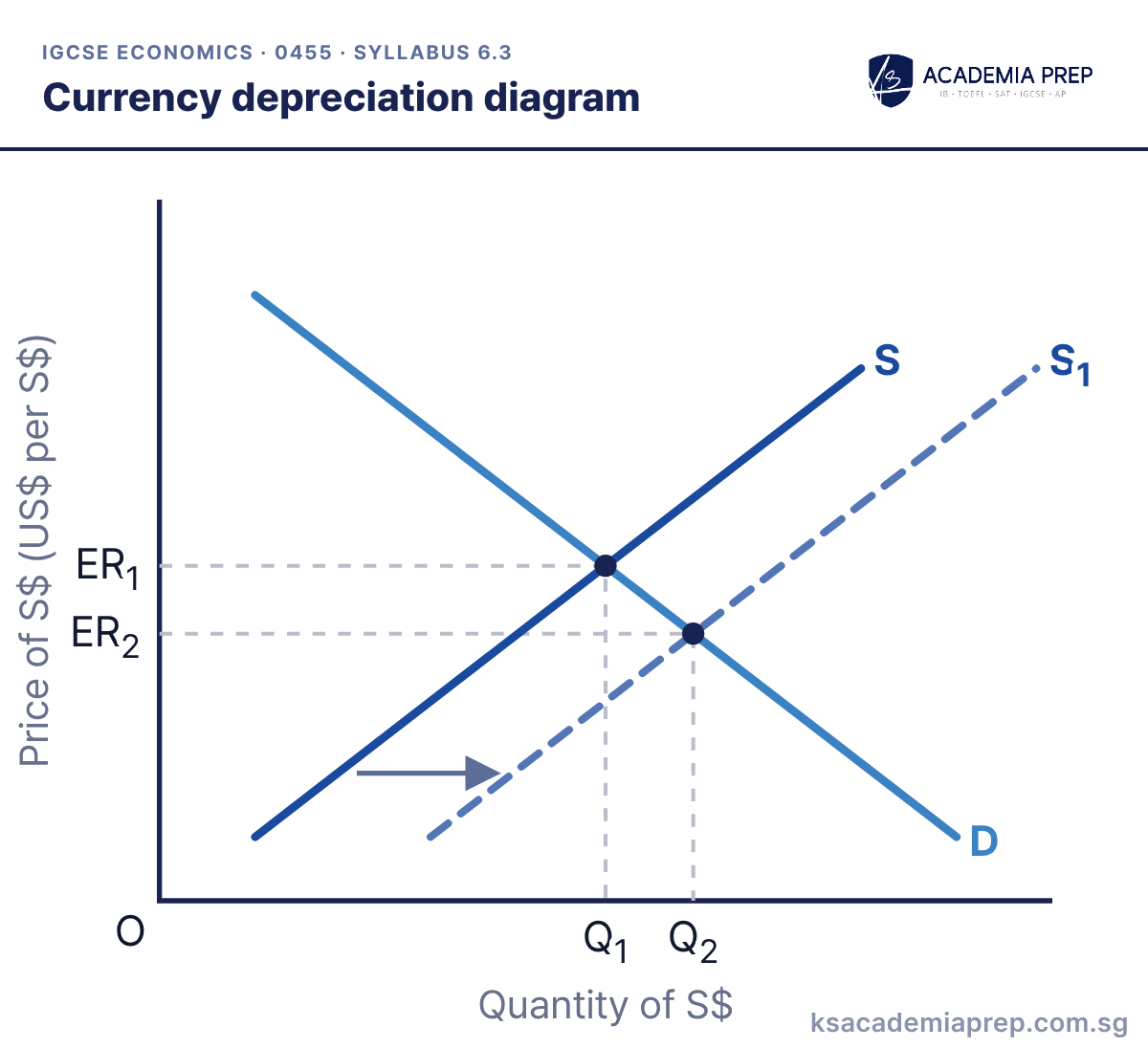
What it shows: An increase in the supply of S$ from S to S₁, e.g. because Singapore residents buy more imports or invest more abroad, lowers the exchange rate from ER₁ to ER₂: the S$ depreciates. A fall in Singapore’s interest rates can have the same effect, as savers move money abroad and sell S$. So can speculators selling S$ because they expect it to fall.
How to draw it
Draw D and S for S$ and mark ER₁ and Q₁.
Draw S₁ to the right with an arrow.
Mark the new equilibrium ER₂, below ER₁. The S$ has depreciated.
Depreciation means the currency buys less foreign currency than before. Say which currency has depreciated.
Frequently asked questions
How do you draw a national minimum wage diagram for IGCSE Economics?
Label the axes wage rate and quantity of labour, draw the demand for and supply of labour, and mark the equilibrium wage (We). Draw the national minimum wage as a horizontal line above We. At that wage, firms demand less labour (Qd) than people want to supply (Qs), and the gap is an excess supply of labour: unemployment. A minimum wage set below We has no effect, so always draw it above.
How do you show an indirect tax on a demand and supply diagram?
Draw a new supply curve above the original and label it S + tax. For a specific (per-unit) tax the new curve is parallel, and the vertical gap between the curves is the tax per unit. Price rises from P₁ to P₂ by less than the tax, and quantity falls from Q₁ to Q₂, because consumers and producers share the tax.
How do you show unemployment on a PPC diagram?
Move the production point from on the curve to a point inside it. Output of both goods falls, but the PPC does not move, because the economy still has the same resources. Only a fall in the quantity or quality of resources shifts the PPC inwards.
What is the difference between a movement along and a shift of the demand curve?
A change in the good's own price causes a movement along the curve: an extension or a contraction. A change in anything else, such as income, the price of a substitute or complement, tastes or advertising, shifts the whole curve: an increase (right) or a decrease (left).
How do you draw price elastic and price inelastic demand curves?
IGCSE diagrams show price inelastic demand with a steep curve, where a large price change causes a small change in quantity, and price elastic demand with a flat curve, where a small price change causes a large change in quantity. Mark both prices and both quantities so the difference in size is visible.
How many diagrams do you need for IGCSE Economics (0455)?
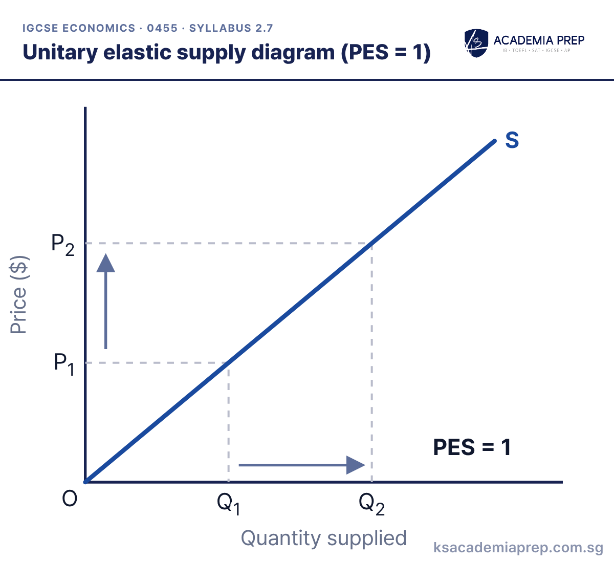
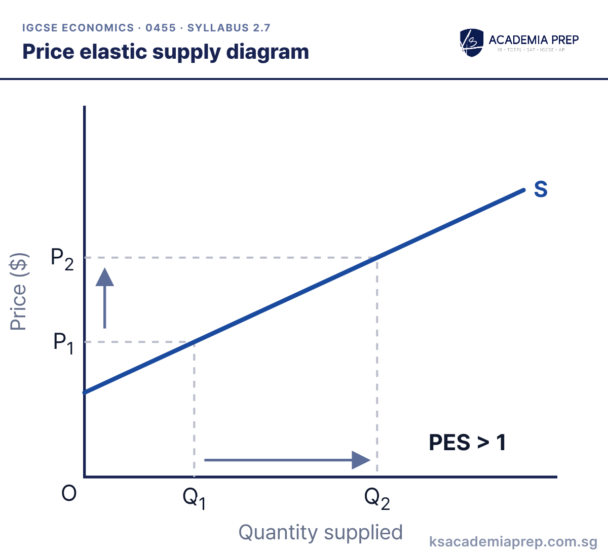
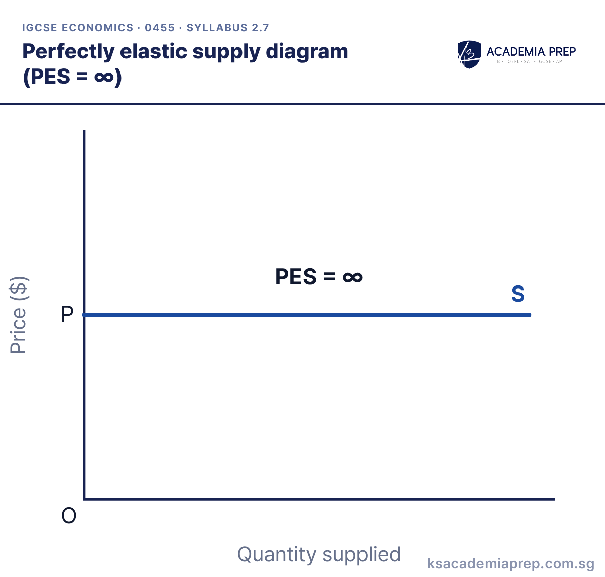
By our count of the 2027 to 2029 syllabus, there are 42 diagrams you may be asked to draw or interpret, from the PPC to foreign exchange rates. This page also includes 1 extension diagram, the backward-bending supply of labour, which is clearly marked.
Which diagrams are new in the 2027 IGCSE Economics syllabus?
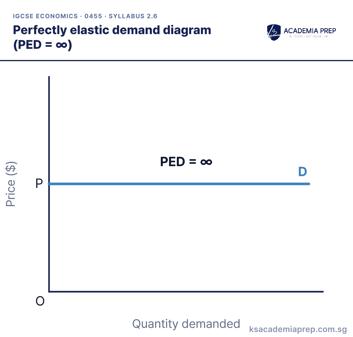
Cambridge's list of changes adds diagrams illustrating national minimum wages and average total cost (ATC) diagrams for economies and diseconomies of scale. The elasticity sections also now name perfectly inelastic, unitary elastic and perfectly elastic explicitly.
Which diagrams are not required for IGCSE Economics?
The syllabus states that demand and supply diagrams for market failure are not required, and that diagrams of perfect and imperfect competition and of monopoly are not required. Population pyramids were removed in the 2027 syllabus.
Is the backward-bending supply of labour curve on the IGCSE syllabus?
No, it is not named in the 0455 syllabus. It is included here as an extension because it helps you evaluate how workers respond to higher wages.
How do I avoid losing marks on IGCSE Economics diagrams?
Label both axes, label every curve, show the original and the new curve with an arrow for any shift, and mark both equilibria with dashed lines. In Cambridge's 2027 specimen Paper 2, the 4-mark diagram question awarded one mark each for these and none for written analysis.
Can I download these diagrams?
Yes. You can download the whole page as a PDF, save any single diagram as an image, or download every diagram in one ZIP file. They are free for personal revision.
Where can I get IGCSE Economics tuition in Singapore to make studying economics much easier?
KS Academia Prep teaches Cambridge IGCSE Economics (0455) at Far East Shopping Centre, #15-06, 545 Orchard Road, and online. Students get structured notes and guided worksheets that build each topic step by step, including every diagram on this page, and tutors they can reach between lessons when they get stuck. Classes are small, with a maximum of 10 students, and lessons are available in English, Mandarin and Korean. See our IGCSE Economics tuition page or message us on WhatsApp at +65 8129 8782.

 By Kirby Ng, Lead IGCSE Economics Tutor at KS Academia Prep · Updated 6 October 2026